
Packaging design influences 94% of first impressions, yet most brands pack every inch of their labels with text, graphics, and claims. You might think more information helps consumers choose your product, but the opposite is often true. Whitespace, the strategic use of empty space in design, is one of the most underutilized tools in consumer packaged goods branding. This article reveals how thoughtful whitespace application boosts premium perception, improves shelf visibility, and drives measurable sales growth in competitive retail environments.
Table of Contents
- Why Whitespace Matters In CPG Packaging Design
- Balancing Whitespace: Avoiding Common Pitfalls And Maximizing Impact
- Whitespace's Proven Effect On Brand Perception And Sales: Case Studies
- How To Apply Whitespace Strategically In Your Packaging Design
- Enhance Your Packaging Designs With Expert Whitespace Guidance
Key takeaways
| Point | Details |
|---|---|
| Whitespace drives purchase decisions | Strategic empty space increases consumer attention and purchase intent by creating visual clarity and premium perception. |
| Balance prevents design failure | Too much whitespace feels sparse and incomplete, while too little creates cluttered, confusing packaging that shoppers ignore. |
| Hierarchy guides consumer focus | Whitespace establishes visual priority, directing eyes to critical brand elements and product benefits within seconds. |
| Proven sales impact exists | Real CPG brands achieved 3x purchase intent increases and 50% sales growth through whitespace optimization. |
Why whitespace matters in CPG packaging design
Consumers spend just 3 to 13 seconds deciding whether to pick up your product or move to the next option. In that brief window, your packaging must communicate quality, relevance, and trustworthiness without overwhelming the viewer. Whitespace creates the breathing room that makes this instant communication possible.
Think of whitespace as the silence between musical notes. Without it, you get noise instead of melody. In packaging design, whitespace reduces cognitive load by giving each element space to register in the consumer's mind. When shoppers scan crowded shelves filled with competing products, designs with intentional empty space naturally draw the eye because they break the visual chaos.
First impressions are 94% design related, and packaging design influences roughly one third of consumer purchase decisions. The CPG market is brutally competitive, with hundreds of similar products fighting for attention. Vitamin packaging design must win where it counts by standing out amid visually similar competitors, and whitespace provides that differentiation.
Whitespace serves multiple psychological functions:
- It signals premium quality and sophistication, suggesting the brand values restraint over desperation
- It creates focus by isolating key messages, making product benefits instantly readable
- It builds trust through clarity, showing consumers you respect their time and intelligence
- It establishes brand confidence, demonstrating you don't need to shout to be heard
Consumers process visual information faster than text. When your packaging uses whitespace effectively, shoppers grasp your product's value proposition in seconds rather than minutes. This speed advantage translates directly to higher conversion rates at the shelf. Avoiding white space UX mistakes becomes essential for maintaining this competitive edge.
Balancing whitespace: avoiding common pitfalls and maximizing impact
Whitespace is powerful, but it requires careful calibration. Too much empty space makes packaging feel incomplete or suggests you're hiding something. Too little creates visual clutter that drives shoppers away. The sweet spot varies by product category, target demographic, and brand positioning.
Whitespace in UX design requires balance, as overuse makes designs feel sparse or incomplete. A luxury skincare brand can use generous whitespace to convey exclusivity, while a value oriented snack brand might need denser layouts to communicate abundance and variety. Understanding your brand's position helps determine the right balance.

Effective whitespace guides the viewer's eye through a deliberate path. Start with your brand name, move to the product benefit, then to supporting details. This visual hierarchy only works when whitespace separates each level clearly. White space is the primary tool for establishing clear visual hierarchy in user experience design.
Common whitespace mistakes include:
- Distributing space evenly across all elements, which creates monotony instead of hierarchy
- Using whitespace randomly without strategic purpose, resulting in awkward gaps
- Neglecting micro whitespace between letters and lines, reducing readability
- Cramming information into corners while leaving large central voids
Pro Tip: Print your design at actual size and view it from six feet away, the typical shopping distance. If you can't identify the product category and primary benefit within three seconds, you need more strategic whitespace around those elements.
Whitespace builds rhythm in design, creating a visual cadence that feels natural to the eye. Alternating dense and sparse areas generates interest and prevents monotony. Think of it as pacing in writing: short sentences create punch, longer ones provide detail, and paragraph breaks give readers time to absorb information.
The relationship between whitespace and other design elements should feel intentional. Empty space around your logo elevates it. Space between product claims makes each one digestible. Margins that frame your design create containment and finish. Every inch of whitespace should serve a purpose, whether that's separation, emphasis, or rest.
Whitespace's proven effect on brand perception and sales: case studies
Data confirms what designers have long understood: whitespace drives business results. Evamor experienced a 3x increase in purchase intent and doubled shelf attention through strategic whitespace application in their packaging redesign. The brand shifted from a cluttered, text heavy label to a clean design that let the product and core message breathe.
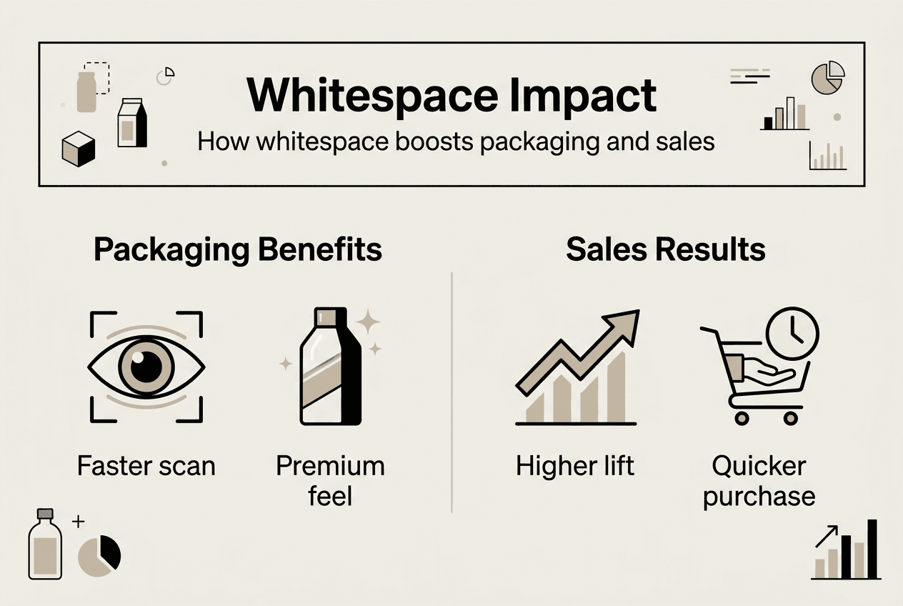
Kalera's packaging redesign led to 25% retail distribution growth and 50% sales growth, with whitespace updates playing a central role. By removing unnecessary elements and creating clear visual zones, Kalera transformed from just another option to a premium choice that commanded attention and justified higher pricing.
Academic research supports these business outcomes. Products with ample whitespace showed 15% higher purchase likelihood compared to designs with dense layouts, according to a Journal of Consumer Research study. This effect held across multiple product categories and demographic groups.
| Brand | Whitespace Strategy | Measured Impact |
|---|---|---|
| Evamor | Simplified label with generous margins | 3x purchase intent, 2x shelf attention |
| Kalera | Clear zones with breathing room | 25% distribution growth, 50% sales increase |
| Generic study products | Ample vs. dense layouts | 15% higher purchase likelihood |
Whitespace signals premium positioning even when price points remain accessible. Consumers associate clean, uncluttered designs with quality, craftsmanship, and attention to detail. This perception allows brands to command higher prices or compete effectively against established premium players.
The shelf stand out effect is particularly valuable in crowded categories. When surrounded by busy, text heavy competitors, a design with strategic whitespace creates a visual oasis that draws the eye naturally. Shoppers notice the difference before they consciously process why, creating an immediate advantage in the critical first seconds of evaluation.
Whitespace also improves information retention. When consumers can quickly grasp your product's key benefits, they're more likely to remember your brand and seek it out in future shopping trips. This memory advantage compounds over time, building brand equity and customer loyalty. You can see effective packaging whitespace examples that demonstrate these principles in action across various product categories.
Distribution expansion often follows successful whitespace implementation. Retailers prefer products that move quickly, and packaging that drives purchase intent makes placement decisions easier. The Kalera case demonstrates how design improvements can open doors to new retail channels and shelf positions.
How to apply whitespace strategically in your packaging design
Start by identifying your packaging's single most important message. This might be your product benefit, brand name, or unique ingredient. Give that element the most surrounding whitespace to create unmistakable emphasis. Everything else should support this primary focus.
Create clear visual sections using whitespace as the divider. Group related information together, such as nutritional facts, usage instructions, or ingredient lists. Leave generous space between these groups so consumers can process one section at a time without confusion.
Follow these steps for strategic whitespace implementation:
- Audit your current design and remove any element that doesn't directly support purchase decisions or regulatory requirements
- Establish a grid system that defines consistent spacing rules across all design elements
- Allocate the largest whitespace zones to your most important messages and brand identifiers
- Use micro whitespace between lines of text and around individual words to improve readability
- Test your design by printing it at actual size and viewing from typical shopping distances
- Gather feedback from target consumers, asking specifically about clarity and visual appeal
Micro whitespace deserves special attention because it dramatically affects readability. Proper use of micro whitespace can improve reading comprehension by up to 20%. This includes letter spacing, line height, and margins around text blocks. Even small adjustments in these areas create noticeable improvements in how easily consumers absorb your messaging.
Pro Tip: Use the squint test to evaluate your whitespace distribution. Squint at your design until details blur. The shapes and masses that remain visible reveal your visual hierarchy. If the wrong elements dominate or everything blends together, redistribute your whitespace to create clearer priority.
Consider your shelf environment when planning whitespace. If competitors use dense, colorful designs, strategic whitespace creates differentiation. If you're in a premium category where minimal designs dominate, you might need unique applications of whitespace to stand out while maintaining category expectations.
Whitespace works with color, typography, and imagery to create cohesive designs. A bold color needs less surrounding space to command attention than a subtle one. Large typography requires more breathing room than small text. Complex imagery benefits from generous margins, while simple icons can sit closer to other elements. Balance these relationships for maximum impact.
Test your designs in realistic conditions before finalizing. Print samples and place them among competitor products on a mock shelf. Photograph them under typical retail lighting. Show them to people unfamiliar with your brand and ask what they notice first. These tests reveal whether your whitespace strategy works in real shopping environments.
Enhance your packaging designs with expert whitespace guidance
Mastering whitespace takes years of design experience and deep understanding of consumer psychology. You know your product and brand better than anyone, but translating that knowledge into effective packaging design requires specialized expertise. Professional designers understand how to balance whitespace with brand personality, regulatory requirements, and shelf impact.
Offcut connects you with experienced packaging designers who have refined their whitespace skills across hundreds of CPG projects. These designers create print ready concepts that elevate your brand presence while maintaining the clarity and focus that drive sales. Instead of paying agency rates for custom work, you access exclusive designs at a fraction of typical costs. The designers get paid for work that would otherwise sit unused, and you get professional packaging that competes effectively on crowded shelves. Explore professional packaging design services that bring expert whitespace application to your brand.
FAQ
What exactly is whitespace in design?
Whitespace, also called negative space, refers to the empty areas between and around design elements on your packaging. It includes margins, padding, gaps between text lines, and any area not occupied by text, images, or graphics. Whitespace isn't necessarily white in color; it's simply the breathing room that separates and highlights content. This space improves clarity by preventing visual elements from competing for attention simultaneously.
How do I know if I'm using too much whitespace on my packaging?
Too much whitespace makes packaging feel unfinished, sparse, or lacking in substance. If consumers struggle to find essential information or if your design feels empty compared to category norms, you've likely overdone it. Balance comes from ensuring whitespace serves a clear purpose, whether emphasizing key elements, improving readability, or creating premium perception. Test your design against competitors and gather feedback from target customers to calibrate appropriately.
Can whitespace really improve sales and customer perception?
Yes, multiple studies and real world case studies confirm whitespace's impact on business outcomes. Products with ample whitespace had 15% increased purchase likelihood in controlled research. Brands like Evamor tripled purchase intent through strategic whitespace application. Consumers associate clean, well spaced designs with quality, premium positioning, and trustworthiness. This perception translates to higher conversion rates, better shelf performance, and stronger brand equity over time.
What practical first steps should I take to improve whitespace use?
Start by removing non essential elements from your current packaging design. Identify the single most important message and give it generous surrounding space. Group related information together and separate these groups with clear whitespace buffers. Increase line spacing in text blocks and add margins around all edges. Print your revised design at actual size and evaluate it from six feet away to ensure key messages remain instantly visible and hierarchy feels clear.