
TL;DR:
- Modern packaging merges material innovation, sensory finishes, and functional interaction to enhance brand storytelling and consumer engagement. Strategic material choices, tactile finishes, and integrated interactive elements like KitKat's signal-blocking wrapper demonstrate the importance of early production planning and multidisciplinary collaboration. Effective packaging design coordinates all system layers and aligns with consumer language, elevating retail impact and brand perception.
Modern packaging is defined as a product container system that combines material innovation, sensory finishing, and functional interaction to drive consumer engagement beyond simple containment. The best modern packaging examples from 2026 prove that the physical pack is still one of the most powerful brand touchpoints a marketer controls. Brands like Noiseless Vodka, Syoss OLEO INTENSE, KitKat, BUILT Puffs, and JIN JIN are each rewriting what packaging can do, from flexible pouches replacing glass to wrappers that block phone signals. This article breaks down the specific strategies behind each, so you can apply them directly.
1. Innovative material choices in modern packaging
The most consequential shift in contemporary packaging is the move away from rigid, conventional substrates toward materials that serve both function and brand identity simultaneously.
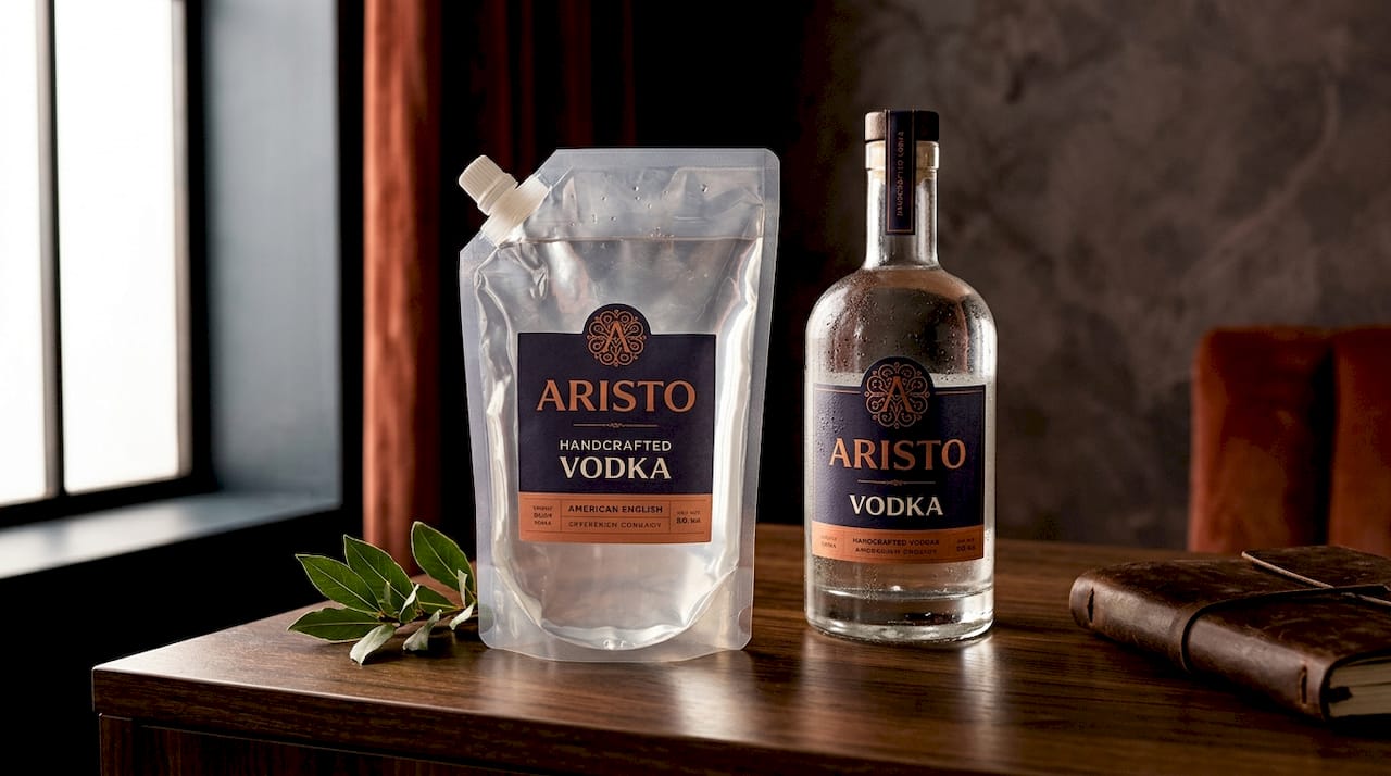
Noiseless Vodka, designed by Hi Estudio, replaced the standard glass bottle with a semi-transparent flexible pouch that carries compressed black grotesque typography and a single spraypaint-green orb accent. That single color decision does more brand work than most full-color labels. The pouch format reduces weight, lowers shipping costs, and signals category disruption before the consumer reads a word.
Sustainable materials are no longer a niche consideration. Recyclable mono-material structures, paper-based alternatives to plastic clamshells, and compostable films are now shelf-ready options with real retail traction. Brands that adopt sustainable formats early gain both a cost advantage and a credibility signal with increasingly eco-aware buyers.
Key material directions worth evaluating:
- Flexible pouches for spirits, supplements, and single-serve beverages
- Semi-transparent films that reveal product color or texture as a design feature
- Shelf-ready secondary cartons that double as display units, cutting retail setup time
- Mono-material structures designed for single-stream recycling without consumer sorting
Pro Tip: Evaluate your material choice against the full lifecycle, from production carbon footprint to end-of-life recyclability, before committing to a substrate. Consumer perception of sustainability is as important as the actual environmental data.
2. How tactile and sensory finishes transform packaging surfaces
Tactile finishes are the fastest way to convert a shelf glance into a hand-reach. Tactile packaging finishes are increasingly recognized as key storytelling elements that create emotional brand connections at the point of sale. That is not a soft claim. It is a production decision with measurable retail impact.
Syoss OLEO INTENSE, produced by MM Packaging in collaboration with KURZ and baries design, uses TRUSTSEAL® SFX hot stamping to create a shimmering 3D drop motif that mimics the texture of cosmetic oil on the pack surface. The production process involves two separate hot stamping applications followed by precision cutting, creasing, and gluing, all completed within an eight-week production timeline. That timeline matters. If you brief a tactile finish as an afterthought, you will miss it.
The strategic value of sensory finishes goes beyond aesthetics:
- 3D embossing and debossing create depth that photographs cannot replicate, making physical retail irreplaceable
- Soft-touch lamination signals premium quality before the consumer reads the price
- Foil stamping catches light at multiple angles, increasing visibility across different retail lighting environments
- Spot UV coating draws the eye to specific brand marks or product claims
Pro Tip: Bring your print finisher into the design conversation at the concept stage, not after artwork is locked. The most effective tactile effects require structural decisions that affect die lines, substrate weight, and press sequence.
3. What interactive and functional packaging actually looks like
The most advanced modern packaging elevates user experience by integrating functional elements that transform packaging into interactive products requiring engineering validation. KitKat's 2026 Break Mode wrapper is the clearest proof of concept in recent memory.
The wrapper functions as a Faraday cage. Its layered structure, combining copper, nickel, polyester, and polypropylene, blocks phone signals after the chocolate is consumed and the wrapper is folded into a pouch. Performance was validated through RF attenuation testing and RSSI measurement, the same standards applied to hardware electronics. This positions packaging design alongside hardware engineering as a discipline, not just a creative exercise.
For designers and strategists considering interaction-led formats, the KitKat example surfaces three non-negotiable requirements:
- Engineering rigor: Functional packaging must meet performance specifications, not just aesthetic ones. RF isolation requires precise sealing tolerances that a standard packaging supplier cannot guarantee without specialized testing.
- Material separation planning: The Break Mode wrapper uses materials that can be separated for recycling after use, addressing sustainability without sacrificing function.
- Consumer instruction design: When packaging performs a function, the on-pack communication must be clear enough to activate behavior. The interaction only works if the consumer understands it.
Cross-category inspiration is available. Pharmaceutical blister packs, temperature-sensitive food packaging, and moisture-indicator labels all use functional material science that FMCG and CPG brands can adapt for engagement purposes. The interactive packaging guide from Offcut covers the broader category in detail.
4. How consumer-tested redesigns drive measurable results
Consumer testing is not a validation step at the end of a design process. It is the input that determines whether a redesign succeeds or fails at retail. Consumer-tested packaging redesigns that resonate linguistically and visually can double sales per distribution point and increase both shelf presence and market penetration.
BUILT Puffs executed exactly this process and recorded a 100% increase in sales per point of distribution after their redesign. The key decisions that drove the result:
- Color shift to buoyant blue. Consumer testing identified that the previous color palette read as generic. The new blue created immediate shelf differentiation in a category dominated by earth tones and neutral packaging.
- Dynamic taste imagery. Static product shots were replaced with motion-suggesting food photography that communicated flavor intensity before the consumer read the product name.
- Language alignment. The brand leaned into the consumer-coined phrase "purse candy" to frame the product as a portable, shareable snack. Packaging copy reflected how real buyers already talked about the product, not how the brand wanted to describe it.
- Approachability signals. Typography and layout were adjusted to reduce the clinical feel of the previous design, making the pack feel more accessible to impulse buyers.
The BUILT Puffs case makes a clear argument: updating your packaging design based on consumer language, not internal brand preference, produces retail results that internal creative review cannot predict.
5. What packaging design signals wellness and premium positioning
JIN JIN, a gut health beverage brand, needed to escape the visual conventions of the wellness category. Most functional drinks signal their positioning through green color palettes, hand-drawn botanicals, and approachable sans-serif typography. JIN JIN chose the opposite direction.
The JIN JIN packaging uses refined typography and a bottle silhouette drawn from premium spirits references, balancing ancient East Asian roots with a modern aesthetic that positions the product alongside whisky and craft gin on a bar cart. The result is a product that reads as a daily ritual rather than a health supplement. That distinction matters enormously at retail, where premium spirits command a different consumer mindset than functional food.
Key visual language strategies from the JIN JIN approach:
- Silhouette as category signal. Bottle shape communicates before color or typography. A spirits-adjacent silhouette places the product in a higher-value mental category.
- Restrained color palette. Limiting the color range to two or three tones signals confidence and sophistication, the opposite of the busy, ingredient-listing approach common in wellness.
- Typography with heritage. Letterforms that reference calligraphic traditions add cultural depth without requiring explanatory copy.
- Bar cart presence as design brief. Designing for a specific use context, in this case, a visible home bar, creates a more specific and compelling visual outcome than designing for "shelf appeal" in the abstract.
Building a powerful visual identity for CPG packaging requires this level of category-specific strategic thinking, not just aesthetic preference.
6. How packaging systems combine for maximum retail impact
No single packaging component operates in isolation. Effective modern packaging design maximizes shelf presence by combining striking front-panel narratives with carefully structured information sections, allowing for immediate visual impact and detailed consumer engagement upon closer inspection.
The standard packaging system for a consumer product involves at minimum three layers of design decision:
| Packaging layer | Primary function | Design priority |
|---|---|---|
| Primary container | Product protection and direct brand contact | Brand identity, material choice, tactile finish |
| Label or sleeve | Information delivery and shelf communication | Typography hierarchy, color, claims |
| Secondary packaging | Retail display and transit protection | Shelf-readiness, unboxing experience, sustainability |
Modern packaging types increasingly include shelf-ready cartons that eliminate retailer setup time and improve in-store presentation consistency. Hinged lids, tear-away panels, and perforated display windows are structural features that reduce retail friction while creating an unboxing moment that extends brand engagement past the point of purchase.
The practical implication for designers: brief all three layers simultaneously. A primary container designed without reference to its secondary packaging will create visual inconsistency that undermines shelf impact, regardless of how strong each individual element is.
Key takeaways
The strongest modern packaging examples share one defining quality: every material, finish, and structural decision serves both brand storytelling and consumer function at the same time.
| Point | Details |
|---|---|
| Material choice is a brand statement | Flexible pouches and sustainable substrates signal category disruption before the consumer reads the label. |
| Tactile finishes require early production planning | Eight-week timelines for premium hot stamping mean finishing must be briefed at concept stage, not after artwork lock. |
| Consumer language drives redesign success | BUILT Puffs doubled sales per distribution point by aligning packaging copy with how buyers already described the product. |
| Interactive packaging demands engineering standards | KitKat's Faraday cage wrapper required RF attenuation testing, placing packaging design in hardware engineering territory. |
| System thinking beats single-layer design | Primary container, label, and secondary packaging must be briefed together to achieve consistent shelf impact. |
Why packaging deserves the same rigor as product development
The KitKat Break Mode wrapper is the example I keep returning to when I want to make the case that packaging is underinvested as a discipline. Most brands treat the pack as the last step in a product launch. KitKat treated it as a product in its own right, with engineering specifications, performance testing, and material science that most CPG teams never consider.
What strikes me most about the examples in this article is not the creativity. It is the production discipline behind the creativity. The Syoss OLEO INTENSE finish required two separate hot stamping passes and an eight-week coordinated production run. The Noiseless Vodka pouch required a structural rethinking of how spirits are contained and displayed. None of these outcomes happened because a designer had a good idea in isolation. They happened because the design team and the production team were in the same conversation from the start.
The wellness positioning work on JIN JIN is the quieter example, but it may be the most transferable lesson. Breaking category visual conventions is not about being different for its own sake. It is about identifying which visual codes your category uses as defaults and then asking whether those defaults actually serve your brand or just signal membership in a crowded group. JIN JIN asked that question and answered it with a bottle that belongs on a bar cart. That is a strategic decision dressed as an aesthetic one.
My honest advice: treat your packaging brief the same way you treat your product brief. Define the functional requirements, the performance metrics, and the production constraints before you open a design file. The brands getting the best results in 2026 are the ones who figured that out first.
— Myles
Ready to find packaging that actually performs?
Offcut is where print-ready packaging concepts live instead of a designer's hard drive. If you are a brand strategist or founder who needs packaging that combines material thinking, tactile finishing, and consumer-tested visual strategy, Offcut gives you exclusive, production-ready designs at a fraction of what an agency charges.
Designers get paid for work that would otherwise sit unused. Brands get concepts built on the same strategic principles behind the examples in this article. Browse the Offcut design library to find packaging that is ready to go to print, not just to a mood board. If you want to go deeper on what makes packaging perform at retail, the packaging design tips for 2026 resource is a strong next step.
FAQ
What makes a packaging design "modern"?
Modern packaging combines material innovation, sensory finishing, and functional interaction to serve brand storytelling and consumer utility simultaneously. Examples include flexible pouches, tactile hot-stamped surfaces, and interactive wrappers like KitKat's signal-blocking Break Mode design.
How much can a packaging redesign impact sales?
A consumer-tested redesign can double sales per point of distribution, as demonstrated by BUILT Puffs, whose color and imagery changes drove a 100% sales increase after aligning packaging with consumer language and shelf expectations.
What are the most effective tactile finishes for premium packaging?
Hot stamping with technologies like KURZ TRUSTSEAL® SFX, soft-touch lamination, spot UV coating, and 3D embossing are the most effective tactile finishes for premium positioning. Each requires early production coordination to execute within standard retail timelines.
How do you design packaging for a wellness brand without looking generic?
Position against category defaults rather than within them. JIN JIN used spirits-adjacent bottle silhouettes, restrained color, and heritage typography to place a gut health product in a premium ritual context rather than the crowded functional food visual category.
What is a shelf-ready packaging system?
A shelf-ready packaging system combines a primary container, label or sleeve, and secondary display carton designed to work together, reducing retail setup time and maintaining brand consistency from transit to point of sale.