
Packaging redesigns fail more often than they succeed, frequently driving sales down instead of up. The Tropicana redesign lost 20% of sales in just two months because consumers could not recognize the new packaging on shelves. These failures stem from preventable mistakes: skipping consumer testing, prioritizing aesthetics over recognition, and misunderstanding how shoppers make split-second purchase decisions. Understanding why packaging design fails helps you avoid expensive missteps and create designs that actually boost brand performance and consumer appeal.
Table of Contents
- Key takeaways
- Common reasons why packaging design fails
- The impact of visual design and consumer perception on packaging success
- Balancing aesthetics and functionality for effective packaging
- Strategies to avoid packaging design failure and boost brand impact
- Boost your packaging designs with OffCut
- Frequently asked questions about packaging design failures
Key Takeaways
| Point | Details |
|---|---|
| Test before launch | Skipping consumer testing led to an unrecognizable redesign and sales losses, as Tropicana demonstrated with a 20 percent drop. |
| Visual clarity matters | Visual confusion from cluttered layouts and poor hierarchy reduces quick product identification during the brief 3 to 7 second shelf evaluation, lowering purchase likelihood. |
| Most redesigns fail | Research indicates that about 63 percent of packaging redesigns do not increase sales, highlighting the need for clear objectives grounded in consumer insights. |
| Brand continuity wins | Evolutionary changes that maintain core brand cues improve recognition and help loyal customers find the product easily. |
Common reasons why packaging design fails
Packaging failures typically trace back to four fundamental mistakes that designers and brand managers overlook during development. Each mistake compounds the others, creating designs that confuse consumers and damage sales performance.
Lack of consumer testing stands as the primary culprit. Tropicana lost 20% sales due to an unrecognizable redesign that eliminated the orange-with-straw image consumers associated with the brand. Shoppers could not find their usual product on shelves, leading them to switch brands entirely. This disaster happened because the company failed to validate the new design with actual consumers before launch. Testing reveals recognition problems before they cost millions in lost revenue.
Visual confusion creates immediate purchase barriers. Cluttered layouts, poor color choices, and confusing hierarchy make products harder to identify and less appealing. Consumers spend only 3 to 7 seconds evaluating products on shelves, so any visual friction directly reduces purchase likelihood. When key information gets buried or brand elements become unrecognizable, shoppers move to competitors offering clearer visual communication.
Most redesigns fail to deliver results. Research shows 63% of packaging redesigns do not increase sales, with many actually decreasing performance. This high failure rate stems from companies changing packaging for the wrong reasons: following trends, refreshing for the sake of change, or prioritizing designer preferences over consumer needs. Successful redesigns require clear strategic objectives tied to consumer insights and market positioning.
Drastic changes alienate loyal customers who rely on visual cues for quick product identification. When familiar packaging suddenly looks completely different, regular buyers cannot find what they need. This recognition failure drives them to try alternatives, potentially losing them permanently. Evolutionary changes that maintain core brand elements while improving clarity and appeal perform better than revolutionary redesigns.
Pro Tip: Before finalizing any packaging redesign, conduct shelf tests where consumers view your new design alongside competitors. Track how quickly they can identify your product and whether they understand what makes it different. This simple validation catches recognition problems that internal teams miss.
Understanding these failure causes helps you brief designers for CPG brands more effectively by emphasizing consumer testing, visual clarity, strategic objectives, and brand continuity from the project start.
The impact of visual design and consumer perception on packaging success
Specific visual elements trigger measurable responses in consumer attention and purchase behavior. Research using eye-tracking technology reveals exactly which design choices capture attention and which get ignored on crowded shelves.
Eye-tracking studies show preferences for medium-high saturation, cool tones, and rounded shapes. These preferences are not random: they align with how human visual processing works under time pressure. Medium-high saturation provides enough contrast to stand out without overwhelming the eye. Cool tones like blues and greens signal trustworthiness and quality. Rounded shapes feel approachable and safe compared to sharp angles. Packaging that aligns with these preferences captures attention faster and holds it longer.
Visual layout has negative effects on purchase intention when poorly executed, even for strong brands. A confusing hierarchy or cluttered composition reduces purchase intent regardless of brand equity. Consumers cannot process messy designs quickly enough to make confident buying decisions. This finding challenges the assumption that brand strength compensates for poor visual design. In reality, weak visual execution undermines even established brands.

Brand experience mediates how design affects buying choices. Consumers with positive past experiences tolerate more design variation and forgive minor visual issues. New customers or those with neutral brand perceptions rely entirely on packaging to make purchase decisions. This means redesigns carry higher risk for brands trying to attract new audiences, as those shoppers lack the brand loyalty buffer that protects against design missteps.
Data-driven design decisions improve shelf impact measurably. The table below shows how specific visual elements affect consumer attention and purchase likelihood based on eye-tracking research:
| Visual element | Consumer preference | Impact on attention | Design recommendation |
|---|---|---|---|
| Color saturation | Medium-high (60-80%) | +34% faster recognition | Avoid both muted and oversaturated colors |
| Color temperature | Cool tones (blues, greens) | +28% longer gaze duration | Use warm accents sparingly for emphasis |
| Shape | Rounded, organic forms | +22% positive perception | Soften sharp corners on primary elements |
| Layout density | 40-60% coverage | +31% purchase intent | Leave breathing room, avoid clutter |
These metrics provide concrete targets for design decisions. Instead of relying on subjective opinions about what looks good, you can optimize for proven consumer preferences. This approach reduces the guesswork that leads to failed redesigns.
Pro Tip: Create multiple design variations that test different saturation levels, color temperatures, and layout densities. Use online testing platforms to show these variations to your target audience and measure which combinations generate the strongest purchase intent before committing to production.
Applying these insights to your packaging design tips for 2026 ensures your designs align with how consumers actually see and evaluate products under real shopping conditions.
Balancing aesthetics and functionality for effective packaging
The tension between beautiful design and practical usability determines whether packaging succeeds or fails in real retail environments. Designers often prioritize visual impact, while consumers prioritize quick recognition and ease of use.
Practical design supports easier product recognition and use. Packaging that clearly displays the product name, key benefits, and usage instructions reduces cognitive load for shoppers. This clarity speeds purchase decisions and reduces returns from confused buyers who grabbed the wrong product. Functional elements like easy-open features and resealable closures add tangible value that aesthetic flourishes cannot match.
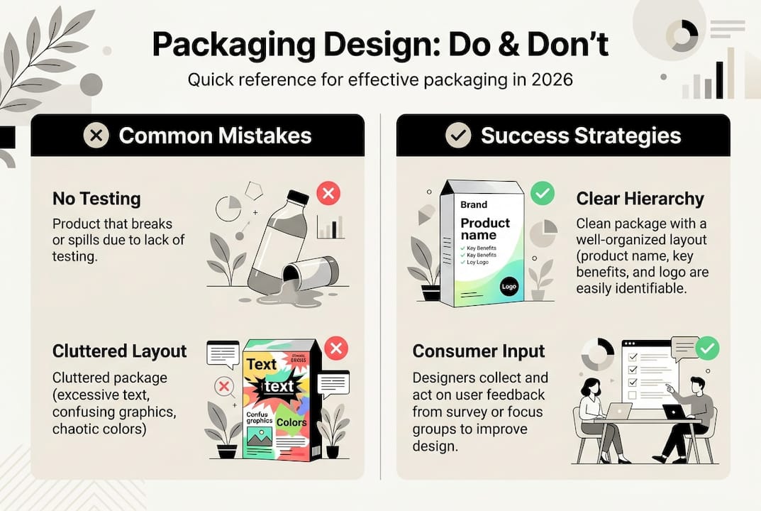
Excessive aesthetics can confuse consumers and reduce usability. Packaging that looks stunning in design portfolios sometimes fails on shelves because it sacrifices clarity for artistic expression. Abstract imagery, unconventional layouts, and trend-chasing design elements may win awards but lose sales. Consumers choose practical packaging over flashy design when they need to make fast decisions under time pressure.
A strategic redesign based on clear messaging boosts sales 88% of the time when executed properly. This success rate comes from prioritizing communication over decoration. Strategic redesigns clarify product benefits, strengthen brand recognition, and remove visual barriers to purchase. They evolve the design language rather than replacing it entirely, maintaining enough familiarity for existing customers while improving appeal for new audiences.
Pro Tip: Test your packaging by showing it to someone unfamiliar with your product for three seconds, then asking what they remember. If they cannot recall the product name, category, and one key benefit, your design prioritizes aesthetics over communication. Simplify until core information sticks immediately.
The comparison below illustrates the trade-offs between flashy and functional packaging approaches:
| Design approach | Visual impact | Consumer recognition | Purchase conversion | Best use case |
|---|---|---|---|---|
| Flashy, trend-focused | Very high | Low to medium | Low | Specialty products, gift items |
| Functional, familiar | Medium | Very high | High | Daily essentials, repeat purchases |
| Balanced strategic | High | High | Very high | Premium everyday products |
This data shows that balanced strategic design delivers the best overall performance. It captures attention without sacrificing recognition or clarity. Flashy designs work only for products where visual impact matters more than quick identification, such as gifts or impulse luxury items.
Key factors for balancing aesthetics and functionality:
- Maintain core brand colors and shapes that customers recognize instantly
- Use whitespace strategically to separate information and reduce visual noise
- Place product name and category in the primary viewing zone (top third of package)
- Reserve decorative elements for secondary areas that do not interfere with key information
- Test readability at actual shelf distance, not just on a computer screen
Implementing whitespace design strategies helps you achieve this balance by giving each element room to communicate without competing for attention.
Strategies to avoid packaging design failure and boost brand impact
Preventing packaging failures requires systematic validation, objective decision-making, and proven design processes. These strategies turn subjective design debates into data-driven decisions that protect your brand investment.
Use focus groups and eye-tracking as prelaunch validation. Testing with target audiences reveals how real consumers perceive your design under realistic conditions. Focus groups uncover emotional responses and comprehension issues. Eye-tracking shows exactly where attention goes and what gets ignored. Together, these methods catch problems before they reach market. Budget for testing as a standard project phase, not an optional extra.
Apply objective messaging over subjective aesthetics in redesigns. Strategic redesign correlates with sales increases when it emphasizes objective messaging that clarifies product benefits and brand positioning. Subjective aesthetic preferences vary widely and often reflect internal team biases rather than consumer needs. Base redesign decisions on measurable improvements in clarity, recognition, and communication effectiveness.
Avoid overloading multisensory effects that reduce likability. Adding textures, metallic finishes, or complex graphics may seem innovative but can backfire. Consumers prefer designs they can process quickly. Excessive sensory input slows comprehension and creates negative associations. Use special effects sparingly and only when they reinforce the product story or brand identity.
Follow a clear stepwise design process for startups and redesigns:
- Define strategic objectives tied to business goals and consumer insights
- Research competitor packaging to identify differentiation opportunities
- Develop multiple concept directions that test different strategic approaches
- Validate concepts with target consumers using quantitative and qualitative methods
- Refine the winning concept based on feedback and shelf testing
- Produce final artwork with technical specifications for production
- Conduct final press checks to ensure color and quality match approved designs
This process reduces failure risk by validating decisions at each stage. Skipping steps to save time or budget typically costs more when designs fail in market.
Leverage designer expertise in concept shaping and consumer insights. Experienced packaging designers understand how visual elements affect perception and behavior. They know which design choices work across categories and which require testing. Partner with designers who ask strategic questions about your target audience, competitive positioning, and business objectives rather than jumping straight to aesthetics.
Additional best practices for avoiding design failure:
- Maintain a consistent design system across product lines for easier brand recognition
- Update packaging incrementally rather than all at once to reduce customer confusion
- Document design rationale and testing results to guide future updates
- Monitor sales performance after launch to identify issues early
- Create packaging guidelines that preserve successful elements across redesigns
Implementing these strategies within your step-by-step packaging design process ensures consistency and reduces the trial-and-error approach that leads to costly failures.
Understanding the designer's role in packaging concept creation helps you collaborate more effectively and leverage their expertise to avoid common pitfalls.
Boost your packaging designs with OffCut
Navigating packaging design challenges becomes easier when you access proven concepts that have already solved similar problems. OffCut connects brand managers with talented designers who have shelf-ready packaging concepts collecting dust on hard drives.
Instead of starting from scratch or paying premium agency fees, you can browse our packaging concept marketplace to find print-ready designs that match your brand vision. Designers benefit by monetizing work that would otherwise go unused, while brands get exclusive access to innovative packaging at a fraction of traditional costs.
For designers, OffCut provides a platform to sell unused packaging concepts and build your reputation while earning from past projects. This marketplace approach reduces waste, accelerates time to market, and creates opportunities for both sides of the packaging design equation.
Frequently asked questions about packaging design failures
What is the biggest reason packaging redesigns fail?
Lack of consumer testing causes most redesign failures. Companies change packaging based on internal preferences or trends without validating that target consumers can still recognize the product. This leads to recognition problems on shelves where shoppers cannot find familiar products, causing immediate sales drops. Testing with actual consumers before launch catches these issues while changes are still easy and inexpensive.
How can I test packaging design before launch?
Use focus groups to gather qualitative feedback on comprehension, appeal, and brand fit. Conduct eye-tracking studies to measure attention patterns and identify visual hierarchy problems. Run shelf tests where consumers view your design alongside competitors to assess recognition speed and differentiation. Online testing platforms can provide quick quantitative data on purchase intent across larger sample sizes at lower cost than traditional methods.
Can flashy packaging hurt brand recognition?
Yes, flashy packaging often reduces recognition when it sacrifices familiar brand elements for visual impact. Consumers rely on color, shape, and logo placement to identify products quickly. Radical aesthetic changes that eliminate these cues make products harder to find on shelves. Functional, familiar packaging consistently outperforms flashy designs for everyday products where quick recognition drives repeat purchases.
What role does consumer perception play in packaging success?
Consumer perception determines whether packaging communicates effectively and triggers purchase intent. Visual preferences for specific saturation levels, color temperatures, and shapes directly affect attention and positive associations. Brand experience mediates how consumers interpret design changes, with loyal customers more forgiving of variations. Poor visual layout negatively impacts purchase intention regardless of brand strength, making perception management critical for packaging success.
How do I balance creativity with functionality in packaging design?
Prioritize clear communication of product name, category, and key benefits in primary viewing areas. Reserve creative expression for secondary design elements that support rather than interfere with core messaging. Test readability and recognition at actual shelf distance under retail lighting conditions. Use whitespace strategically to separate information and reduce cognitive load. Maintain enough brand continuity that existing customers recognize the product while improving visual appeal for new audiences.