
TL;DR:
- Over 50% of consumers under 35 are willing to pay more for distinctive packaging design.
- Packaging aesthetics influence consumer perception through color, typography, balance, and tactile signals.
- Testing in realistic environments and linking design choices to business outcomes are essential for success.
Over 50% of consumers under 35 pay more for distinctive packaging design, and 30% directly link strong aesthetics to product quality. That is not a minor detail. It is a business lever most independent brands are leaving untouched. The instinct is to focus on logos or a trendy color palette, but research points to something deeper: balance, unity, and emotional resonance predict consumer preference far more reliably than any single visual element. This guide breaks down what packaging aesthetics really are, which attributes drive purchase behavior, how leading design frameworks compare, and how you can test and refine your approach to get real results.
Table of Contents
- Defining packaging aesthetics: More than just looks
- The science of attraction: Why aesthetics drive consumer choice
- Aesthetic frameworks: Minimalism, maximalism, and the new hybrid
- Best practices: Testing, iteration, and linking aesthetics to outcomes
- Our take: What most guides miss about packaging aesthetics
- Apply aesthetic principles with Offcut
- Frequently asked questions
Key Takeaways
| Point | Details |
|---|---|
| Aesthetics drive value | Unified and distinctive packaging directly boosts consumer willingness to pay more. |
| Science-backed choices | Attributes like color saturation, unity, and connectedness are proven to capture attention and convert. |
| Hybrid styles win | Minimalist-maximalist combinations lead in both retail and e-commerce environments. |
| Testing beats trend | Iterative, context-based testing reliably links aesthetics with brand outcomes, outperforming awards-based design decisions. |
Defining packaging aesthetics: More than just looks
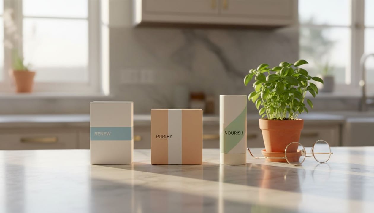
Packaging aesthetics are not just about being pretty. They are the full set of visual and tactile signals that shape a consumer's first impression and keep shaping how they perceive the product long after that initial glance. Think of it as the sensory handshake between your product and the buyer, before a single word is read or a cap is unscrewed.
The core facets include:
- Color: Hue, saturation, and contrast communicate mood and category cues instantly.
- Typography: Font weight, style, and spacing affect readability and brand personality.
- Symmetry and balance: These give the eye a resting point and signal professionalism.
- Form and structure: The physical shape of the package creates expectations about product quality.
- Materiality: Texture, finish, and substrate (the material a package is made from) trigger tactile associations even when seen on screen.
These elements do not operate in isolation. Packaging aesthetics impact attention, unity, and perceived quality, as measured by neural network benchmarks that score consumer preference with surprising accuracy. This is not guesswork. It is measurable.
Where packaging aesthetics diverge from general design is in their stakes. A brand's social media graphic can be iterated in hours. Packaging goes to print, sits on shelves, and ships to customers. Getting it wrong is expensive. Getting it right compounds. The role of designers in this process is therefore about much more than visual execution. It is about translating business intent into sensory experience.
Two traps catch brands early. First, confusing aesthetics with decoration. Decoration adds. Aesthetics communicate. Second, skipping emotional intent and jumping straight to execution. The fastest way to produce generic packaging is to open a design tool before deciding what you want consumers to feel.
"Great packaging is not the absence of clutter. It is the presence of intention."
Pro Tip: Before selecting a single color or font, write one sentence describing the emotional response you want your customer to have when they first see your product. Every design decision after that should serve that sentence. Reviewing common packaging design mistakes can help you spot where intention breaks down in execution.
The science of attraction: Why aesthetics drive consumer choice
The shelf is a competition you cannot opt out of. Understanding why certain packages win that competition is where the science gets useful.
Research using eye-tracking and consumer scoring reveals a clear hierarchy of attributes. Medium-high saturation, cool tones, and rounded shapes not only capture more attention but directly correlate with higher consumer preference, with an adjusted R² of 0.702. In plain terms: about 70% of the variation in consumer preference can be explained by measurable visual attributes. That is a remarkable finding for any brand owner who has wondered whether design investment is worth it.
| Attribute | Impact on attention | Impact on preference |
|---|---|---|
| Medium-high color saturation | High | High |
| Cool color tones | Moderate | High |
| Rounded shapes | High | High |
| Symmetrical balance | Moderate | Moderate |
| High visual unity | High | Very high |
| Warm tones (high contrast) | High | Moderate |
Here is the journey from shelf to loyalty, broken into stages:
- Visibility: A package must be seen before it can be chosen. Saturation and contrast do the heavy lifting here.
- Attention: Once seen, does it hold the eye? Unity and balance keep attention from bouncing to a competitor.
- Preference: Does it feel right for the product category? Shape and color temperature play key roles.
- Purchase: Does emotional resonance tip the decision? This is where all elements working together matter most.
- Loyalty: Consistent aesthetics across SKUs and touchpoints reinforce brand recognition and trust.
The practical insight here is that brands chasing novelty often sacrifice unity, which actually reduces preference even as it increases momentary attention. Weird grabs eyes. Unified keeps hearts. For a deeper breakdown of what works in 2026, tips to boost packaging consumer appeal covers attribute-level strategies you can apply immediately.
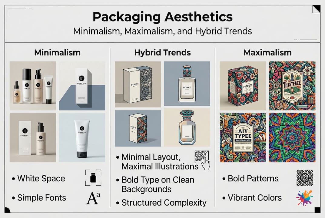
Aesthetic frameworks: Minimalism, maximalism, and the new hybrid
Knowing that aesthetics matter is step one. Knowing which aesthetic framework fits your brand and channel is where strategy gets real.
Minimalism prioritizes clarity. It uses white space, restrained palettes, and clean typography to signal quality, transparency, and often sustainability. It performs well in premium and eco-focused categories where the message is "less is more."
Maximalism goes the other direction: bold color clashes, intricate patterns, expressive illustration, and emotional saturation. It signals energy, abundance, and personality. It excels in gift, snack, and lifestyle categories where shelf presence equals competitive advantage.
The hybrid approach is where the most interesting work is happening right now. Hybrid approaches featuring minimalist bases with maximalist accents tend to win in e-commerce and retail, combining visual clarity with the punch needed to stop a scroll or grab a glance. It is not compromise. It is intentional layering.
| Style | Best channel | Audience fit | Key risk |
|---|---|---|---|
| Minimalism | DTC, luxury, eco | Design-literate, premium buyers | Feeling cold or generic |
| Maximalism | Mass retail, gift, snack | Impulse buyers, younger audiences | Losing unity, feeling chaotic |
| Hybrid | E-commerce, multi-channel | Broad, trend-aware shoppers | Inconsistent execution |
Common mistakes brands make with these frameworks:
- Choosing a style based on personal taste rather than channel or audience fit.
- Applying maximalist complexity to a category where consumers expect clarity.
- Using minimalism so stripped-back that there is nothing to emotionally connect with.
- Ignoring that connectedness, typicality, and unity rank as top drivers of positive consumer response, more than variety or novelty alone.
Pro Tip: Test hybrid designs by placing them in a simulated shelf or digital scroll environment, not in side-by-side isolation. Context changes everything. For a broader look at where styles are heading, current packaging design trends lays out the full landscape. If budget is a concern, cost-effective packaging inspiration shows how to get quality results without overspending.
Best practices: Testing, iteration, and linking aesthetics to outcomes
Even the most visually impressive packaging can underperform if it is never stress-tested against real-world conditions. The brands that consistently win are the ones that treat packaging as a hypothesis, not a finished statement.
Here is a three-phase testing cycle that works:
- Context simulation: Place your design in a realistic shelf or digital environment. Side-by-side comparisons create bias. Shelf context simulation, eye-tracking, and iterative testing provide truer insight into what drives emotion and purchase behavior than isolated tests ever will.
- Eye-tracking: Use heatmaps or consumer panels to identify where attention lands first, where it drops off, and what gets missed entirely.
- Laddering: Ask consumers what a design makes them feel, then why. This uncovers rational and emotional drivers that surface data alone will miss.
"Design that only wins awards is design that solved the wrong problem."
Do's and don'ts when connecting aesthetics to business results:
- Do link design decisions to supply chain realities. A beautiful texture that triples per-unit cost is not a win.
- Do measure aesthetic updates against sales data, not just engagement metrics.
- Do consider usability. A stunning lid that is difficult to open destroys brand trust faster than mediocre graphics.
- Don't optimize for virality without checking brand consistency. Viral moments fade. Brand equity compounds.
- Don't ignore sustainability. Aesthetic choices that conflict with your sustainability commitments undermine brand trust. Sustainable design for CPG brands is becoming a baseline expectation, not a differentiator.
When you are ready to refresh an existing line, the process of updating packaging for brand impact is less about starting over and more about refining what already works. And if you have existing design work sitting unused, repurposing old packaging concepts can generate value in ways most brands never consider. For a broader view of where the industry is heading, emerging packaging trends provides useful context.
Our take: What most guides miss about packaging aesthetics
Most packaging advice focuses on the technical process: pick a style, apply the principles, test, repeat. That is necessary. But it misses the bigger trap: chasing validation instead of results.
We see brands obsess over design awards and viral posts, and then wonder why their sales do not reflect the praise. Awards judge aesthetics in isolation. Retail does not. A package that wins a design competition but gets lost on a crowded shelf has solved the wrong problem.
The other gap we see is context collapse. Brands test designs in presentations or mood boards, not in the actual environments where buying decisions are made. A design that looks stunning on a white background may disappear next to a competitor's bolder packaging. Repurposing old packaging designs with fresh context can sometimes outperform a brand-new concept.
Our honest take: expect your first aesthetic direction to need at least one meaningful revision. That is not failure. That is iteration working as intended. Lean into it.
Apply aesthetic principles with Offcut
Ready to move from understanding to application? Offcut exists precisely for moments like this.
Offcut is where great packaging designs go instead of a hard drive. Whether you are a brand owner looking for exclusive, print-ready concepts without the agency price tag, or a designer with strong packaging work sitting unused, Offcut connects the two. The platform is purpose-built for CPG packaging, which means every concept you find or submit is grounded in real commercial context, not portfolio fantasy. If you want to put today's aesthetic principles into practice, explore Offcut's resources to find inspiration or apply your next concept. Designers ready to monetize their unused work can sell unused packaging concepts and start generating value from work that would otherwise go unnoticed.
Frequently asked questions
What makes packaging aesthetics different from general design?
Packaging aesthetics focus specifically on how visual and tactile qualities shape consumer perception and purchase decisions, with emphasis on unity, balance, and emotional connection. Packaging aesthetics impact measurable attention and preference in ways general design principles alone do not address.
How do I choose the right aesthetic style for my product?
Start with your sales channel and target audience. Hybrid approaches outperform single-style designs for retail and e-commerce success, while unity and connectedness should guide every aesthetic choice regardless of style.
Do consumers really pay more for attractive packaging?
Over 50% of consumers under 35 will pay more for distinctive package design, particularly when aesthetics signal product quality and brand credibility.
How can I test if my packaging aesthetics work?
Context-driven studies provide truer insights than isolated comparisons. Use shelf simulations, eye-tracking, and iterative consumer feedback to understand what actually drives attention and purchase behavior.
Recommended
- Packaging design tips to boost consumer appeal in 2026
- Why packaging design fails: avoid costly mistakes in 2026
- Innovative packaging design trends to elevate your brand 2026
- Packaging design inspiration: cost-effective ideas to boost branding
- Crafting Visual Narratives: How Graphic Design Elevates Corporate Storytelling - Blucat Group Inc
- Luxe cadeauverpakking ontwerpen voor een indrukwekkend resultaat – Kadopapier.net