
TL;DR:
- Color influences consumer purchase decisions within 90 seconds.
- Different hues and saturation levels communicate product strength, safety, or naturalness.
- Emerging trends include multisensory schemes and sustainable, minimal ink palettes.
Color is the first thing a shopper sees before they read a single word on your label. Research confirms that packaging color drives purchase decisions in under 90 seconds, making it one of the most commercially powerful tools in a designer's kit. But choosing the right color scheme is rarely as simple as "pick what looks good." You need to balance brand identity, category norms, psychological signals, and sensory expectations all at once. This article breaks down that challenge with evidence-backed examples, comparison tools, and practical guidance for both designers and brand owners working across consumer packaged goods.
Table of Contents
- How color schemes influence packaging perception
- Classic color scheme examples for core product categories
- Saturated vs. muted schemes: Potency, gentleness, and product fit
- Innovative and on-trend color scheme examples for 2026
- Quick-reference comparison: Color schemes by product goal
- The overlooked power of color: More than just looks
- Ready to create unforgettable packaging color schemes?
- Frequently asked questions
Key Takeaways
| Point | Details |
|---|---|
| Color shapes perception | Shifts in color palette can transform how products are seen and chosen on the shelf. |
| Saturation signals strength | Use high saturation for 'strong' products and muted hues for 'gentle' items to align with consumer expectations. |
| Refer to product goals | Choose color schemes that echo your product’s intended emotional response and market category. |
| Trendy color pairings work | Emerging color schemes like lilac–mustard or clay–teal help brands stand out in 2026. |
| Test beyond aesthetics | Go beyond looks by considering cross-sensory signals, context, and consumer responses to color choices. |
How color schemes influence packaging perception
Before diving into specific palettes, it helps to understand why color works the way it does on shelf. Colors trigger sensory and emotional expectations before a consumer ever opens the product. This is not abstract theory. It shapes what people expect a product to taste, smell, or feel like, and it directly influences whether they reach for it or walk past.
One compelling example: pink signals sweetness and berry flavor notes in coffee packaging, while brown reliably communicates bitterness and dark roast intensity. This is not a coincidence or a design preference. It is a trained sensory association that plays out consistently across consumer studies. When a coffee brand uses a warm, dusty pink label, shoppers expect a lighter, fruitier roast. Brown or near-black packaging cues a bold, punchy espresso.
Color intensity matters just as much as hue. Higher saturation boosts perceived potency and can meaningfully increase purchase intent for products positioned as strong or effective. Think of the electric blue on a sports drink or the deep red on an energy supplement. These are not accidents. Designers working in packaging concept creation understand that saturation choices are strategic levers, not decorative ones.
"Color is not decoration on packaging. It is communication. The hue, the saturation, and the contrast all speak before the copy does."
Here is a quick reference on how different color properties influence consumer perception:
| Color property | Consumer effect | Best use case |
|---|---|---|
| High saturation | Signals potency, strength, energy | Supplements, energy drinks, bold flavors |
| Low saturation / muted | Signals gentleness, safety, calm | Baby care, skincare, wellness |
| Warm hues (red, orange, yellow) | Stimulates appetite and urgency | Food, beverages, snacks |
| Cool hues (blue, green, white) | Signals freshness, cleanliness | Dairy, water, personal care |
| Earth tones (brown, tan, clay) | Communicates naturalness, trust | Organic food, coffee, artisan goods |
Understanding these connections is the foundation for every color decision you make. Pair this with smart typography in packaging, and you build a label that communicates clearly before the consumer consciously thinks about it.
Classic color scheme examples for core product categories
With that context on significance, let us explore how specific color schemes deliver on these psychological cues across the major CPG categories you are most likely to work in.
Energy and sports drinks: Red, white, and metallic accents This combination signals speed, power, and modern performance. The metallic sheen communicates premium positioning while red creates urgency and physical arousal. Brands in this space lean heavily on high contrast and bold typography to amplify the saturated palette. It is a formula that has worked for decades because it aligns perfectly with what the target consumer wants to feel.
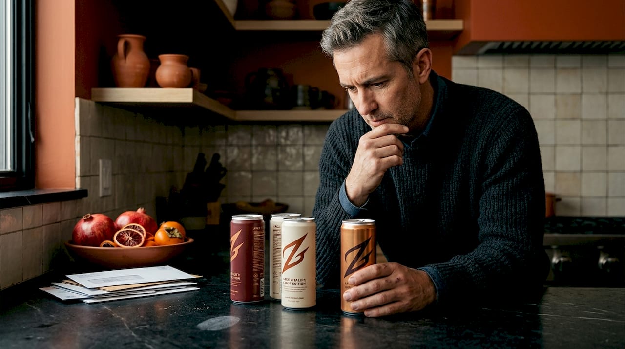
Health snacks and natural foods: Earthy greens and warm neutrals Think kraft paper tones, forest greens, and off-white. These palettes communicate honesty, sustainability, and whole ingredients without saying a word. Consumers looking for cleaner options use these visual cues as a shorthand for trust. The color psychology for brands principle at work here is that earth tones lower the perceived risk of a new product because they evoke familiarity and nature.
Coffee packaging: Dusty pink vs. deep brown This is one of the most research-supported examples in packaging color science. Pink elicits sweetness and berry-forward flavor expectations, while deep brown or near-black packaging primes the palate for bitterness and richness. Third-wave coffee brands have exploited this brilliantly, using unexpected pastel schemes to signal specialty, single-origin, and fruit-forward roast profiles.
Dairy and gentle wellness: Soft blue and white Blue is perhaps the most universally trusted color in packaged goods. Combined with white, it communicates purity, freshness, and clinical mildness. This scheme dominates dairy aisles, water brands, and gentle skincare because it reduces anxiety and suggests that the product is safe for everyday use.
Children's snacks and cereals: Bold primary palettes Red, yellow, blue, and green in high saturation combinations signal fun, variety, and excitement. These palettes are deliberately loud because they need to appeal to children at shelf level while also triggering impulse buying in adult caregivers. The visual noise is the point.
Here are the key principles to apply when selecting schemes by category:
- Match hue temperature to appetite stimulation (warm for food, cool for wellness)
- Align saturation level with the product's potency positioning
- Use contrast to direct the eye toward key messaging or flavor variants
- Respect category conventions enough to be recognizable, then break one rule to stand out
- Test your scheme against competitor shelf sets, not just on a white background
Pro Tip: Pull the top five competitor products in your category and photograph them together. Your job is not to copy the dominant palette but to find the one gap in the spectrum that is ownable and still makes intuitive sense. Need cost-effective packaging inspiration to get started? Start by mapping what already exists before designing what is new.
When you are sourcing packaging design for a client or your own brand, this category-by-category framework gives you a defensible starting point for every color conversation.
Saturated vs. muted schemes: Potency, gentleness, and product fit
Once you know the basic categories, you can fine-tune your scheme choices based on desired perception strength using color saturation.
Higher saturation increases perceived efficacy and potency, which makes it ideal for products where strength is the selling point. Cleaning products, pre-workout supplements, bold hot sauces, and industrial-grade tools all benefit from saturated palettes because they prime the consumer to expect maximum performance. In e-commerce specifically, saturated packaging stands out on white product pages where competitors often default to muted tones.
Muted and pastel palettes, however, are the right call for gentle categories. Baby skincare, calming teas, moisturizers, and sleep supplements should use lower saturation tones that reduce visual intensity and communicate that the product will not overwhelm or irritate. Brands that accidentally apply high saturation to gentle products risk confusing consumers at the point of decision, creating a mismatch between what the color signals and what the product delivers. This is confirmed by research showing that the wrong saturation level actively harms gentle product perception even if every other design element is correct.
Here is a comparison table to guide saturation decisions:
| Scheme type | Saturation level | Product fit | Emotional effect |
|---|---|---|---|
| Bold and potent | High (vivid, electric) | Energy drinks, supplements, cleaners | Confidence, urgency, power |
| Gentle and safe | Low (pastels, dusty) | Baby care, skincare, calming wellness | Reassurance, mildness, trust |
| Premium artisan | Medium (rich but not electric) | Specialty food, wine, cosmetics | Sophistication, intentionality |
| Natural and organic | Low to medium (earthy) | Health food, sustainable brands | Authenticity, transparency |
Follow these steps when applying saturation choices to your packaging brief:
- Define the primary consumer emotion you want to trigger at first glance.
- Identify whether your product is positioned as strong/active or gentle/passive.
- Select a base hue that fits the category, then adjust saturation to match positioning.
- Test the scheme under both retail lighting and outdoor photography conditions.
- Review against 2026 packaging trends to ensure the palette feels current while staying strategically sound.
- Check your scheme against merch packaging strategies to see how color translates across physical formats.
The core mistake designers make is treating saturation as a purely aesthetic preference. It is not. It is a functional signal that consumers process instantly and unconsciously.
Innovative and on-trend color scheme examples for 2026
Color schemes also evolve with trends, and understanding what is working in 2026 can help your brand stand out with confidence.
The most interesting developments are happening at the intersection of unexpected color pairings and multisensory design. Combinations like lilac and mustard, or teal and rust, are getting significant shelf traction because they feel contemporary and ownable without abandoning psychological logic. Lilac still signals gentleness; mustard adds warmth and appetite stimulation. The pairing is surprising, but each color does its job.
Multisensory schemes are also gaining momentum. Packaging designers are using color alongside tactile textures and scent-connoting hues to create a more complete sensory impression. Mint green with a matte finish, for example, communicates cooling and freshness before the consumer can even read the label. This cross-modal thinking is where the most exciting design work is happening right now.
Key trends shaping 2026 packaging color schemes:
- Neo-neutrals with saturated accents: Clay, sand, and stone backgrounds paired with one vivid pop of color. The neutral grounds the product in authenticity while the accent creates shelf contrast.
- Gradient fades: Moving from one hue to another within a single panel to suggest transformation, flavor layering, or mood shifts. Common in beverage and beauty.
- Upcycled and minimal ink palettes: Sustainability-inspired design using only two or three low-ink colors. These are increasingly favored by brands that want to signal both environmental responsibility and premium restraint.
- Scent-connoting hues: Yellow for citrus, mint green for cooling, rose gold for floral. These are shorthand signals that communicate fragrance or flavor without words.
- Unexpected dark grounds: Deep forest green, near-black navy, and rich plum replacing white as the base color for premium wellness and functional food brands.
Pro Tip: If you want to stay ahead of what is landing on shelf, track the importance of sustainable design for CPG brands. Sustainability is not just a materials story. It is increasingly a color story, and brands that lead here earn significant consumer loyalty.
Quick-reference comparison: Color schemes by product goal
To wrap up, here is a comparison table to reference as you choose and justify your design's color schemes.
As research confirms, saturation and hue can upend expectations when they clash with the product's emotional positioning. This table helps you avoid that mismatch by pairing scheme type to goal from the start.
| Goal | Recommended hue | Saturation level | Emotional impact | Category examples |
|---|---|---|---|---|
| Gentle and safe | Soft blue, pastel pink, white | Low | Reassurance, safety | Baby care, skincare, calming tea |
| Bold and potent | Red, electric blue, orange | High | Power, urgency, confidence | Energy drinks, supplements, cleaning products |
| Sustainable and natural | Forest green, clay, warm brown | Low to medium | Authenticity, trust | Organic snacks, eco-personal care |
| Trend-forward | Lilac and mustard, teal and rust | Medium to high | Curiosity, vibrancy | Specialty beverages, artisan snacks |
| Premium and refined | Deep navy, rich plum, matte black | Medium | Sophistication, exclusivity | Fine food, luxury skincare, specialty coffee |
One design element that is often overlooked in this decision is using whitespace effectively. The color scheme does not exist in isolation. How much breathing room surrounds your palette affects whether it feels crowded or confident, bold or delicate. Great schemes need room to land.
The overlooked power of color: More than just looks
Here is what most packaging color guides will not tell you. Color is still being used superficially by the majority of brands, even in 2026. Designers pick something that looks good in a mood board, clients approve it because it feels right, and the opportunity to do something strategically powerful gets left on the table.
The science of color in packaging is clear enough that small, deliberate changes to shade or saturation can shift consumer willingness to pay by a measurable amount. A slight increase in saturation on a supplement label can make it feel more clinical and effective. A shift from a cool blue-green to a warm jade on a tea label can change the perceived flavor from "minty" to "earthy." These are not redesigns. They are micro-adjustments with outsized results.
The conventional rules, warm colors for food, cool colors for wellness, earth tones for organic, are a starting point, not a finish line. The brands that win on shelf are the ones that understand the rules well enough to break exactly one of them in a way that creates distinction while still making intuitive sense to the consumer. That requires testing, not guessing. It requires thinking about texture, scent, and emotional context alongside the color itself.
We also believe there is enormous value in repurposing packaging designs that already exist. A concept created for one brief often contains color logic that works brilliantly for a different category. Unused work holds more strategic value than most designers realize, and bringing that work to market in a different form is both smart and financially sound.
The best packaging designers we have seen do not just ask "what color looks right?" They ask "what does this color make the consumer feel, expect, and believe before they read a single word?" That is the shift from decoration to strategy.
Ready to create unforgettable packaging color schemes?
If you have spent time studying these color scheme examples and frameworks, you already know that the gap between inspiration and execution is where most great concepts stall. At Offcut, we built a platform specifically to close that gap.
Offcut is where great packaging designs go instead of a hard drive. If you are a designer with unused concepts sitting in your project folders, those color schemes and label ideas have real commercial value. Brand owners on Offcut get access to exclusive, print-ready packaging concepts at a fraction of what a traditional agency charges. Designers get paid for work that would otherwise disappear. When you are ready to put your color knowledge to work, sell your packaging concepts on Offcut and connect with brands actively looking for exactly what you have already built.
Frequently asked questions
What effect does color saturation have on product perception?
Higher saturation makes a product feel stronger or more potent, and boosts purchase intent for products where performance is the promise, while muted colors signal gentleness, safety, and calm.
Which colors work best for packaging gentle products?
Soft blues, pastels, and earthy neutrals consistently signal mildness and safety because they reduce visual intensity. Research shows that high saturation actively harms gentle product perception even when other design elements are correct.
How do I choose a color palette suited for sustainable packaging?
Prioritize nature-inspired hues like forest greens, clay, and warm tans, and keep the overall palette minimal to reinforce low-impact production values. Two or three earthy colors with minimal ink coverage communicate sustainability more convincingly than complex multi-color schemes.
Can color alone change consumers' taste or scent expectations?
Yes, and the evidence is specific. Pink signals sweetness and berry flavor notes in coffee packaging, while brown cues bitterness and dark roast intensity, demonstrating that color creates genuine sensory expectations before a product is ever tasted.
Recommended
- Packaging design inspiration: cost-effective ideas to boost branding
- How to repurpose old packaging designs for lasting impact
- How to source packaging design that elevates your brand
- Packaging design tips to boost consumer appeal in 2026
- The Psychology of Color in Brand Design | Rule27 Design | Rule27 Design
- 7 Things for Customers to Consider When Designing Packaging - www.printcafeusa.com