
TL;DR:
- Typography influences up to 60% of consumer first impressions and perceived product quality.
- Matching font style to brand personality and category enhances trust and brand recall.
- Strategic font choices drive consumer behavior, trial rates, and long-term brand equity.
Nearly two-thirds of consumers try new products based on packaging appeal alone. That number should stop you cold. Before a shopper reads your ingredients list or checks your price point, your font has already made a case for or against your brand. Typography is the silent salesperson on every shelf, communicating personality, trust, and quality in a fraction of a second. In this article, you'll learn how different font choices shape consumer perceptions, which typefaces align with specific brand identities, and how to apply these insights to build packaging that actually converts.
Table of Contents
- Why typography matters for packaging
- Mapping font types to brand identity
- How font choices drive consumer behavior
- Applying typography principles for stronger packaging
- A fresh take: Why font trends alone won't build your brand
- Take your packaging to the next level with expert support
- Frequently asked questions
Key Takeaways
| Point | Details |
|---|---|
| Font choice shapes brand identity | Using the right font connects your packaging to clear brand traits and builds trust. |
| Typography impacts buying decisions | Font styles can influence up to 64% of consumers to try new products. |
| Data-driven design works best | Combining empirical evidence and creative insight leads to effective packaging outcomes. |
| Avoid font trends without context | Blindly following font trends can undermine authenticity and brand distinction. |
Why typography matters for packaging
Typography does more than display words. It carries emotion, signals category, and sets expectations before a single claim is read. A bold, angular font on a protein bar communicates intensity and performance. A flowing script on a candle box whispers relaxation and indulgence. These aren't accidents. They're deliberate choices that work on shoppers at a subconscious level.
The numbers back this up. Font choice influences 60% of initial impressions and 40% of perceived product quality. That means your typeface is doing heavy lifting even before your product name registers. For CPG brand owners, this is either a huge opportunity or a costly blind spot, depending on how seriously you treat it.
Understanding consumer psychology is the foundation here. Shoppers don't consciously think "that serif font makes this feel premium." They just feel it. That emotional shortcut is exactly why font psychology deserves as much attention as your color palette or logo mark.
"Eye-tracking data shows where consumers look, but it doesn't explain why. Pairing visual data with surveys and neuro-behavioral methods is the only way to understand what fonts are actually communicating to your buyer." — NielsenIQ
This insight matters for how you research and test your packaging. Many brands run eye-tracking studies and call it done. But eye-tracking alone is insufficient. You need surveys and neuro data to understand why certain fonts attract attention and what emotional response they trigger.
Common ways typography shapes packaging perception include:
- Credibility: Clean, legible fonts signal professionalism and reduce purchase hesitation
- Category fit: Shoppers expect certain font styles in certain aisles, and deviating too far creates confusion
- Price perception: Heavier, more refined typography tends to push perceived value upward
- Memorability: Distinctive fonts improve brand recall across repeat purchase cycles
Avoiding packaging design mistakes starts with understanding that typography isn't decorative. It's functional. And staying current with packaging design trends means knowing when font conventions shift and how to adapt without losing brand equity.
Mapping font types to brand identity
Different font families carry distinct personality traits. Matching the right typeface to your brand story isn't guesswork. It's a structured decision based on how each font family communicates.
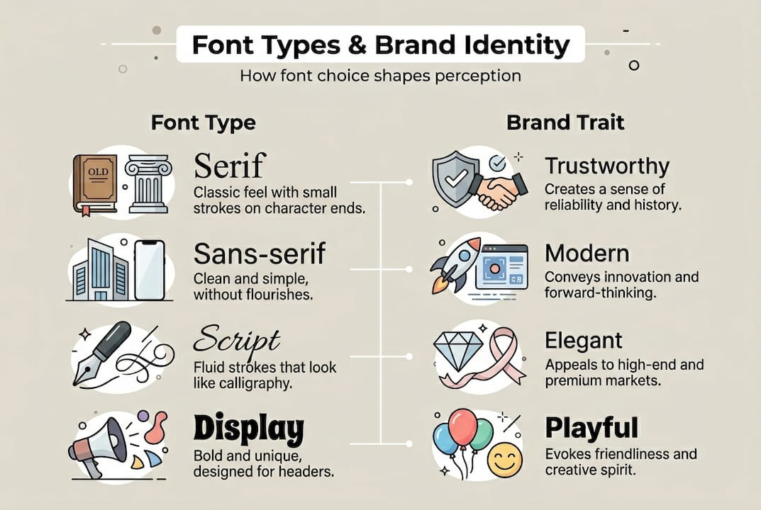
Here's a quick breakdown of the four main categories and what they signal:
| Font type | Brand traits | Best-fit categories |
|---|---|---|
| Serif | Traditional, trustworthy, premium | Luxury goods, wine, aged spirits, heritage foods |
| Sans-serif | Modern, clean, approachable | Tech-adjacent products, health foods, minimalist brands |
| Script | Elegant, personal, artisanal | Skincare, candles, boutique confections, gifting |
| Display | Bold, expressive, playful | Snacks, energy drinks, youth-focused brands |
Serif fonts convey tradition and trustworthiness, sans-serif signals modernity, script expresses elegance, and display fonts are bold and expressive. These aren't rigid rules, but they reflect deeply ingrained consumer associations built over decades of visual culture.
Here's a practical process for aligning your font choice with your brand message:
- Define your brand personality in three words. Rugged, playful, and honest reads very differently from refined, minimal, and premium. Your font must match those descriptors.
- Audit your competitive shelf set. What fonts dominate your category? Identify the visual norm, then decide whether to align with it for familiarity or break from it for standout appeal.
- Test your shortlist with your actual audience. Show three to five font options on a mock-up to a sample of your target buyers. Measure emotional response, not just preference.
- Check legibility at actual package size. A font that looks stunning at 72pt on screen can become unreadable at 8pt on a label. Always proof at real dimensions.
For deeper packaging design inspiration, looking at how experienced designers approach font selection in real concepts can shortcut your learning curve significantly. Understanding the designers' role in concept creation also helps you brief creative partners more effectively.
Pro Tip: Consistency across your product line matters as much as the font itself. Using the same typeface family across SKUs builds visual recognition. Shoppers learn to spot your brand faster, which directly supports repeat purchase.
How font choices drive consumer behavior
Font selection isn't just an aesthetic decision. It has measurable effects on trial rates, trust, and purchase intent. The data here is hard to ignore.

Vintage-style fonts are perceived as safer and higher quality by shoppers, while packaging appeal overall drives 64% of consumers to try new products. That connection between visual style and safety perception is especially relevant in food, supplements, and personal care, where trust is a prerequisite for trial.
Here's how different font styles affect buyer perceptions:
| Font style | Perceived quality | Trust level | Trial likelihood |
|---|---|---|---|
| Classic serif | High | High | Moderate |
| Clean sans-serif | Moderate to high | High | High |
| Handwritten script | Moderate | Moderate | Moderate |
| Bold display | Moderate | Low to moderate | High (impulse) |
Common font-related mistakes that hurt conversion include:
- Using too many typefaces. More than two font families on a single package creates visual noise and dilutes brand clarity
- Prioritizing style over legibility. A beautiful font that's hard to read at shelf distance loses the sale before it starts
- Ignoring hierarchy. When everything is the same size and weight, nothing stands out. Shoppers need a clear visual path through your packaging
- Mismatching font and category. A playful display font on a medical supplement creates cognitive dissonance that erodes trust
From a designer's perspective, the tension between creativity and clarity is real. Expressive fonts can differentiate a brand, but only when legibility is protected. The best packaging designs use whitespace design principles to give typography room to breathe, which actually amplifies its impact rather than reducing it.
Getting your print-ready packaging essentials right also means ensuring your chosen fonts render correctly across different print substrates. A font that looks sharp in digital proofing can lose definition on matte or textured materials.
Applying typography principles for stronger packaging
Knowing that fonts drive behavior is one thing. Building a repeatable process to act on that knowledge is another. Here's a practical framework for CPG brands approaching font selection.
Step-by-step font selection process:
- Start with brand strategy, not font catalogs. Your brand values, target audience, and price positioning should dictate your font direction before you open a single typeface library.
- Narrow to two typefaces maximum. One for primary brand messaging (your brand name, hero claim) and one for supporting information (ingredients, directions, regulatory copy).
- Verify category alignment. Cross-reference your shortlist against successful competitors and category leaders. You want to fit the space while standing out within it.
- Test for legibility at multiple sizes. Print mock-ups at actual label dimensions and check readability under store lighting conditions, not just on a bright monitor.
- Validate with consumer feedback. Even a small sample of five to ten target shoppers can reveal whether your font communicates the right brand personality.
Best practices for CPG brands include:
- Limit your packaging to two font families to maintain visual cohesion
- Establish a clear typographic hierarchy: brand name, product descriptor, key claim, and fine print each need distinct sizing and weight
- Avoid ultra-thin fonts on dark or complex backgrounds. They disappear at shelf distance
- Use bold weight for the one claim you most want shoppers to remember
- Revisit your font choices whenever you reposition, reformulate, or enter a new retail channel
Font choice influences initial consumer impressions and long-term brand recall, which means the investment in getting it right pays dividends across every touchpoint. Following a clear packaging design process and building smart packaging workflow strategies into your team's practice keeps typography decisions deliberate rather than reactive.
Pro Tip: User-test your fonts before launch by creating two or three mock-ups with different typeface options and showing them to real shoppers without context. Ask what the product is, who it's for, and how much they'd expect to pay. The answers will tell you everything your internal team can't.
A fresh take: Why font trends alone won't build your brand
Here's something most typography guides won't tell you: following font trends is one of the fastest ways to make your packaging forgettable.
Every few years, a typeface style dominates CPG shelves. Geometric sans-serifs swept through wellness brands. Retro serifs flooded artisan food. When everyone in your category adopts the same visual language, your brand stops being a brand and starts being a category signal. You blend in rather than stand out.
The deeper work is pairing font choice with genuine brand context. That means understanding your specific customer, their cultural references, their trust triggers, and the shelf environment where your product lives. Eye-tracking studies must be paired with behavioral analysis to generate actionable design insights, and the same principle applies to trend research. Knowing what's popular doesn't tell you what's right for your brand.
The brands that build lasting visual equity use typography as an expression of a specific story, not a borrowed aesthetic. If you want portfolio-level packaging work that actually differentiates, start by asking what your font says about your brand's origin, values, and promise. Then find the typeface that answers that question honestly.
Take your packaging to the next level with expert support
Typography decisions carry real commercial weight, and getting them right often requires more than internal debate or trend browsing. You need to see what strong, intentional font choices actually look like in finished packaging concepts.
Offcut connects CPG brand owners with print-ready packaging concepts developed by experienced designers. Instead of starting from scratch or paying full agency rates, you get access to thoughtfully crafted designs where typography, layout, and brand identity have already been worked through. Browse designer packaging concepts built for real shelf environments, or explore the full range of packaging design resources available on the platform. The work exists. You just need to find the concept that fits your brand.
Frequently asked questions
How does typography affect consumer perceptions?
Font choice influences up to 60% of initial impressions and 40% of perceived product quality, making typeface selection one of the highest-leverage decisions in packaging design.
Which font types are best for different product categories?
Serif fonts suit luxury and traditional products, sans-serif fits modern and clean brands, script is ideal for elegance and artisanal goods, and display fonts work best for bold or playful product lines.
What mistakes should brands avoid when choosing packaging fonts?
Avoid font overload, illegible text at shelf size, and mismatching font personality with brand values, as these errors directly reduce trial rates and weaken brand recall over time.
Can changing typography increase product sales?
Attractive font choices can encourage up to 64% of consumers to try new products based on packaging appeal, making typography one of the most cost-effective levers for driving trial.