
TL;DR:
- Effective landing pages focus on clarity, message match, and minimizing friction to boost conversions. Continual, data-driven testing on mobile-optimized, fast-loading pages ensures sustained improvement. Relying on templates and neglecting strategic alignment erodes trust and wastes advertising spend.
Cluttered navigation, mismatched ad copy, and slow load times are quietly killing your conversion rates every single day. Most e-commerce brands pour budget into paid traffic and email campaigns, then send that hard-earned audience to a landing page that undermines the whole effort. The gap between a "pretty" page and a high-converting one isn't about aesthetics — it's about fundamentals. This article breaks down the evidence-based best practices that move the needle: clarity, friction reduction, mobile performance, and disciplined testing. Master these and you'll see measurable ROI lift, not just better-looking pages.
Table of Contents
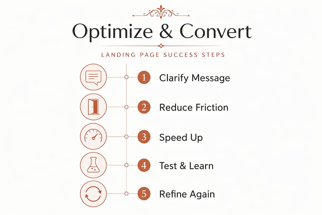
- Why landing page clarity drives conversion
- Friction killers: design, navigation, and CTAs that work
- Mobile-first and lightning-fast: performance that converts
- Test, learn, repeat: data-driven optimization in action
- What most e-commerce brands get wrong about landing pages
- Optimize your conversions with Offcut
- Frequently asked questions
Key Takeaways
| Point | Details |
|---|---|
| Single-purpose focus | A clear value proposition and one main offer above the fold are essential for landing page conversions. |
| Minimize friction | Remove distractions and use a single, prominent CTA to guide users toward your goal. |
| Performance matters | Fast load times and a mobile-first design are now table stakes for conversion success. |
| Continuous testing | Use systematic, single-change A/B testing to refine and improve your landing page effectiveness. |
Why landing page clarity drives conversion
The first job of any landing page is simple: confirm that the visitor landed in the right place. That sounds obvious, but an enormous number of e-commerce pages fail this test within two seconds.
When someone clicks an ad promising "30% off winter jackets," they expect to land on a page about winter jackets at 30% off. Not a homepage. Not a general sale page. The exact promise from the ad. This alignment between the traffic source and the landing page message is what marketers call "message match," and it directly affects trust. Single-purpose landing pages with a value proposition made immediately clear above the fold consistently outperform general product pages in conversion studies.
Your value proposition should answer three questions before the user scrolls:
- What is this product or offer?
- Why should I care about it right now?
- What do I need to do next?
If any of those three questions require a scroll to answer, you're already losing people. Visitors make snap judgments. The cognitive load of figuring out where they are and what you want from them burns through patience fast.
"A landing page is not just a destination — it's a handshake between your ad promise and your brand's ability to deliver on it. Break that handshake and trust evaporates instantly."
The same logic applies to email campaigns. If you send a segmented email to loyal customers about a product relaunch, don't link them to the standard product detail page. Build or customize a page that acknowledges their history and speaks to the relaunch specifically. That level of precision pays off. Google's Quality Score for paid ads is directly tied to how well the landing page matches the user's expectations based on the ad they clicked. Better match equals lower cost per click and better ad placement. It's a financial incentive on top of a conversion incentive.
Multiple offers on a single landing page is another common mistake. Every additional offer or link you add dilutes the page's purpose. Think of it this way: if you give visitors three things to think about, they often choose none. Cost-effective branding strategies work on the same principle — focus creates impact. And just like standout landing page designs, your page should do one thing exceptionally well rather than several things adequately.
Friction killers: design, navigation, and CTAs that work
Clarity sets the destination, but eliminating sources of friction keeps users moving toward your goal.
Friction is anything that slows down or interrupts the path between the user's intent and the action you want them to take. On a landing page, friction shows up as excess navigation links, long forms, weak or confusing CTA copy, auto-playing media, and pages that look different from the ad that delivered the click.
Here's a direct comparison of friction-heavy versus friction-light design choices:
| Element | Friction-heavy | Friction-light |
|---|---|---|
| Navigation | Full site menu with 10+ links | No menu or minimal single link |
| CTA buttons | Multiple buttons with different labels | One button, one message |
| Form fields | 8+ required fields | 2-3 essential fields only |
| Page length | Scrolling required to find the offer | Offer visible above the fold |
| Social proof | Buried at the bottom | Near the CTA |
| Visual noise | Multiple competing design elements | Clean hierarchy, focused visuals |
The single CTA rule is worth emphasizing. Concentrating on one key action while minimizing distractions is one of the most consistently backed recommendations in conversion rate optimization (CRO). It feels counterintuitive — more options should give users more chances to convert, right? Wrong. Decision paralysis is real, and landing pages are not the place to test a user's patience.
Here's a practical process for auditing and reducing friction on your current landing pages:
- Remove the main navigation menu. Your landing page is not your website. A full nav bar is an invitation to leave. Strip it out or replace it with just your logo.
- Audit every link on the page. Each link is a potential exit. Every link that doesn't support the conversion goal should go.
- Rewrite your CTA copy. "Submit" and "Buy Now" are weak. "Get my free sample" or "Claim 30% off today" are specific and action-oriented.
- Move social proof up. Testimonials and trust badges that live below the fold don't help undecided visitors above the fold. Relocate them next to or just below the primary CTA.
- Cut form fields to the minimum. If you don't absolutely need a phone number, don't ask for it.
Pro Tip: Run a five-second test with a fresh audience. Show the page for five seconds, then ask what they think the page is offering. If they can't answer clearly, your value proposition and hierarchy need work before you touch anything else.
Beyond design, there's a compliance angle too. Google's destination experience policy requires that ad landing pages be functional, useful, and easy to navigate. Pages with misleading content, aggressive interstitials, or confusing navigation can trigger policy violations that affect your entire ad account. Staying friction-light isn't just good for conversion; it's good for your ad spend.
Check out these streamlined user journey tips for more on reducing complexity across the customer experience.
Mobile-first and lightning-fast: performance that converts
With friction addressed, let's focus on another conversion driver: performance, particularly for today's mobile shoppers.

Over 60% of e-commerce traffic now comes from mobile devices. Yet many brands still design landing pages on desktop and adapt them down, which is the wrong order of operations entirely. Mobile users have higher expectations for speed and lower tolerance for friction than desktop users. They're often shopping in shorter, more purposeful sessions, and they abandon slow pages fast.
Here's how load time affects landing page performance:
| Load time | Bounce rate increase | Estimated conversion impact |
|---|---|---|
| 1 second | Baseline | Best performance |
| 3 seconds | ~32% higher bounce | Significant drop |
| 5 seconds | ~90% higher bounce | Severe impact |
| 10 seconds | ~123% higher bounce | Near total abandonment |
Designing for mobile situations means accepting that users have only a couple of seconds before they make the decision to stay or leave. That reality should shape every element of your landing page.
A strong mobile optimization checklist for e-commerce landing pages includes:
- Compress all images to the smallest file size that still looks sharp on retina displays
- Use lazy loading so images below the fold don't slow the initial page load
- Limit third-party scripts — tracking pixels, chat widgets, and pop-ups all add load time
- Test tap target sizes so buttons and links are easy to tap with a thumb
- Use a single-column layout that doesn't require pinching or horizontal scrolling
- Test on real devices, not just browser simulators, because behavior differs
Speed is a ranking and Quality Score factor for Google Ads as well, so the performance dividend is double. Improving mobile load time doesn't just lift conversions; it reduces your cost per click.
Your visual identity on mobile devices matters too. A landing page that looks polished on mobile communicates professionalism at a glance, which contributes directly to trust and conversion.
Test, learn, repeat: data-driven optimization in action
Now that your landing page is fast and focused, what's next? Iteration — the engine of ongoing improvement.
No landing page is finished on launch day. The best-performing pages in e-commerce are the ones that have been refined through dozens of data-driven tests over time. A/B testing (also called split testing) is the process of showing two versions of a page to different segments of your audience and measuring which version produces better results.
The most important discipline in A/B testing is restraint. Testing one element at a time until results are statistically significant gives you clean, trustworthy data. If you change the headline, the CTA button color, and the hero image simultaneously and conversion goes up, you don't know which change made the difference. That ambiguity is expensive.
Here's the order in which to test elements, starting with the highest-impact:
- Headline and subheadline — These have the largest surface area and most immediate impact on whether users keep reading.
- CTA button copy and color — Small wording changes can produce surprising shifts in click-through rate.
- Hero image or video — Visual context above the fold shapes first impressions dramatically.
- Value proposition structure — Bullet list versus paragraph format, short versus long.
- Social proof placement — Testimonials above vs. below the CTA.
- Form length and fields — Every field you remove is a friction point eliminated.
- Page layout and column structure — Single column versus side-by-side product/form layouts.
"The brands that win long-term aren't the ones with the best initial design — they're the ones who run the most rigorous tests and actually act on the results."
Pro Tip: Don't call a test early because the leading variant "looks like it's winning." Statistical significance, typically at 95% confidence or above, means your sample size is large enough that the result isn't random. Calling tests early based on small sample sizes leads to false positives and decisions that hurt rather than help.
Sustainable improvement means building a testing calendar, not running tests ad hoc when conversion dips. Treat it as an ongoing business process. Explore a step-by-step landing page testing framework to build this discipline into your workflow.
What most e-commerce brands get wrong about landing pages
We've covered the best practices. But the mistakes that cost brands the most money are rarely the obvious ones.
The biggest hidden problem we see is the assumption that a good-looking template equals a good landing page. Templates are starting points, not strategies. When you pick a template and populate it with your offer without rethinking the layout for your specific audience and traffic source, you're building on someone else's assumptions. Templates don't account for the specific expectations your ad set or email segment is creating in your visitors' minds.
The second most costly mistake is treating the ad-to-page connection as a cosmetic concern. Marketers often ensure the colors match and the product photo is consistent, then call it a day. But message match goes much deeper. The tone, the specific offer language, and the emotional framing of your ad need to continue seamlessly on the landing page. If your ad copy is urgent and promotional and your landing page is calm and editorial, there's a mismatch that erodes trust even when visitors can't articulate why they feel uncertain.
The third mistake is skipping disciplined testing because "we already know what works." No you don't. What worked six months ago for a different audience segment in a different competitive environment may not work today. Consumer behavior shifts. Competitive offers change. Seasonal context shifts what people expect. Continuous testing is the only way to stay calibrated to reality rather than your own assumptions.
We've also seen brands invest heavily in marketplace approaches to visual design, getting great-looking assets, and then waste that investment by dropping those assets into an unconverted, friction-heavy page structure. Great design is a multiplier — but only if the foundation beneath it is solid. Clarity, friction reduction, mobile performance, and testing are that foundation. Everything else is decoration.
Optimize your conversions with Offcut
Applying these landing page principles takes more than willpower — it takes the right resources at the right time.
Offcut exists to help e-commerce founders and marketers move faster without compromising quality. Our marketplace connects you with print-ready, professionally designed concepts that communicate value at a glance — the exact quality of first impression your landing pages need to back up the promise made in your ads. Whether you're building out a new product page or refreshing a campaign-specific landing page, designers boost conversions when they work with assets built for purpose, not for portfolio. Explore what's possible and find your next great concept at Offcut.
Frequently asked questions
What is the most important element for landing page conversion?
The headline and value proposition above the fold are crucial because they immediately communicate relevance and answer the visitor's core question. Shopify confirms that single-purpose pages with a clear, above-the-fold value proposition aligned to the traffic source consistently drive higher conversions.
How many CTAs should a landing page have?
A high-performing landing page typically uses one clear, prominent CTA to avoid distracting pathways and focus user action. CRO research consistently supports concentrating on one key action to minimize decision fatigue and increase conversion rates.
Do Google Ads penalize slow or confusing landing pages?
Yes, Google evaluates landing page experience factors including speed, navigation, and usefulness as direct inputs to Quality Score, which affects both ad placement and cost per click.
How often should I A/B test my landing page?
Landing pages should be tested continuously, starting with high-impact elements, with each test running until results are statistically significant. Shopify advises collecting enough data for statistical reliability before drawing conclusions or making permanent changes.