
TL;DR:
- Website menus are crucial for showcasing packaging and driving purchase decisions.
- Proper menu design improves product discovery, engagement, and conversion rates for CPG brands.
- Using appropriate menu types and avoiding accessibility and clutter issues enhances packaging visibility online.
Packaging drives 72% of purchase decisions for consumer products, yet most CPG founders spend thousands perfecting label colors and dieline specs while ignoring the digital gateway that controls whether anyone sees those designs at all. Your website menu is not just a navigation element. It is the first decision-making framework your visitors encounter, and it directly shapes how your packaging gets discovered, experienced, and acted upon. This guide walks you through proven menu strategies that put your packaging front and center and convert browsers into buyers.
Table of Contents
- Why smart menu design matters for CPG brands
- Different menu types and their impact on packaging presentation
- Avoiding menu mistakes: Accessibility, mobile, and clutter
- Applying menu strategy: Practical steps for your CPG site
- Our perspective: What CPG site menus often miss
- Find packaging design solutions that transform your menu
- Frequently asked questions
Key Takeaways
| Point | Details |
|---|---|
| Menu drives packaging visibility | A well-designed website menu directly influences how customers discover and evaluate packaging designs. |
| Mega menus suit large catalogs | Mega menus are essential for CPG sites with broad product lines but must be organized to avoid confusion. |
| Mobile navigation is critical | Optimizing menus for mobile users is crucial since most CPG traffic comes from smartphones. |
| Accessibility increases sales | Accessible menus make it easier for all users to explore packaging, leading to more purchase decisions. |
| Audit and iterate for impact | Regularly review menu performance and structure to keep packaging design front and center for your audience. |
Why smart menu design matters for CPG brands
Think of your website menu as a storefront window display. If it is cluttered, confusing, or invisible on a phone screen, customers walk past without looking inside. For CPG brands, where the product experience often begins online before a shopper ever touches a box on a shelf, that missed moment costs real revenue.
A well-structured navigation creates a clear visual hierarchy that guides visitors from curiosity to conversion. When your packaging designs are organized logically within a menu, customers move through your catalog with confidence. They find what they are looking for, they discover related products, and they stick around longer. Visible navigation improves task completion rates measurably across e-commerce sites, meaning fewer abandoned sessions and more purchases.
Here is what strong CPG menu design delivers:
- Faster product discovery: Shoppers locate specific packaging variants without friction
- Higher time on site: Clear paths encourage exploration of your full product line
- Better first impressions: A polished menu signals brand professionalism before they read a single word
- Increased conversions: When packaging images are accessible within one or two clicks, purchase intent rises
The connection between navigation and packaging is not theoretical. When a founder learns how to boost consumer appeal through design, the next logical step is ensuring those designs are actually discoverable. A beautiful package hidden three levels deep in a confusing menu might as well not exist. Menu strategy is packaging strategy. It is simply executed in a different medium.
Brands that treat menu design as part of their overall identity, rather than an afterthought, consistently see stronger engagement. Think about how a menu that labels products by occasion, ingredient, or lifestyle rather than internal SKU codes transforms the browsing experience. That approach reflects the same thinking that goes into elevating your brand through cohesive packaging design.
Different menu types and their impact on packaging presentation
Not every menu structure works for every CPG brand. Your catalog size, visual identity, and target customer all influence which format will showcase your packaging most effectively. Here is a practical breakdown.

| Menu type | Best for | Packaging advantage | Key trade-off |
|---|---|---|---|
| Horizontal bar | Small to mid product lines | Clean, focused, easy to scan | Limited real estate |
| Mega menu | Large catalogs | Shows categories with imagery | Can overwhelm if poorly organized |
| Sticky menu | All sizes | Keeps navigation accessible while scrolling | Can reduce visible content area |
| Hamburger | Mobile-first brands | Space-saving on small screens | Hidden options reduce discoverability |
Menu mechanics include all four of these formats, and the data on which performs best is telling. A striking 88% of top US e-commerce sites use mega menus for large catalogs, and for good reason. When a CPG brand has twenty or more SKUs across multiple categories, a mega menu lets you display product imagery, category labels, and even featured packaging concepts in a single visual panel. Done well, it is a mini catalog inside your navigation.
That said, simplicity versus scale remains a genuine debate. A horizontal menu with five to seven items works beautifully for boutique brands with a tight product line because it keeps attention on the packaging itself rather than the navigation chrome. A sticky menu keeps your brand identity visible while customers scroll through detailed product pages, which is genuinely useful for storytelling-heavy CPG sites. The right answer depends on what you are selling and who you are selling it to.
Follow these steps to match your menu type to your packaging presentation goals:
- Count your active SKUs. Fewer than fifteen products? A clean horizontal menu is your friend. More than that? Plan for a mega menu structure.
- Map your customer journey. Do buyers shop by flavor, format, occasion, or ingredient? Let that logic drive your menu categories rather than your internal taxonomy.
- Prioritize mobile behavior. Test your menu on three different phones before you finalize anything.
- Add packaging imagery strategically. Mega menus support product thumbnails. Use them. Visual cues dramatically improve click-through rates in navigation panels.
- Test sticky versus static. Run an A/B test on your highest-traffic product pages to see whether a sticky header increases time on page or purchase clicks.
Pro Tip: If you have a seasonal or limited-edition packaging line, consider a featured "drop" section in your mega menu that rotates monthly. It creates urgency and draws the eye to new visual concepts without disrupting your standard category structure.
Integrating these decisions into a broader packaging workflow strategy makes the entire process more efficient. When your web and packaging teams are aligned on how products get organized, the menu becomes a natural extension of the brand architecture rather than a separate project. You will also find that whitespace design strategies that work beautifully on physical packaging translate directly into mega menu layouts when you give each category room to breathe.
Avoiding menu mistakes: Accessibility, mobile, and clutter
Even experienced founders make these errors. And in the CPG space, where packaging design is your primary visual asset, menu mistakes do not just annoy users. They actively hide your product.
Mega menus risk clutter when categories are not grouped logically, hamburger menus on desktop hide options that shoppers expect to see immediately, and multi-tier menus fail accessibility standards when they cannot be navigated by keyboard. Each of these problems sends a percentage of your potential customers to a competitor.
Here are the most common pitfalls to eliminate:
- Overloading categories: Jamming fifteen product types into one dropdown creates decision paralysis
- Ignoring keyboard navigation: Screen reader users and keyboard-only shoppers cannot buy what they cannot access
- Using internal jargon: Menu labels like "SKU Group B" or "Retail Program 3" mean nothing to a shopper
- Forgetting hover states and active states: Visual feedback tells users where they are in the menu hierarchy
- Skipping alt text on menu images: Packaging thumbnails in mega menus need descriptive alt text for accessibility and SEO
Mobile deserves its own conversation. Over 70% of CPG site traffic comes from mobile devices, which means your hamburger menu is not a secondary consideration. It is the primary navigation experience for most of your visitors. Labels must be readable without zooming. Touch targets need to be large enough to tap without frustration. Product filters for categories and product types should load quickly and respond cleanly.
"The most beautiful packaging in the world fails online when a mobile user cannot find the product page within two taps." — A truth every CPG founder learns eventually.
Pro Tip: Run a real-device test with someone who has never seen your site. Watch where they tap, where they pause, and where they give up. That five-minute session will tell you more than any analytics dashboard.
A well-maintained portfolio structure for CPG follows the same logic as a well-structured menu: the best work should be findable without a guided tour. And just as precise dielines for packaging prevent costly print errors, precise menu architecture prevents costly navigation failures.
Applying menu strategy: Practical steps for your CPG site
Ready to put this into practice? Here is a straightforward roadmap for auditing and upgrading your current navigation to better serve your packaging presentation.
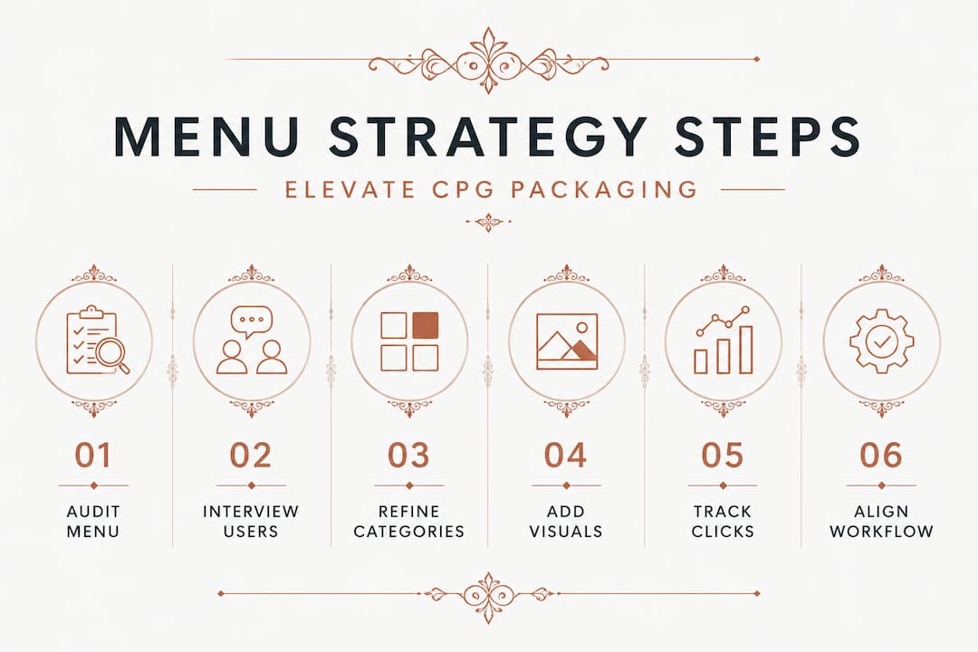
Step 1: Audit your existing menu. Click through every item in your navigation and ask: Does this path lead to packaging within two clicks? If not, map out where the friction is. Visible navigation directly improves task completion, so any dead end or confusing detour is costing you conversions.
Step 2: Interview three real customers. Ask them to find a specific product using your current menu. Do not help them. Their confusion points are your redesign priorities.
Step 3: Rebuild your category logic around buyer intent. Instead of organizing by product code or launch date, organize by how customers think. "Snacks by diet," "seasonal bundles," and "bestsellers" outperform internal taxonomies every time.
Step 4: Add packaging visuals where your menu format allows. Even a small product thumbnail in a dropdown communicates more than a text link. Shoppers recognize your packaging color palette before they read the label.
Step 5: Set up analytics tracking on menu clicks. Most analytics platforms let you track navigation interactions. After four weeks, you will see which categories get clicked and which are invisible. Drop or restructure the low performers.
Step 6: Integrate menu reviews into your quarterly packaging workflow. New product launches mean new menu items. Align both projects so neither the package design nor the navigation falls behind.
Refining a portfolio workflow for CPG follows the same iterative principle: you build, you measure, you adjust. Your menu is never truly finished because your product line is never truly finished. Also ensure that when new designs go live, the files meet print-ready design standards so the packaging shown in your navigation actually matches what arrives on shelves. That consistency builds trust. Finally, if you are sourcing new design concepts, exploring design marketplaces for CPG can give you fresh visual directions that also inform how you structure your categories.
Our perspective: What CPG site menus often miss
Here is something most articles on this topic will not tell you: most CPG founders treat the menu as a tech problem when it is actually a brand strategy problem. They hand it off to a developer, approve the wireframe in ten minutes, and move on. Then they spend six months wondering why their conversion rate is stuck.
We have seen this pattern repeatedly. A founder invests heavily in stunning, innovative packaging design, sources concepts that genuinely stand out on shelf, and then presents them through a website navigation that was built in an afternoon and never revisited. The packaging deserves better.
What the most effective CPG brands do differently is treat their menu as a storytelling tool. Each category label is a micro-headline. Each dropdown is a curated editorial moment. They think about how to source packaging design with the same intentionality they bring to naming those categories in their menu.
There is also a creative feedback loop that founders rarely notice. When you organize your navigation thoughtfully, you often discover gaps in your packaging lineup. A category that should exist but does not. A product format your customers keep searching for but you have not developed. Your menu, audited honestly, becomes a product development tool.
The brands that win in CPG are the ones who understand that the digital shelf and the physical shelf follow the same rules. Visibility drives discovery. Discovery drives trial. Trial drives loyalty. Your menu is the first shelf.
Find packaging design solutions that transform your menu
When your navigation is ready to showcase great packaging, the designs need to match that ambition. That is where Offcut changes the equation for CPG founders.
At Offcut, we connect founders with exclusive, print-ready packaging concepts that designers created but never launched. Instead of paying agency rates for custom work that takes months, you access professional concepts at a fraction of the cost, ready to be adapted and put to work immediately. Whether you need fresh concepts for a new product line or visual directions that give your menu categories real identity, Offcut has the inventory. Designers get paid for work that would otherwise sit unused. You get designs worth showcasing. Explore how to sell unused packaging concepts or browse packaging solutions built for founders who take presentation seriously.
Frequently asked questions
What is the best menu type for CPG sites with many products?
Mega menus are ideal for CPG sites with large catalogs, as 88% of top e-commerce sites use them, but they must be logically grouped by buyer intent rather than internal product codes to avoid overwhelming visitors.
How should a CPG website optimize for mobile navigation?
Use hamburger menus with clear text labels and large touch targets, since over 70% of CPG traffic comes from mobile, and include easy-to-use filters so shoppers can find specific packaging categories without excessive scrolling.
Which menu mistakes undermine packaging design?
Cluttered dropdowns, poor category grouping, and failure to support keyboard navigation are the top offenders, each of which makes packaging harder to discover and frustrates users before they ever see your product.
How can menu improvements increase sales for CPG brands?
Clear, visible navigation improves task completion and puts packaging designs in front of shoppers faster, reducing drop-off and supporting the 72% of purchase decisions that packaging design directly influences.
Are minimalist menus effective for CPG packaging sites?
Minimalist menus can sharpen focus on calls-to-action, but as the debate between minimalism and engagement shows, CPG brands with visual packaging ranges often lose product visibility when navigation is too sparse. Balance is essential.