
TL;DR:
- Packaging design is critical for product visibility and consumer trust on crowded shelves.
- Founders should establish core brand elements, research competitors, and test packaging in real shelf contexts.
- Consistent branding, thorough testing, and scalable asset systems are essential to long-term success.
Picture this: a founder spends months developing a truly great snack product, lands a regional grocery deal, and then watches it sit on the shelf while a less impressive competitor sells out. The difference? Packaging. 98% of CPG brand owners rate packaging as highly important to their success, and nearly all plan changes in the next three years. Your product's visual identity is not decoration. It is your first salesperson, your silent brand ambassador, and often the deciding factor between a shopper picking up your product or walking past it. This guide gives you an affordable, actionable path from blank canvas to shelf-ready brand.
Table of Contents
- What you need for visual identity packaging
- Step-by-step: Designing your visual identity packaging
- Consumer testing and iteration: Ensuring shelf impact
- Workflow, scaling, and common pitfalls
- Why visual identity packaging often misses the mark—and how founders can fix it
- Bring your packaging vision to life with expert support
- Frequently asked questions
Key Takeaways
| Point | Details |
|---|---|
| Get your essentials right | A good logo, color palette, and clear brand guidelines set your packaging up for success. |
| Follow a proven process | Design, test, and refine with feedback at each stage to avoid costly mistakes later. |
| Test with real shoppers | Affordable consumer testing before launch helps ensure shelf impact and sales lift. |
| Streamline with digital tools | Centralized asset management and smart use of templates scale brand consistency and efficiency. |
| Stay flexible and keep iterating | Keep your packaging system adaptable so you can efficiently handle new SKUs and markets. |
What you need for visual identity packaging
Before you open any design tool, you need to know what you're building. A packaging visual identity is made up of several interconnected brand elements that work together to create instant recognition and trust.
The core brand elements every founder needs:
- Logo: Your primary brand mark, delivered in multiple file formats (SVG, PNG, PDF) and at least two color variations, one for light backgrounds and one for dark.
- Color palette: A primary color, one or two secondary colors, and their exact print codes (Pantone, CMYK) and digital codes (HEX, RGB). Consistent color palette use can increase brand recognition by up to 80%, which is a huge competitive advantage on a crowded shelf.
- Typography: One or two typefaces with clear rules about where each is used, such as headlines versus ingredients lists.
- Brand voice messaging: Taglines, ingredient callouts, benefit statements, and any regulatory copy like nutrition facts or allergen warnings.
These four elements form the foundation. Without them locked in, every design decision becomes a guessing game, and inconsistency is the fastest way to confuse shoppers and erode trust.
Tools and affordable options for early-stage founders:
| Asset/Resource | Budget Option | Mid-Range Option |
|---|---|---|
| Logo design | Canva, Looka | Offcut pre-made concepts |
| Color exploration | Coolors, Adobe Color | Brand designer session |
| Typography | Google Fonts, DaFont | Licensed typeface purchase |
| Packaging mockups | Placeit, Smartmockups | Dieline templates |
| Print-ready files | Self-export via Canva | Freelancer or Offcut file prep |
| Label printing | Sticker Mule, StickerApp | Local print broker |
| Regulatory review | FDA label guidelines (free) | Regulatory consultant |
Explore color scheme examples specifically built for packaging before you commit to a palette. Retail lighting conditions are harsh, and colors that look great on a monitor can flatten or shift under fluorescent lights.
Pro Tip: Create a single shared folder (Google Drive or Dropbox works fine) that holds every brand asset: logos, fonts, color swatches, and approved messaging. Label files clearly with version numbers. This simple habit saves hours of rework when you're briefing a printer, a co-packer, or a new designer.
Beyond aesthetics, your packaging must also meet regulatory requirements. For food and beverage products in the US, this means nutrition facts panels, allergen statements, net weight declarations, and manufacturer address. Budget time for this during design, not after. Retrofitting compliant copy into a finished design is painful and expensive. Treat regulatory copy as a design constraint from day one, exactly like your logo or color palette. You can find plenty of cost-effective packaging design ideas that bake compliance into the visual flow rather than burying it.
Step-by-step: Designing your visual identity packaging
Now that you know what's required, here's how to put those elements into action, step by step.
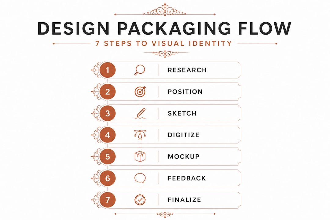
Step 1: Research your competitive set. Walk the actual retail aisle where your product will live. Photograph every competing product. Note color patterns, typography styles, size hierarchies, and any gaps in how the category communicates with shoppers. If every competitor uses earthy browns and greens, a bold white and electric blue might own attention instantly.
Step 2: Define your brand positioning on paper. Write two sentences: who your buyer is and what emotional promise your product delivers. This positioning statement is the brief that governs every design decision. Without it, you end up making choices based on personal taste rather than market strategy.
Step 3: Sketch concepts, even rough ones. Do not jump straight into digital tools. Rough pencil sketches force you to think about layout and hierarchy before you get distracted by color and polish. Sketch at least three distinct directions before touching a screen.
Step 4: Build a digital render. Take your strongest sketch into a design tool and create a full-scale dieline (the flat template that unfolds into the actual package shape). This is where your color palette, typography, and imagery come together. Follow brand guidelines strictly here. Companies like Dow have detailed logo treatment rules, specifying no alterations to the mark and a defined primary color for all applications. Apply the same discipline to your own brand from the start.
Step 5: Create a realistic mockup. Drop your flat design into a 3D mockup tool so you can see how it looks as a physical product. This step reveals proportion problems, type that is too small to read, and colors that compete with each other in ways that a flat file hides.
Step 6: Gather structured feedback. Share the mockup with at least five people who match your target buyer profile. Ask specific questions: What does this product do? Who is it for? Would you pick it up? Avoid asking "Do you like it?" That question tells you almost nothing useful.
Step 7: Prepare print-ready files. Once you've incorporated feedback and finalized the design, export your files to the exact specifications your printer requires, typically PDF/X-4 format, with CMYK color mode, 3mm bleed, and all fonts embedded or outlined.
Full custom agency vs. budget packaging formats:
| Format | Cost Range | Turnaround | Best For |
|---|---|---|---|
| Full custom agency design | $5,000 to $25,000+ | 8 to 16 weeks | Series A+ brands |
| Offcut pre-made concepts | Fraction of agency cost | Days | Early-stage startups |
| DIY with templates | $0 to $500 | 1 to 2 weeks | MVP testing |
| Freelancer via Upwork | $300 to $2,000 | 2 to 4 weeks | Single SKU launches |
| Label/sleeve only design | $150 to $800 | 1 to 3 weeks | Line extensions |
One data point that should change how you think about customization: personalized packaging lifts repeat purchases by 27%. That is not a trivial number. For a subscription snack brand or a DTC wellness product, repeat purchase rate is everything. Even small personalizations, like a name on the label, a seasonal variant, or a regional edition, can meaningfully move the needle without a full redesign. Use a step-by-step design guide to ensure you're covering every stage with the right level of detail.
Pro Tip: Design your packaging system on a grid from the start. A modular grid makes it easy to swap out flavor names, images, or seasonal graphics for new SKUs without rebuilding the entire layout from scratch. This single habit can cut your line extension design time in half.
Consumer testing and iteration: Ensuring shelf impact
Executing your design is not the end. Real market feedback is essential for fine-tuning your packaging's effectiveness before you commit to a large print run.
Testing your packaging does not require a massive budget or a formal research agency. What it does require is structure and honesty. A three-round testing approach, used by experienced packaging researchers, works well even for founders running lean.
Round 1: Direction setting (60 to 80 consumers, 3 to 4 concepts). Show different design directions to a pool of target consumers. Your goal here is to identify which direction communicates the right brand promise and creates the strongest positive reaction. Do not test polished finals at this stage. Test directions.
Round 2: Refinement. Take the winning direction, incorporate feedback, and develop it further. Test the refined version with a fresh group of 30 to 40 consumers. Focus on specific elements: Is the product name readable? Does the primary benefit come through clearly? Is the visual hierarchy guiding the eye correctly?
Round 3: Shelf context validation. This is the most critical round. Testing methodology shows that validation in shelf context is the true test of packaging effectiveness, because 70 to 76% of all purchase decisions are made at the shelf. Place your design mockup alongside real competitor products on a simulated shelf, even if that shelf is a photo on your laptop screen during a video call survey, and ask shoppers which product catches their eye first.
"70 to 76% of purchases are decided at the shelf. If your packaging does not win that moment, no amount of advertising spend can fully compensate."
Best practices for interpreting results:
- Look for patterns across multiple respondents, not individual outlier opinions.
- Pay more attention to behavioral cues (which product they reach for first) than stated preferences (which one they say they like).
- If three or more people mention the same specific problem, that is a signal to act on.
- Aim for two full iterations before locking in your final design.
- Digital render testing via tools like UserTesting or even a simple Instagram story poll costs almost nothing and can validate a direction quickly.
Understanding why testing packaging matters goes beyond confirming that a design looks good. It is about reducing the financial risk of a packaging launch that fails to connect. And if you're working with an outside designer, understanding the designer's role in testing helps you collaborate more effectively during concept refinement.
Workflow, scaling, and common pitfalls
Testing and iteration feed into ongoing improvement, so set solid systems to stay efficient and consistent as you scale.
Common mistakes that derail CPG packaging projects:
- Scope creep: A single SKU design turns into three SKUs mid-project with no budget adjustment or timeline buffer. Scope creep is the number one reason packaging projects run late and over budget.
- Branding inconsistency: Different designers or team members using slightly different logo files, hex codes, or font weights across packaging, social media, and website, creating a fragmented brand experience that confuses shoppers.
- Outdated files in circulation: Sending an old version of a dieline to your printer because the file naming convention was unclear. This mistake alone can cost thousands of dollars in reprints.
- Ignoring print specifications: Designing in RGB color mode instead of CMYK, forgetting bleed margins, or embedding low-resolution images that print blurry.
- Skipping supplier vetting: Not requesting a physical proof before approving a full production run. Color shifts between your screen and the printed substrate can be dramatic.
Workflow tools for scaling your packaging operation:
| Tool | Primary Function | Key Benefit |
|---|---|---|
| Frontify or Brandfolder | Centralized brand asset management | Cuts asset-request time by up to 80% |
| Adobe Illustrator | Dieline and print-ready file creation | Industry standard for print output |
| Figma | Collaborative design and feedback | Real-time team review |
| AI dieline generators | Rapid SKU templating | Cuts production from weeks to days |
| Sticker Mule / StickerApp | Short-run label printing | Low minimum orders for testing |
| Local print brokers | Offset and flexographic printing | Better pricing at volume |
A real-world example shows just how much a systematic approach pays off: one snack manufacturer used AI templates across 50 flavor variants, cut production time from 12 weeks to 5 weeks, saved $25,000, and gained a 15% increase in shelf share. That is the compounding effect of smart systems. Explore improving packaging workflow to build out a process that fits your team size and budget.
Pro Tip: Nominate one person on your team as the "brand file owner." Every approved asset, from finalized logos to current dieline templates, lives in one place and only that person approves new additions. This single role eliminates 90% of version-control headaches.
For early-stage founders looking at cost-effective CPG strategies, the best investment is usually in pre-built, professionally designed concepts that can be customized quickly rather than starting from scratch each time.
Why visual identity packaging often misses the mark—and how founders can fix it
Here is an uncomfortable truth that most packaging guides will not tell you: the biggest packaging failures we see from CPG founders are not caused by bad taste or low budgets. They are caused by bad process.
Founders who overspend on packaging often do so because they are trying to buy their way out of a branding problem that they haven't clearly defined yet. A gorgeous $20,000 agency package that isn't grounded in a real positioning strategy will still underperform on shelf. Meanwhile, founders who underspend tend to skip the testing phase entirely, treating design as a one-time task rather than an iterative process. Both extremes cost more in the long run.
The brands that consistently win on shelf share a few common behaviors. They lock in brand guidelines early and treat them as non-negotiable constraints, not suggestions. They test with real humans, in realistic shelf contexts, before committing to a full print run. They build scalable asset systems from day one, even if that just means a well-organized shared folder with clearly named files.
The most overlooked factor is consistency over time. Shoppers build brand recognition through repeated exposure to the same visual cues. Every time you tweak your logo because someone on the team got bored, or you switch font weights because a new designer had a different opinion, you reset that recognition clock. Discipline in holding to your brand system is worth more than any single design upgrade.
Standout packaging inspiration is everywhere, but the founders who convert inspiration into traction are the ones who combine it with a ruthlessly consistent execution process. Look at what works in your category, define your point of difference clearly, test it with real people, and then hold the line.
Bring your packaging vision to life with expert support
Building a visual identity from scratch is genuinely hard, and the learning curve is steep when you're also running a company. The good news is that you don't have to start from zero.
Offcut is built specifically for CPG founders who need professional, print-ready packaging concepts without the agency price tag or the six-week wait. Great design doesn't have to live on a designer's hard drive. Browse unused packaging concepts from experienced packaging designers, get exclusive files you can take directly to print, and build a visual identity that competes at the highest level, all at a fraction of what a traditional agency would charge. Your shelf presence is too important to leave to chance or a generic template.
Frequently asked questions
What visual elements are essential for CPG packaging?
A clear logo, consistent color palette, readable typography, and concise benefit-focused messaging are the four non-negotiable elements of strong CPG packaging visual identity.
How can startups test packaging concepts affordably?
Use pop-up surveys, digital shelf simulations, or short social media polls to gather consumer feedback at low cost. 70 to 76% of purchases are decided at shelf, making even simple testing a high-return activity.
What are common mistakes to avoid in CPG visual identity packaging?
Inconsistent branding, skipping consumer testing, and poor file management are the top culprits. Centralized asset management can cut asset-request time by up to 80%, which is a concrete process improvement any team can implement immediately.
Do personalized packaging options really increase sales?
Yes. Personalized packaging lifts repeat purchases by 27% according to industry data, making it a worthwhile investment especially for DTC and subscription-based CPG brands.