
TL;DR:
- In-store label appeal influences up to 76% of consumer purchase decisions.
- Effective packaging combines visibility, material choice, compliance, and brand consistency.
- Testing in real shelf conditions and agility in design improves market performance.
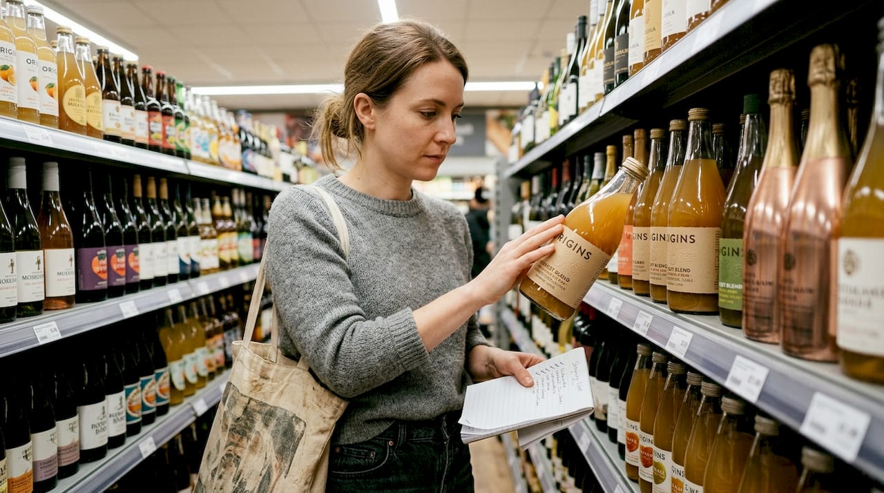
Your label has about three seconds to convince a stranger to pick up your product. That's not a metaphor — 70-76% of CPG purchases are decided right at the shelf, which means your label is doing the heavy lifting your entire marketing budget can't. For founders running lean, the pressure is real: how do you create packaging that looks premium, communicates your brand story, and still fits a startup budget? This article breaks down the criteria, practical solutions, and testing methods that give your label the best possible shot at winning in a crowded aisle.
Table of Contents
- Key criteria for effective CPG label design
- Top cost-effective label design solutions
- How premium label choices shape consumer perception
- Testing and optimizing label designs for impact
- Our perspective: Label design success lies in agility, not just aesthetics
- Affordable label design resources for CPG brands
- Frequently asked questions
Key Takeaways
| Point | Details |
|---|---|
| Shelf impact matters | More than 70% of CPG purchases are influenced by how a product label stands out on the shelf. |
| Balance cost and effect | Standard materials and design tweaks can deliver high visual impact without high costs. |
| Premium cues boost value | Strategic premium elements like substrates or finishes can elevate perceived brand quality. |
| Test in real context | Always validate label designs in realistic shelf settings to ensure they truly perform in market. |
Key criteria for effective CPG label design
Label design isn't just about looking good. It's a strategic tool that either earns attention or loses it in a fraction of a second. Before you spend a dollar on printing, you need to understand what actually makes a label work on shelf.
Here are the core criteria every CPG founder should evaluate:
- Visibility and shelf impact: Color contrast, shape differentiation, and bold typography are your first line of offense. Your label needs to pop against competitors, not blend in.
- Material selection: The substrate you choose sends a psychological signal before anyone reads a single word. Matte finishes feel artisan. Glossy finishes feel fresh and clean. Standard paper feels approachable and affordable.
- Compliance and functionality: Ingredient lists, barcodes, and regulatory copy must fit without crowding the design. Plan for these early, not as an afterthought.
- Brand story consistency: Every color, font, and visual element should reinforce who you are. Inconsistency erodes trust faster than a bad review.
- Shelf context testing: Isolated design reviews fail to predict real performance. You need to see your label next to competitors, under store lighting, and at eye level.
Pro Tip: Print a few mockups and place them on a real store shelf or a shelf replica at home. What you see in isolation on a screen is almost never what shoppers see in context.
A common trap founders fall into is optimizing for beauty over function. A label can win design awards and still lose on shelf because it blends into the category or buries the product name. Avoid the most expensive packaging design mistakes by anchoring every decision to how the label performs in its actual retail environment, not just how it looks in a PDF. Strong consumer appeal tips consistently point back to one thing: clarity wins.
Top cost-effective label design solutions
With these key criteria in mind, let's explore practical and affordable solutions that can bring your vision to life without breaking the bank.
Budget doesn't have to mean boring. Some of the most iconic CPG labels in the market today are built on simple, disciplined design thinking rather than expensive production.
"The best label design isn't the most complex one. It's the one that communicates the most with the least."
Here are the most effective budget-friendly approaches:
- Digital printing for short runs: Digital printing lets you test multiple label versions without committing to large minimum order quantities. You can iterate fast and respond to market feedback without wasting inventory.
- Stock shapes and standard materials: Custom die-cut shapes cost more. Standard rectangles, ovals, and circles keep costs down while still allowing strong visual differentiation through color and typography.
- White space and minimalism: Minimalism isn't a compromise. It's a strategy. Clean labels with strong white space often outperform busy designs because they feel premium and are easier to read at a glance.
- Repurposing existing design concepts: If you've already invested in brand assets, logos, or color systems, build your label around what you have. Repurposing label designs is one of the most underused cost-saving strategies in CPG.
- Design marketplaces for unused concepts: Agencies and freelancers produce work that never sees the light of day. Platforms that surface these unused, print-ready concepts give founders access to professional-grade design at a fraction of the cost.
Pro Tip: Look for cost-effective design ideas that were created for your category but never launched. These concepts are already market-informed and often just need minor customization.
One counterintuitive insight worth noting: premium substrates signal luxury to 62% of consumers, but you don't need to use them across your entire line. A single premium finish on your hero SKU can elevate the whole brand perception without blowing your label budget.
How premium label choices shape consumer perception
While cost-effective solutions are essential, let's not overlook how selective premium touches can pay off.
Consumers don't read labels the way you think they do. They feel them. Texture, finish, and weight all communicate brand values before the brain processes a single word. This is why material choice is one of the highest-leverage decisions a CPG founder can make.
62% of consumers associate premium substrates with luxury, and that perception directly affects how much they're willing to pay. A soft-touch matte laminate on a skincare label doesn't just look expensive. It feels expensive, and that tactile signal builds trust in a way that digital advertising simply can't replicate. Understanding the luxury packaging value equation helps founders decide where to invest and where to save.
Here's a practical comparison of common label materials and their impact:
| Material type | Relative cost | Consumer perception | Best use case |
|---|---|---|---|
| Standard paper | Low | Approachable, natural | Food, beverage, artisan goods |
| Polypropylene (BOPP) | Low to medium | Clean, durable | Beverages, personal care |
| Matte laminate | Medium | Premium, artisan | Specialty food, beauty |
| Soft-touch laminate | Medium to high | Luxury, high-end | Premium skincare, spirits |
| Foil stamping | High | Prestige, celebratory | Gift items, limited editions |
The key trade-off is simple: every step up in material quality increases cost but also raises the reference price in the consumer's mind. That means you can often charge more for a product with a premium label, which offsets the material cost. The brands winning in private label and specialty retail right now are using tiered strategies, where the core line uses standard materials and a premium tier uses elevated finishes to anchor higher price points.
Keeping up with design trends for CPG also matters here. Trends like frosted finishes and embossed typography are moving from luxury into accessible price points, which means founders can capture premium perception without the historically high costs.
Testing and optimizing label designs for impact
Once your label concept is nearly complete, it's time to ensure it will deliver in stores. Here's how to test and optimize with confidence.
Most founders skip testing because it feels expensive or time-consuming. That's a mistake. A label that performs 20% better in conversion pays back any testing investment within the first production run.
Here's a practical step-by-step process:
- Build a shelf mockup: Place your label on the actual product and arrange it next to your top three competitors on a real or simulated shelf.
- Run eye-tracking tests: Even basic eye-tracking tools can reveal whether shoppers find your label first or skip past it. This data is more reliable than any focus group opinion.
- Measure emotional response: Use rapid consumer feedback surveys to capture gut reactions. Ask shoppers what they feel about the product in three seconds, not what they think after studying it.
- A/B test specific elements: Swap out one variable at a time, such as color hierarchy, headline font size, or logo placement, to isolate what's actually driving attention.
- Iterate and retest: Isolated design evaluations miss over 70% of real-world buying context. Every round of testing should bring you closer to shelf-ready confidence.
Optimization method comparison:
| Method | Effort level | Predictive accuracy | Cost |
|---|---|---|---|
| Shelf mockup review | Low | Moderate | Free |
| Consumer surveys | Medium | Moderate to high | Low |
| Eye-tracking study | High | High | Medium |
| In-store A/B test | High | Very high | Medium to high |
The brands that consistently win at shelf are the ones that treat label design as an ongoing process, not a one-time project. Updating packaging for impact is a competitive advantage, not an admission that you got it wrong the first time. Smart use of whitespace strategies during each iteration cycle can dramatically improve readability without requiring a full redesign.
Stat to know: With the majority of purchase decisions made at the shelf, every optimization cycle you run is directly tied to revenue, not just aesthetics.
Our perspective: Label design success lies in agility, not just aesthetics
Here's the uncomfortable truth most design agencies won't tell you: the brands that win on shelf aren't always the ones with the biggest design budgets. They're the ones that move fast, test honestly, and aren't precious about changing direction when the data says to.
We've seen founders spend six months in revision cycles chasing a "perfect" label, only to launch into a market that had already shifted. Meanwhile, a brand that launched with a good-enough label, tested it in three stores, and iterated twice in the same period was already on its second growth curve.
Unconventional assets, like repurposed design concepts from design marketplace advantages, often outperform custom-commissioned work because they were built by designers who already understood the category. The biggest wins come from aligning fast, feedback-driven design with genuine consumer emotion, not from chasing "luxury" signals for their own sake. Agility is your real competitive edge.
Affordable label design resources for CPG brands
For founders who want to put these insights into practice quickly, here's where to turn for real results.
Finding great label design shouldn't mean spending months briefing agencies or sifting through generic freelancer portfolios. Offcut was built specifically for CPG founders who need print-ready, professionally designed concepts without the agency price tag.
At Offcut, you get access to exclusive packaging concepts that experienced designers created but never launched. These are real, market-informed designs that are ready to adapt and print. If you're a designer with unused concepts sitting on your hard drive, joining as a designer means your work finally gets the audience it deserves. For founders, it means skipping the blank-page problem entirely and going straight to iteration.
Frequently asked questions
What type of label material is most cost-effective for small CPG brands?
Standard paper or polypropylene are the most budget-friendly options, offering versatility and reliability for short runs. While premium substrates signal luxury, standard materials remain cost-efficient for brands building their first label runs.
Does label design really impact purchase decisions at retail?
Yes — up to 76% of CPG purchases are made based on in-store label appeal, especially at the shelf. Your label is often the only marketing touchpoint that matters in the moment of purchase.
How can I test if my label design will actually perform in-store?
Test labels in realistic shelf displays using eye-tracking and gather emotional response data for best predictive results. Isolated designs fail to predict performance, so shelf context is non-negotiable.
Do premium-looking labels always increase sales?
Premium cues boost perceptions of luxury, but the best ROI comes from matching materials to your brand and target audience. Premium substrates carry a 62% consumer association with luxury, but impact varies significantly by category and strategy.
Recommended
- Packaging design inspiration: cost-effective ideas to boost branding
- Print-ready design essentials for CPG packaging success
- 5 strategies to improve CPG packaging design workflow
- Advantages of design marketplaces for CPG packaging
- Supply chain optimization for CPG brands: boost profitability – Reddog Consulting Group
- Optimize sustainable packaging workflow for EU compliance