
TL;DR:
- Visual storytelling in CPG uses images and narratives to emotionally engage consumers and drive sales.
- Effective visuals are clear, emotionally specific, brand consistent, and show real-life transformations.
- Structured frameworks like EPIC help brands create scalable, meaningful visual assets aligned with their core story.
Most CPG founders think visual storytelling means hiring a talented designer and making their packaging look beautiful. That assumption quietly costs brands millions in missed connections with shoppers every single year. Visual storytelling is the art of conveying narratives using images, color, layout, typography, and composition to engage audiences emotionally and drive purchase decisions. The difference between a package that sits on shelves and one that flies off them often comes down to whether the visuals tell a coherent story or simply decorate a container.
Table of Contents
- What is visual storytelling? Core definition and why it matters in CPG
- The mechanics: how visual storytelling actually works
- Frameworks and tools: from EPIC to practical workflows
- Critical nuances and common mistakes: what to avoid in CPG visual storytelling
- Real-world impact: top CPG case studies in visual storytelling
- Our perspective: why the best CPG visual storytelling puts story before beauty
- Take the next step: professional packaging concepts to power your brand
- Frequently asked questions
Key Takeaways
| Point | Details |
|---|---|
| Tell a clear story | Effective CPG visual storytelling delivers a narrative, not just decoration. |
| Structure drives results | Organized visual hierarchy and emotional cues move customers to act. |
| Frameworks boost consistency | Tools like EPIC ensure your visuals align across all consumer touchpoints. |
| Test for real impact | Shelves and social feeds respond best to clear, lifestyle-driven visuals. |
| Common pitfalls matter | Avoid overdesign and lost narratives—clarity and consistency win in CPG. |
What is visual storytelling? Core definition and why it matters in CPG
With so much noise in the CPG space, knowing why visual storytelling works is the foundation for doing it right.
At its most practical level, visual storytelling conveys narratives through carefully chosen visual elements to spark emotion and move people toward action. For CPG brands, "action" means picking your product off a crowded shelf, clicking "add to cart," or recommending it to a friend. Every visual choice either serves that chain of events or undermines it.
The critical distinction most founders miss: visual storytelling differs fundamentally from decoration. Decoration adds visual noise. Storytelling adds meaning. A beautiful gradient background is decoration. A packaging visual that shows someone savoring a morning ritual with your product embedded in it is storytelling. One is aesthetic. The other is narrative.
"Great CPG packaging doesn't describe a product. It puts the consumer inside a feeling they already want to have."
Here is why that distinction matters behaviorally. When consumers encounter visuals that communicate a clear narrative, their brains process meaning and emotion simultaneously. This dual processing accelerates decision-making, which is critical when a shopper has less than seven seconds to evaluate your product at shelf. The emotional connection in branding that effective visual storytelling builds is not a soft metric. It directly influences purchase intent, repeat buying, and word-of-mouth.
What separates high-performing CPG visuals from mediocre ones:
- Narrative clarity: The consumer immediately understands who this is for and what feeling it delivers
- Emotional specificity: The visuals trigger a precise emotion, not a vague positive feeling
- Brand consistency: Every visual touchpoint reinforces the same story
- Functional readability: The story is legible at 10 feet and at thumbnail size
- Authentic context: The product appears in real life situations the consumer recognizes
Understanding these layers is what separates founders who study designer roles in packaging from those who simply brief designers on color preferences. Strategy drives storytelling. Aesthetics serve strategy.
The mechanics: how visual storytelling actually works
Now that we've explored what visual storytelling is, let's get into the principles and mechanics of how it drives real results for brands.
Core mechanics include narrative structure, visual hierarchy, emotional connection through faces and color psychology, and intentional composition. Understanding each mechanic gives you a framework for critiquing and improving your own visuals systematically rather than relying on gut feel alone.
Narrative structure in packaging means your front panel has a beginning (problem or context), middle (your product as the answer), and end (the transformed state the consumer experiences). Think of an energy drink that opens with a visual of exhaustion, centers the product as the turning point, and ends with an action scene. That arc happens in less than a square foot of real estate. Done well, it feels effortless. Done poorly, it just looks like clip art.
Visual hierarchy controls where the eye travels. Contrast, scale, and placement determine reading order. If your logo, flavor name, benefit statement, and brand tagline are all competing for the same visual weight, the consumer's brain registers confusion instead of a story. Whitespace in packaging is one of the most underused tools for creating hierarchy that guides the eye through a narrative sequence naturally.
Emotional cues are the fastest shortcut to engagement. Human faces trigger mirror neurons, making consumers feel emotions directly. Color psychology operates below conscious awareness. Warm amber tones signal indulgence and comfort. Cool blues signal clarity and performance. Specific scenarios (a family dinner, a solo workout, a late-night study session) prime the consumer to project themselves into the product's story.

Composition ties it all together. Rule of thirds, leading lines, and intentional framing create visual tension that pulls attention and holds it. Lifestyle visuals outperform product-only visuals consistently. Brands like Nutella and Mentos scaled localized content 50% faster and doubled their output by committing to lifestyle-first visual frameworks instead of product-centric shots.
The brand story in CPG context also changes depending on whether you're designing for shelf or digital. At shelf, your visuals need to survive at 10 feet away with zero context. Online, you have thumbnails, secondary images, and copy to build the story layer by layer. The mechanics are the same, but the sequencing and emphasis shift significantly. Knowing why packaging design fails often comes down to brands designing for one context while neglecting the other entirely.
Pro Tip: Test your packaging design both as a 2-inch thumbnail on a white background and as a physical mock-up from 10 feet away before finalizing any concept. If the story doesn't land in both contexts, the design needs revision.
Frameworks and tools: from EPIC to practical workflows
Equipped with the mechanics, the next step is selecting the right framework and tools to execute visual storytelling at scale.
Frameworks prevent the chaos that happens when visual storytelling is treated as a creative free-for-all. The EPIC framework offers CPG brands a structured approach with four components: Essence (defining the core emotional truth of the brand), Personify (creating a character or persona the visuals speak through), Inflect (applying thematic variations across campaigns and SKUs), and Catalog (building a library of SMART visual assets for consistent deployment).
| EPIC component | What it defines | CPG application |
|---|---|---|
| Essence | Core brand emotional truth | The single feeling your product delivers |
| Personify | Brand persona or character | The type of consumer your visuals feature |
| Inflect | Thematic variations | Seasonal, regional, or campaign adaptations |
| Catalog | SMART visual asset library | Reusable photography, icons, color systems |
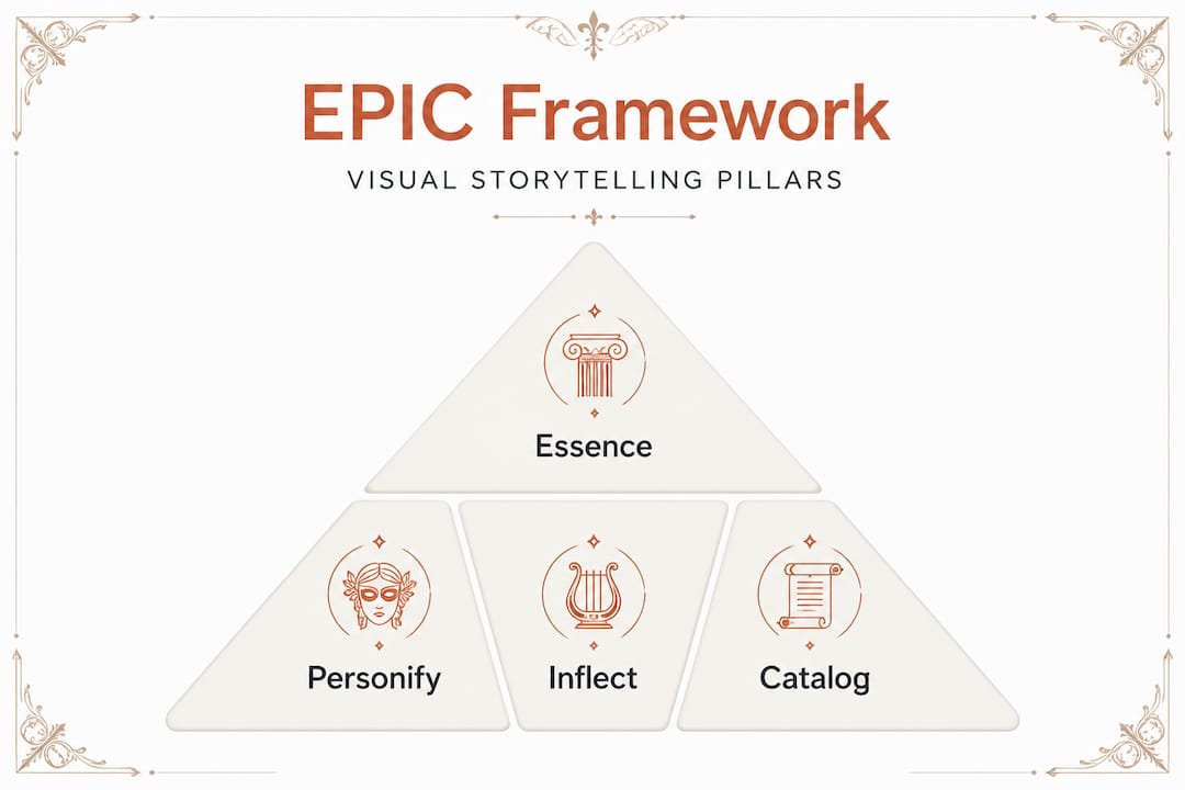
The catalog component is especially powerful for CPG founders managing multiple SKUs or regional variations. Instead of reinventing your visual language for every new product, you build a modular system of pre-approved assets that can be assembled quickly and consistently. This is how large brands maintain visual coherence across hundreds of touchpoints without it becoming a logistical nightmare.
The practical workflow for developing CPG visual storytelling breaks into four stages:
- Define objective and audience: Clarify the exact emotion and action you want to trigger, and specify the consumer segment this visual is designed for
- Create concept and storyboard: Sketch the narrative arc and map which visual elements carry which part of the story
- Select or create visuals and text: Build or source assets that align with your EPIC framework and the narrative storyboard
- Distribute and adapt per channel: Resize, reframe, and resequence the visuals for shelf, social, e-commerce, and retail displays
For tools, Adobe Creative Suite handles production-level work while Figma enables rapid iteration and collaboration, particularly useful when working with external designers or agencies. For sourcing great packaging concepts, having a system for evaluating designs against your EPIC framework before committing to print is non-negotiable.
Staying current with 2026 packaging design trends also matters here. Frameworks should be stable, but the specific visual expressions within them should evolve to stay culturally relevant. The brand storytelling techniques that boost engagement are rarely static. They adapt to where consumer attention is trending while keeping the underlying story consistent.
Critical nuances and common mistakes: what to avoid in CPG visual storytelling
Knowing what works is vital, but knowing what to avoid can save even more resources and protect brand reputation.
The most common mistake is aesthetic overload. Founders fall in love with their own brand and try to include every brand asset, color, texture, benefit claim, and design flourish on the front panel simultaneously. The result is visual noise that registers as chaos to the consumer brain. Avoid aesthetics over clarity because overloading information and creating inconsistency are the fastest ways to kill a brand's shelf performance before it gets a fair chance.
The second mistake is inconsistency across touchpoints. A compelling on-shelf narrative that contradicts your Instagram grid, your website hero image, and your Amazon secondary photos creates cognitive dissonance. Consumers do not consciously notice the disconnect, but they feel it as a vague sense that the brand is not trustworthy or established. Consistency is not about repeating the same image. It is about repeating the same story in different visual formats.
The third mistake is focusing on the product rather than the transformation. Showing your protein bar in close-up detail is less effective than showing what life looks like when someone makes your protein bar part of their morning. Updating packaging for impact often means making this exact shift: pulling back from product shots and leaning into lifestyle context.
Common pitfalls to actively avoid:
- Cluttered front panels that sacrifice readability for completeness
- Generic lifestyle imagery that could belong to any brand in your category
- Inconsistent color usage across SKUs that fragments brand recognition
- Typography that fights itself instead of guiding the eye through the narrative
- Ignoring digital context and designing exclusively for physical shelf
Pro Tip: When repurposing old packaging or refreshing a line, always run user-testing at shelf from 10 feet away and as a digital thumbnail before production. Real-world readability testing consistently surfaces issues that studio previews miss.
Real-world impact: top CPG case studies in visual storytelling
Let's see how these principles and frameworks have delivered real wins for CPG brands in recent campaigns.
The numbers behind effective visual storytelling are not theoretical. A peer-reviewed study on tea packaging demonstrated that color, graphics, logo, and layout all increase purchase intent by shaping brand experience, with figurative graphics showing a positive effect coefficient of β=0.153. That means the way a product is visually narrated directly predicts whether a consumer reaches for it.
Chobani's campaigns offer a more dramatic illustration. By committing to lifestyle visual storytelling instead of product-centric advertising, Chobani achieved +26% new buyers, +116% units sold, and +52% return on ad spend. These are not incremental gains. They are category-changing results driven almost entirely by how the brand chose to visually frame its products. The proven packaging strategies behind these wins share a common thread: they prioritized the consumer's story over the product's features.
Real-world CPG wins attributed to visual storytelling:
- Chobani lifestyle pivot: Replaced product hero shots with everyday family moments, resulting in 26% new buyer acquisition and more than doubling unit sales volume
- Nutella localization strategy: Used modular visual storytelling frameworks to scale localized content 50% faster and achieve twice the content output without losing brand coherence
- Tea category packaging study: Brands that invested in figurative, narrative-driven packaging graphics consistently outperformed competitors relying on descriptive text and product photography alone
- Mentos digital adaptation: Applied the same lifestyle-first storytelling framework across social channels, achieving faster content production cycles while improving engagement metrics
The common thread in every one of these cases is that the storytelling marketing examples that converted leads and drove sales were built on emotional narrative frameworks, not on better photography of the product itself. The product is the supporting character. The consumer's transformation is the hero.
Our perspective: why the best CPG visual storytelling puts story before beauty
Here is the uncomfortable truth that most design briefs avoid: beauty without story is an expensive decoration. We have seen founders spend significant budget on photography and design that is genuinely stunning but completely forgettable because it does not answer the one question every consumer asks subconsciously: "What does this have to do with me?"
The conventional wisdom in CPG has long been that premium aesthetics signal premium quality. That is partially true. But brands that win loyalty over years are not the ones with the most sophisticated visual execution. They are the ones whose visuals make consumers feel recognized. The visual storytelling consistency that builds brand equity operates through repeated emotional confirmation: every time a consumer sees your packaging or your ad, they feel the same thing. That repetition is what transforms a purchase into a preference and a preference into advocacy.
We are also skeptical of the "trending now" approach to visual storytelling. Chasing a design trend without anchoring it to your narrative framework produces visuals that look current but feel disconnected from the brand's core story. The founders who obsess over the latest CPG design trends without first locking in their EPIC framework are building on sand. The trend changes next season. The story should last a decade.
The brands that outperform in CPG visual storytelling share one discipline: they decide what they want consumers to feel before they decide what they want consumers to see. Feeling first. Aesthetics second. Every single time.
Take the next step: professional packaging concepts to power your brand
The insights in this article are only valuable if they translate into packaging that actually executes on them. That is where finding the right design partner matters enormously.
At Offcut, we built a marketplace specifically for CPG founders who need print-ready, narrative-driven packaging concepts without the six-figure agency retainer. Our designers create concepts that would otherwise sit on hard drives, and founders get exclusive access to work that is already production-ready. If your visual storytelling strategy is solid but your current packaging is not carrying it, discover packaging concepts from designers who specialize in CPG narratives and understand what it takes to win at shelf and online. Real story. Real execution. Fraction of the cost.
Frequently asked questions
What makes visual storytelling effective for consumer packaged goods (CPG)?
Visual storytelling uses emotional cues, consistent themes, and narrative structure to differentiate brands on shelves and build the kind of loyalty that survives category disruption and competitive pressure.
Does visual storytelling really impact sales in CPG brands?
Yes, the evidence is clear. Chobani's lifestyle visuals drove 26% more new buyers, 116% more units sold, and a 52% improvement in return on ad spend compared to product-only creative approaches.
What is the EPIC framework in visual storytelling?
EPIC helps brands create consistent, meaningful visuals by defining Essence, Personify, Inflect, and Catalog components that anchor every visual decision to a coherent brand narrative.
How do I test if my CPG visuals work?
Apply the 10-foot shelf-back test for clarity in retail contexts, and run A/B tests comparing lifestyle versus product-only visuals for digital channel performance.
Are there affordable tools for creating visual stories?
Yes. Adobe suite, Figma, and stock images give founders and marketing teams the capability to build and iterate on visual storytelling systems without enterprise-level budgets.