
TL;DR:
- Getting packaging color wrong leads to brand recognition issues, retailer chargebacks, and costly reprints.
- Building a disciplined workflow with precise specifications, calibrated tools, and physical proofs ensures consistent, high-quality outputs.
Getting your packaging color wrong is not just a design problem. It is a business problem. Packaging color mismatches erode brand recognition on shelf, trigger retailer chargebacks, and cost CPG brands significant money in reprints and lost consumer trust. A disciplined packaging color selection workflow is what separates brands that look consistent everywhere from those that look right once and wrong everywhere after. This guide walks you through the exact tools, proofing sequences, measurement standards, and quality checkpoints your team needs to build a color process that holds up from design file to finished box.
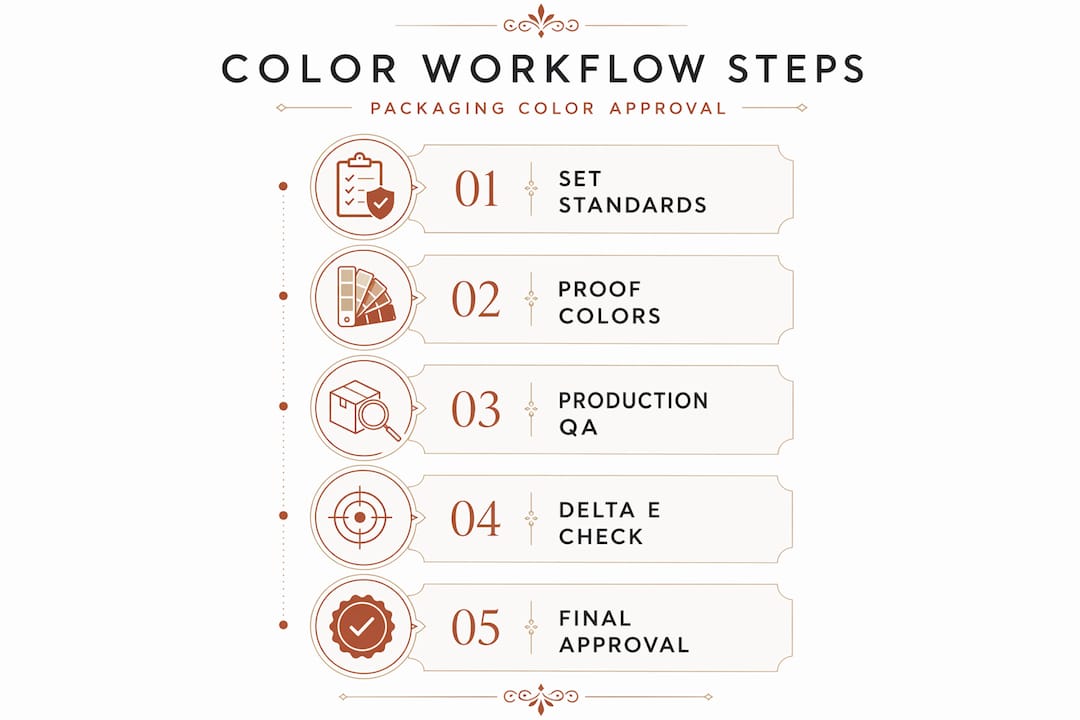
Table of Contents
- Understanding requirements: essential tools and color concepts
- Preparing your packaging color workflow: setting standards and proofing
- Executing the workflow: color measurement and quality control in production
- Troubleshooting and common pitfalls in packaging color workflows
- Expected outcomes: benefits of a disciplined packaging color selection workflow
- Why most packaging color processes fail and how to build a workflow that works
- Optimize packaging color workflows with Offcut
- Frequently asked questions
Key Takeaways
| Point | Details |
|---|---|
| Establish measurable color standards | Define exact Pantone codes with substrate and finish details to avoid costly color mismatches. |
| Use physical proofs | Incorporate contract hard proofs including finishing processes to validate true packaging color. |
| Calibrate instruments regularly | Maintain spectrophotometer calibration every 4 hours to prevent color measurement drift. |
| Monitor color quantitatively | Apply Delta E metrics with defined tolerance for consistent color acceptance in production. |
| Avoid common workflow errors | Prevent approval of soft proofs alone and disregard of finishing effects to reduce reprints. |
Understanding requirements: essential tools and color concepts
Before you can build a reliable packaging color selection workflow, you need a shared vocabulary and the right instruments. Most color problems start not with bad printing but with misaligned expectations between designers, brand managers, and press operators.
Proof types every brand manager should know
There are three types of proofs that matter in packaging color workflows:
- Soft proof: An on-screen simulation using ICC profiles (standardized color profiles that map how a device captures or reproduces color) on a calibrated monitor. Soft proofing uses ICC profiles on calibrated monitors but cannot fully replace physical proofs for spot colors and packaging.
- Contract hard proof: A physical inkjet or press-calibrated print that becomes the legally binding color target your printer must match. This is the gatekeeper proof.
- Press proof: An actual press run used to verify color on the exact substrate and with the exact inks specified. Reserved for high-volume or premium jobs.
Color measurement: CIE Lab and Delta E*
The CIE Lab* color space is the international standard for measuring color as human vision perceives it. "L" is lightness, "a" is the green-to-red axis, and "b" is the blue-to-yellow axis. Delta E (written as ΔE) is the numerical distance between two colors in that space. A Delta E of 1.0 or below is imperceptible to the human eye. Above 3.0 and most consumers will notice on shelf.
| Delta E value | Perception level | Typical action |
|---|---|---|
| 0.0 to 1.0 | Imperceptible difference | Accept |
| 1.0 to 2.0 | Slight difference, expert eye only | Accept with review |
| 2.0 to 3.5 | Noticeable to trained eye | Flag for decision |
| Above 3.5 | Clear mismatch to consumers | Reject and reprint |
Essential instruments for your workflow
- Spectrophotometer (measures reflected color numerically; do not confuse with a colorimeter, which is less precise)
- Color-calibrated monitor with hardware calibration device
- D50 or D65 standardized light booth for physical proof and sample review
- Pantone Formula Guide in the correct edition for your print process (coated vs. uncoated)
Pro Tip: Every monitor used in your approval chain, from the designer's laptop to the brand manager's screen, should be hardware-calibrated on the same schedule. A $150 calibration device eliminates the single biggest source of subjective color disagreement before a proof is ever printed.
Explore color scheme examples for packaging design to see how color palette selection process decisions translate into real-world shelf presence before you lock your choices.
Preparing your packaging color workflow: setting standards and proofing
With tools and concepts in place, the next step is building the front end of your workflow. This means specifying colors precisely and sequencing your proofing steps to catch problems early, when fixes are cheap, not after you have printed 50,000 units.
How to specify Pantone colors the right way
Specifying exact Pantone codes with substrate and finish targets, followed by contract proofing before finishing, is critical to avoid color shifts and wrong approvals. This level of specification detail is what separates a color that holds across print runs from one that drifts by region or season.
Your color spec document should include:
- Full Pantone code with library (e.g., PMS 485 C for coated, not just "red")
- Substrate type and weight (e.g., 350gsm SBS board, uncoated kraft)
- Finish stack in order (e.g., gloss lamination, then spot UV on logo only)
- Target Delta E tolerance for each color (typically ΔE ≤ 2.0 for brand colors, ΔE ≤ 1.0 for premium products)
- Light viewing condition (D50 or D65)
Proofing sequence: the four-step process
- Soft proof review: Designer and brand manager align on digital color intent using calibrated monitors. Flag any colors requiring spot ink treatment.
- Contract hard proof: Print vendor produces a contract proof on the target substrate. This proof must include all specified finishes. Sign off only when Delta E targets are met.
- Finishing simulation proof: If lamination or spot UV is involved, the contract proof must be finished to final spec before approval. Color changes after finishing are common and must be measured, not assumed.
- Press proof (if warranted): Required for metallics, dark stock, or any color with a tight Delta E tolerance below 1.5.
| Proof stage | Purpose | When to require it |
|---|---|---|
| Soft proof | Digital alignment | Every project, always |
| Contract hard proof | Binding color target | Every project, always |
| Finished contract proof | Post-finish color check | Any job with lamination or UV |
| Press proof | Press-accurate verification | Premium, metallic, or tight-tolerance jobs |
Why finishing destroys proofs you thought were approved
Gloss lamination can shift a color 1.5 to 2.0 Delta E units cooler and darker. Spot UV on a solid color panel creates a perceived brightness contrast that makes surrounding colors look duller. If you approved the proof before finishing and then finished the run, you approved the wrong thing. This is one of the most expensive mistakes in the CPG packaging design workflow, and it happens constantly.

Pro Tip: Ask your printer for a "finished color drawdown" on your actual substrate as a low-cost pre-proof before committing to a full contract proof. It takes one day and can save a full reprint.
For a thorough overview of what makes packaging files production-ready before color proofing begins, see these print-ready design essentials to ensure your files are set up correctly from the start.
Executing the workflow: color measurement and quality control in production
Proofs are approved. Production starts. Now the question is whether the press actually matches what you approved. This is where most CPG brands either win or lose their color consistency battle.
Calibration is not optional
Uncalibrated spectrophotometers can drift 1.5 to 2.0 Delta E, causing out-of-tolerance product to be released without anyone catching it. That means your instrument, the tool you are trusting to protect your brand, is telling you the color is fine when it is not.
The recommended calibration cadence:
- Calibrate at the start of every production shift
- Recalibrate every 4 hours during active production
- Run a certified reference tile after each calibration to verify accuracy
- Log all calibration events in your quality system
What to measure and how often
- Measure a color patch from each substrate lot before the run begins
- Take in-line measurements every 500 to 1,000 sheets depending on run length
- Measure immediately after any press stop or ink change
- Compare every measurement against the contract proof Delta E target, not against the previous sheet
Special cases requiring more rigorous physical proofing
- Spot colors on dark stock: Ink opacity varies dramatically. Always require a press proof.
- Metallics and foils: Spectrophotometers cannot measure specular (mirror-like) reflection reliably. Use visual assessment under standardized lighting plus physical reference samples.
- Fluorescent inks: Standard spectrophotometers do not measure UV-reactive components accurately. Specify instrument type in your supplier brief.
Pro Tip: Build a simple color log sheet that travels with every job through production. Operators record Delta E at each checkpoint. This creates accountability and gives you data to analyze if a color issue surfaces downstream. It also makes supplier disputes much easier to resolve.
Avoiding common packaging design mistakes before production starts means your color workflow has fewer variables to manage on press. You can also streamline your packaging artwork process to reduce the number of revision cycles that introduce color drift.
Troubleshooting and common pitfalls in packaging color workflows
Even well-intentioned teams make predictable mistakes. Knowing the failure modes in advance is what lets you build a workflow that does not depend on everyone doing everything perfectly.
The most common color workflow failures
- Approving soft proofs as final without a physical contract proof. Screens lie, even calibrated ones, especially for spot colors.
- Signing off on unfinished proofs and assuming the finish will not change the color. It always does.
- Skipping spectrophotometer calibration "just this once" because the production schedule is tight.
- Sending Pantone numbers to a supplier without specifying the library (coated vs. uncoated), the substrate, or the finish stack.
- Using verbal or visual approval ("looks good to me") instead of a signed, measured color standard document.
"Most failures arise from workflow problems. Approving vibes instead of measurable standards leads to expensive reprints and inconsistent packaging color."
The real cost of getting it wrong
Out-of-tolerance packaging does not just get reprinted. It triggers retailer chargebacks, which can run 2 to 5 percent of invoice value per incident. It generates consumer returns when seasonal or promotional packaging does not match the brand color on adjacent products. And it erodes the brand equity you built through every marketing dollar you have ever spent.
Pro Tip: Create a one-page "color specification sheet" for each SKU that lives in your packaging approval folder. It should include the contract proof scan, Delta E targets, Pantone specs with library, substrate, finish stack, and sign-off date. Any supplier can be onboarded to your color standards in under 10 minutes with this document.
Learning how to source packaging design effectively includes evaluating whether your suppliers have the measurement infrastructure to actually meet your color standards before you award a job.
Expected outcomes: benefits of a disciplined packaging color selection workflow
When CPG brands commit to a rigorous packaging color selection workflow, the results show up in real business metrics, not just design quality scores.
What you gain from doing this right
- Consistent shelf presence across retail channels, regions, and print runs, which builds consumer trust and brand recognition faster than any campaign
- Significantly fewer reprints, because color problems are caught at proof stage for hundreds of dollars rather than at press stage for tens of thousands
- Retailer compliance: major retail buyers now require documented color standards and measurable proof approval for private label and branded packaging alike
- Measurable quality control that gives your operations team objective acceptance criteria instead of subjective visual checks
- Faster supplier onboarding because your specs are complete, leaving no room for interpretation errors
Brands targeting Delta E below 1.0 achieve imperceptible color differences, reducing returns and retailer chargebacks significantly. That single metric, Delta E below 1.0, is the clearest line between brands that look premium everywhere and brands that look inconsistent somewhere.
For practical packaging design inspiration that demonstrates how color consistency translates to brand impact on shelf, these examples show both the best colors for packaging and how a rigorous color palette selection process supports long-term brand visibility.
Why most packaging color processes fail and how to build a workflow that works
Here is the uncomfortable reality: the vast majority of packaging color problems are not printing failures. The press is not the villain. The ink is not the villain. The workflow is.
When a brand manager approves a color on screen without a physical proof, that is a workflow failure. When a spec sheet says "Pantone 485" without a library, substrate, or finish note, that is a workflow failure. When a spectrophotometer goes a full shift without calibration because production is behind schedule, that is a workflow failure. The press just did what it was set up to do. The problem was upstream.
What successful CPG brands do differently is operationalize their color standards. They treat Delta E targets the way a food manufacturer treats temperature limits: non-negotiable, documented, and verified at every critical control point. They use the contract proof as a gatekeeper, meaning nothing moves forward until a finished, measured, signed proof exists. And they specify exact Pantone codes with substrate and finish stacks so there is no room for a supplier to "interpret" the color brief.
The brands that struggle tend to rely on visual approval from people who are not trained colorists, working on uncalibrated screens, reviewing unfinished proofs. They approve the vibe. Then they wonder why the printed boxes look different from the comp, from each other, and from last season's run.
The fix is not expensive. It is disciplined. A calibrated monitor, a spectrophotometer, a color spec sheet, and a proofing sequence that includes finishing costs less to implement than a single reprint job. The CPG packaging workflow strategies that work are built around measurable standards, not aesthetic judgment calls.
One more thing brands consistently underestimate: communication alignment. Your printer, finisher, and brand manager all need to be working from the same physical reference standard, not from separate files, emails, and screen approvals. The contract proof, in physical form, with measured sign-off, is the single source of truth. Make it non-negotiable and your color workflow becomes dramatically more reliable overnight.
Optimize packaging color workflows with Offcut
Building a rigorous packaging color selection workflow starts with having great design concepts that are already production-ready. Offcut gives CPG founders access to exclusive, print-ready packaging designs from professional designers at a fraction of agency cost, which means your color workflow starts with files that are set up correctly from day one.

When your design foundation is solid, your proofing and measurement process has fewer variables to chase. Offcut connects brands with packaging design concepts that include proper color specifications and substrate-appropriate design choices, reducing the upstream errors that cause downstream color problems. Whether you are sourcing your first packaging design or refreshing an existing line, Offcut gives you a faster, more cost-effective path to print-ready concepts that hold up through every stage of your color approval workflow.
Frequently asked questions
What is soft proofing in packaging color selection?
Soft proofing is an on-screen simulation of how colors will print, using ICC profiles on a calibrated monitor to mimic press and paper characteristics. However, soft proofing cannot fully replace physical proofs for accurate spot colors on packaging.
Why is instrument calibration important in packaging color workflows?
Regular calibration prevents spectrophotometer drift that can silently release out-of-tolerance packaging. Uncalibrated instruments can drift 1.5 to 2.0 Delta E, which means you may be approving color that consumers can clearly see is wrong.
How do finishing processes like lamination affect packaging color?
Lamination, spot UV, and varnish alter how light reflects and scatters off a surface, which shifts the measured and perceived color. Finishing changes light scatter and can break a match that looked correct pre-finish, so every proof must include the complete finish stack before sign-off.
What Delta E tolerance should brands target for packaging color consistency?
Premium CPG and FMCG brands should target a Delta E below 1.0 to ensure color differences are imperceptible to consumers. Brands targeting Delta E below 1.0 see meaningful reductions in retailer chargebacks and consumer returns due to color inconsistency.
What are common mistakes in packaging color approval workflows?
The most costly mistakes are approving soft proofs without contract hard proofs, ignoring how substrate and finish alter final color, and skipping spectrophotometer calibration under production pressure. Approving vibes instead of measurable standards leads directly to expensive reprints and inconsistent packaging across your product line.