
TL;DR:
- Most CPG product failures are due to poor branding beyond just a logo.
- Building a strong brand identity involves strategy, visual system, and consistency tailored for shelf impact.
- Effective brand identity requires ongoing testing, enforcement, and iteration aligned with consumer perception.
Between 80 and 95 percent of new CPG products fail due to poor branding, yet most founders still treat brand identity as a logo project they hand off to a freelancer the week before launch. That misunderstanding is expensive. Brand identity is the complete architecture of how your product is perceived at every touchpoint, from the shelf to social media to an unboxing moment at home. This guide cuts through the noise, defines brand identity precisely for the CPG context, and gives you a practical framework to build one that earns attention, drives trust, and scales across your product line.
Table of Contents
- Brand identity defined: Beyond logos and visuals
- What makes CPG brand identity unique
- How to build a brand identity system that works
- Key pitfalls, myths, and advanced tips for founders
- Why most CPG founders get brand identity wrong (and how to fix it)
- Bring your brand identity to life with Offcut
- Frequently asked questions
Key Takeaways
| Point | Details |
|---|---|
| Brand identity is holistic | It covers values, visuals, story, and how customers experience every touchpoint. |
| Shelf-first approach is key | Packaging must be bold and clear to win trust and stand out in CPG. |
| Test, don’t guess | Use real consumer feedback—not intuition—to refine brand identity and drive sales. |
| Consistency builds trust | A coherent brand identity across all products boosts recognition and repeat purchases. |
Brand identity defined: Beyond logos and visuals
With the scope set, it's important to dissect what brand identity really includes and what it doesn't.
A lot of founders use "brand identity" and "logo" interchangeably. That confusion costs them. Brand identity is the complete system of visual, verbal, and experiential elements that define how a brand is perceived, encompassing core values, unique value proposition, brand story, visual identity, messaging, and brand promise. The logo is one tile in a much larger mosaic.
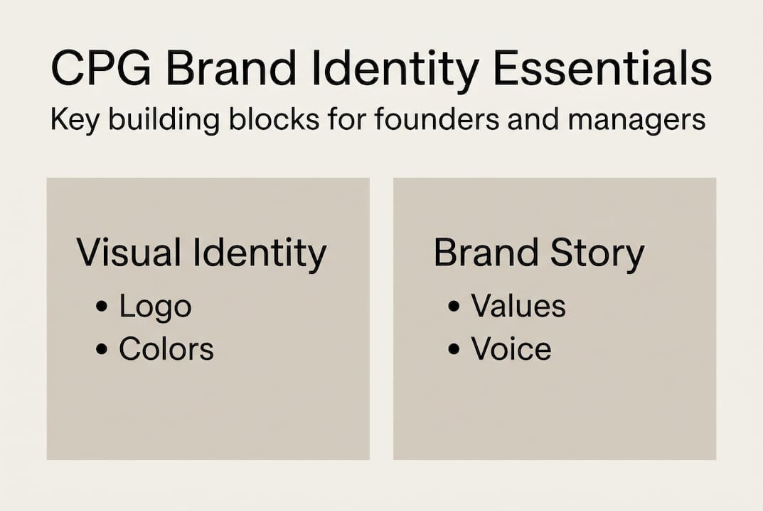
Think of brand identity in two layers. The first layer is visual identity: your logo, color palette, typography, packaging structure, and photography style. The second layer is brand strategy: your positioning, purpose, voice, promise, and the story that gives all those visuals meaning. Plenty of CPG startups build a beautiful visual identity with no coherent brand strategy underneath it. The result is packaging that looks professional but says nothing specific to anyone in particular.
Here is a cleaner way to see the difference:
| Element | Visual identity | Brand strategy |
|---|---|---|
| Logo and icon | ✓ | |
| Color palette | ✓ | |
| Typography system | ✓ | |
| Core values | ✓ | |
| Unique value proposition | ✓ | |
| Brand voice and tone | ✓ | |
| Brand promise | ✓ | |
| Brand story | ✓ |
The core elements you need to define before you touch a design tool:
- Core values: What your brand genuinely stands for, not aspirational buzzwords
- Brand story: The real reason your product exists and who it serves
- Unique value proposition: The specific, provable benefit that separates you on shelf
- Visual system: Logos, color, type, and imagery rules that travel consistently across every format
- Brand promise: The single expectation you set for every customer, every time
As branding strategist Marty Neumeier puts it: "A brand is not what you say it is. It's what they say it is." That quote matters because brand identity is always perceived through experience. Every touchpoint, a hang tag, a secondary panel, a shipping box, reinforces or erodes the identity you've built. You can learn more about branding for founders and how these principles apply at an early stage. For a foundational overview, branding 101 basics is a useful starting point.
The most dangerous myth here is that brand identity is a one-time creative project. It's a living system that requires maintenance, enforcement, and occasional iteration as your product line grows.
What makes CPG brand identity unique
After laying out the foundational elements, let's drill into what makes the CPG context so challenging and high-stakes.
CPG brand identity lives or dies on the shelf. That's not a metaphor. It's a physical reality. A shopper walking a grocery aisle makes a visual decision in roughly three seconds. Your packaging is your salesperson, your advertisement, and your first impression rolled into one object. No other category puts that kind of pressure on a brand identity system.

For CPG startups, brand identity must prioritize shelf impact with bold colors, legible typography readable from 10 feet, clear hierarchy for quick decisions, and scalable systems for product lines to create "brand blocks" on shelves. A brand block is what happens when multiple SKUs of the same brand sit together and create an instantly recognizable visual signature from across the aisle. Think of the bright orange Penguin Books spine, except applied to a row of protein bars or sparkling water cans.
Here's what that means in practice for your identity system:
- Own a color: Pick a hero color that no major competitor in your category uses. Defend it across every SKU, every format, every display unit.
- Prioritize legibility at distance: Your brand name and key benefit claim must be readable at 10 feet. Test this physically, not just on screen.
- Design for the shelf set, not the single unit: Lay out five units side by side and see what pattern they create together. If it looks chaotic, your system needs work.
- Build a scalable template: Every new SKU should slot into your existing visual architecture without requiring a redesign from scratch.
The trust dimension matters just as much as the visual one. 81% of consumers need to trust a brand before buying. In CPG, trust is built through consistency. A shopper who sees your brand three times across three different formats, say a shelf display, an Instagram ad, and a farmers market booth, should have the same emotional experience each time. When those touchpoints feel inconsistent, trust evaporates.
Pro Tip: Print a physical sample of your packaging and place it on an actual shelf next to competitors at your local store. Take a photo from 10 feet away. That image will tell you more than any screen mockup ever will.
Great packaging design tips can sharpen your shelf execution, while staying current with packaging design trends keeps your system fresh without losing brand coherence. For a broader view on how custom print packaging choices affect brand perception, it's worth exploring material and finish decisions early in your process.
How to build a brand identity system that works
Having covered CPG-specific demands, here's how to actually develop your own effective system.
Building brand identity without a process is like launching a product without a formula. You might get lucky, but you're mostly guessing. A structured 5-step process gives you a repeatable framework that grounds every creative decision in strategy.
- Define purpose, mission, and values: Start here, not with colors. Write one sentence that explains why your brand exists beyond making money. Then list three to five values that will govern every decision, from ingredient sourcing to packaging copy to customer service tone.
- Nail your USP: Be brutally specific. "Better for you snacks" is not a USP. "The only chickpea puff with 10 grams of protein and no artificial binders" is a USP. Clarity here drives clarity everywhere else.
- Craft your brand story: Who started this brand? What problem were they solving? What do they know that no one else does? A real story creates emotional connection and gives your team a reference point for every future creative decision.
- Develop voice and messaging: Write out how your brand talks. Is it warm and encouraging, or bold and irreverent? Document it in a tone guide with examples of on-brand and off-brand language so anyone who writes for your brand stays consistent.
- Build your visual system with guidelines: Logo usage, color codes, type hierarchy, photography style, iconography rules. Put all of it in a living brand guide that gets updated as your system evolves.
The Wei-Chuan case study is one of the best examples of this process delivering real results. The redesign blended authenticity with clarity, and purchase intent jumped 13 percentage points through multiple testing rounds, moving from 19 to 32 points. That result didn't come from a gut-feeling redesign. It came from testing specific brand identity elements against real consumer responses and iterating until the numbers moved.
The iteration piece is where most CPG founders quit too early. Your first visual system will not be your final one. Build a step-by-step packaging identity process that includes checkpoints for consumer testing, not just internal team reviews. Understanding the designer's role in that process helps you get better work out of every creative collaboration.
Pro Tip: Run a simple 5-second test with 20 real consumers before finalizing any packaging design. Show them your packaging for five seconds, then ask them to recall the brand name, the key benefit, and how it made them feel. The gaps between what you intended and what they remember tell you exactly what to fix. For more on packaging design considerations before going to print, a pre-production review is worth building into your timeline.
Your brand guidelines are only useful if someone enforces them. Designate a brand guardian, whether that's you, a brand manager, or an agency partner, whose job is to flag deviations before they ship.
Key pitfalls, myths, and advanced tips for founders
Now that you have a build process, it's crucial to sidestep common traps and learn from experienced founders.
The biggest single error in CPG brand identity is trusting your own taste over consumer data. Founders are deeply close to their products, which creates a blind spot. Marketers overestimate element fame and underestimate uniqueness, and the accuracy of intuition alone sits at roughly one in 50 within a 5% margin. Those are not good odds when you're betting launch capital on a packaging decision.
The most common pitfalls to avoid:
- Designing for yourself: Your personal aesthetic is not your target consumer's aesthetic. Test relentlessly.
- Copying category cues: Matching competitors makes you invisible. Distinctiveness drives shelf standout, not similarity.
- Ignoring secondary packaging: The back panel, the side, the inner packaging. All of it is brand real estate.
- Scaling too fast: Launching ten SKUs before proving one creates identity fragmentation that's expensive to fix later.
- Confusing strategy with identity: Writing a brand strategy document that never gets translated into visual and verbal standards means you have a strategy that no one can execute.
Now for the myths. The "higher purpose" myth is particularly prevalent in the CPG space right now. Distinctiveness is more important than differentiation, and purpose without real commitment behind it reads as hollow to consumers. Founders who build a brand around a vague purpose statement they can't operationalize create a credibility gap that undermines everything else. Sell your product well, responsibly, and with genuine quality. That is a brand purpose consumers actually respect.
The concept of "cathedral thinking" is worth building into your identity from day one. Medieval cathedral builders planned structures they knew would take centuries to complete. They designed systems that future builders, ones they'd never meet, could continue without losing coherence. Apply that same logic to your brand identity. Every asset you create, every color you choose, every tone decision you make, should work for the brand five SKUs and ten years from now.
Pro Tip: Before finalizing your brand identity, run a "distinctiveness audit." Pull your packaging alongside six competitors and cover all the brand names. Can consumers identify your brand by color and shape alone? If not, your distinctiveness score is too low. The design marketplace advantages of accessing pre-built, shelf-tested concepts can accelerate this process significantly. For early-stage brand inspiration, looking at what's already proven in adjacent categories often unlocks better ideas than starting from scratch. For CPG-specific execution details, CPG packaging asset tips cover the production side of getting brand identity assets print-ready.
"Brand distinctiveness is not about being different for the sake of it. It's about being instantly ownable in the mind of your shopper, without them having to think twice."
Why most CPG founders get brand identity wrong (and how to fix it)
Here's the uncomfortable truth: most CPG brand identity failures aren't design failures. They're process failures. Founders who have a strong intuition about their product often assume that intuition extends to their branding. It rarely does.
The hero-founder mentality, where one person's taste drives every creative decision, is statistically unreliable. Research confirms that marketers overestimate element fame and underestimate uniqueness, with individual accuracy hovering around one in 50. That's a failure rate no founder would accept in product formulation, yet it's standard practice in brand identity.
The second problem is confusing strategy with identity. Writing a brand strategy deck is not the same as building a brand identity system. Strategy tells you what you want to stand for. Identity is the tangible execution of that strategy across every surface your consumer sees or touches. Skipping the translation step means your strategy stays on a slide and never reaches the shelf.
The fix is simpler than most people think: build for the shelf first, test with real consumers, and enforce your guidelines like they're product specs. Invest in sustainable design matters as a long-term asset, not just a launch-week checklist item. Plan your identity for scale, not just your first SKU. The brands that win on shelf are not always the ones with the biggest budgets. They're the ones with the most deliberate, consistently enforced brand identity systems.
Bring your brand identity to life with Offcut
With a clear brand identity foundation, here's where you can turn ideas into strategic assets.
Building a CPG brand identity from scratch is one of the most demanding creative challenges a founder faces. The good news: you don't have to start with a blank page or a six-figure agency retainer.
Offcut is where great packaging designs go instead of a hard drive. Founders get exclusive, print-ready packaging concepts at a fraction of agency cost, while designers get paid for work that would otherwise collect dust. If you've done the strategy work and know what your brand needs to say, Offcut gives you access to shelf-ready design concepts you can adapt and launch faster than a traditional agency process. Whether you're validating your first SKU or building out a full product line, explore what OffCut for designers makes possible for your next launch.
Frequently asked questions
What are the main components of brand identity for CPGs?
The main components are core values, unique value proposition, brand story, logo, colors, typography, messaging, and brand promise, working together as a complete visual, verbal, and experiential system that shapes consumer perception.
Why does brand identity matter more in CPG than other industries?
CPG brands rely on shelf impact and instant recognition, and brand identity must prioritize shelf impact with legible typography, bold colors, and scalable systems that create recognizable brand blocks across multiple SKUs.
How do you know if your brand identity is effective?
Test it with real consumers for recognition, trust, and shelf standout because marketers overestimate element fame and data consistently outperforms team opinion when evaluating brand identity performance.
How often should a CPG startup revisit its brand identity?
Revisit at every major product launch or packaging redesign, or when sales data shows declining shelf impact, since brand identity is a living system that requires regular review as your product line and market position evolve.