
TL;DR:
- Debossing creates a recessed, shadowed impression that enhances tactile and visual appeal.
- It boosts brand perception, shelf differentiation, and product durability through textured finishes.
- Understanding techniques, materials, and quality checks ensures successful debossed packaging outcomes.
Many brand owners assume debossing and embossing are two names for the same trick. They're not, and that confusion costs real money when a packaging brief comes back from the printer looking nothing like the mood board. Debossing presses a design into a surface, creating a recessed impression you can feel with your fingertips. Embossing pushes the design up. That single physical difference changes how light plays across a package, how a consumer's hand interprets the texture, and ultimately how your brand registers in memory. This article breaks down exactly how debossing works, why it matters for packaging, and how to apply it without wasting budget or time.
Table of Contents
- What is debossing? The process and key principles
- Why debossing matters for packaging aesthetics and functionality
- Types of debossing techniques used in packaging
- Applying debossing: Step-by-step guide for designers and brands
- A fresh perspective: Why thoughtful debossing pays off
- Bring your packaging vision to life with Offcut
- Frequently asked questions
Key Takeaways
| Point | Details |
|---|---|
| Debossing definition | Debossing is a technique that creates indented designs in packaging for tactile and visual impact. |
| Brand enhancement | Using thoughtful debossing strengthens brand identity and boosts consumer engagement. |
| Technique variety | Designers can choose from several debossing methods based on material and desired effects. |
| Practical guidance | A clear step-by-step process helps brands apply debossing successfully to their packaging. |
| Marketplace advantage | OffCut’s platform offers access to creative packaging designs featuring advanced finishing techniques like debossing. |
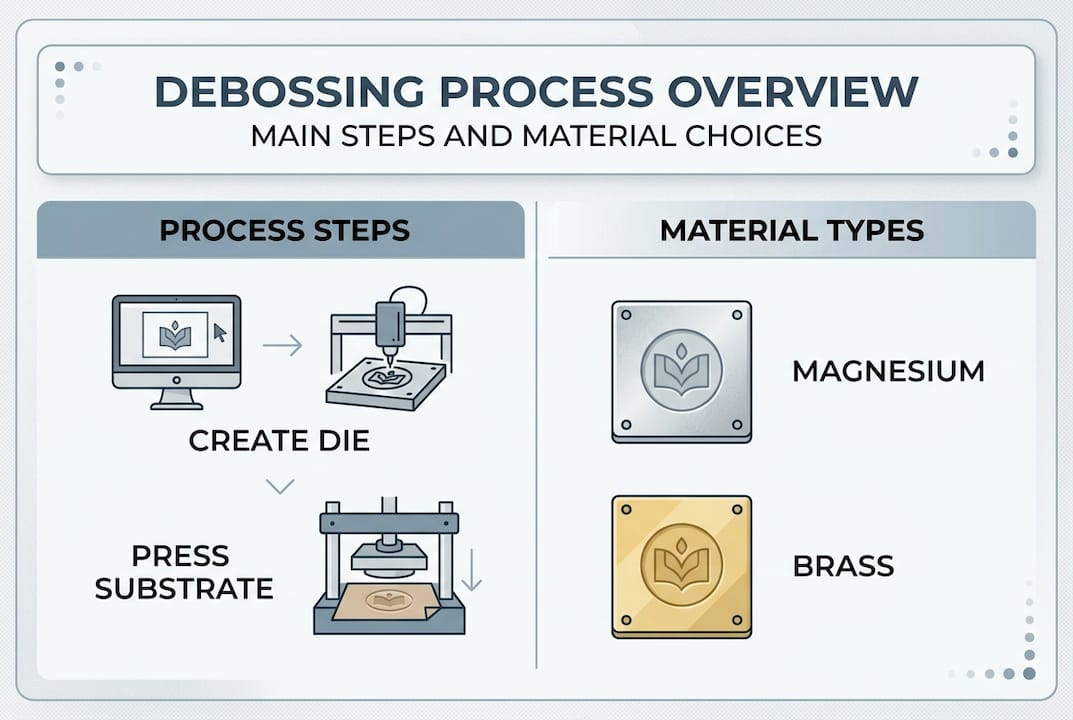
What is debossing? The process and key principles
Debossing is a print finishing technique where a custom metal die presses into a substrate from the front, leaving a recessed, indented impression. Unlike printing, there is no ink transfer. The visual effect comes entirely from shadow and depth created by the indentation itself.
The die is typically made from magnesium, brass, or copper. Each material offers different levels of detail and durability. Brass and copper dies last longer and hold finer detail, making them worth the extra cost for production runs above a few thousand units. The die is heated or pressed cold against the material, depending on the substrate and the desired effect.
How debossing differs from embossing at a glance:
| Feature | Debossing | Embossing |
|---|---|---|
| Surface direction | Pressed inward (recessed) | Raised outward |
| Visual effect | Shadow in the recess | Highlight on the raised area |
| Tactile feel | Finger sinks into design | Finger rides over design |
| Common use | Logos, text, borders | Premium seals, crests |
| Best materials | Thick paper, card, leather | Thick paper, card, foil |
As embossing vs. debossing research confirms, both techniques rely on a matching male and female die set, but the orientation of those dies determines whether the design rises or recedes. Knowing which direction serves your concept is not a minor detail. It is the whole design decision.
Where debossing fits in the packaging toolkit:
- Blind debossing: no ink or foil, purely tactile and shadow-driven
- Foil debossing: metallic foil applied simultaneously with the impression
- Combined debossing and embossing: using both within the same design for contrast
- Registered debossing: aligning the impression precisely with an existing printed image
Just as understanding a die-cutting guide unlocks more structural possibilities for packaging, understanding debossing opens a dimension of finish that printing alone can never replicate.
Pro Tip: Choose blind debossing when your brand identity is strong enough to communicate through shape and texture alone. Logos pressed without foil or color read as confident and restrained, which is exactly the signal premium brands want to send.
Why debossing matters for packaging aesthetics and functionality
A package's job extends well past protecting a product. It has roughly three seconds to make a shelf argument, and then it has the entire unboxing moment to reinforce the purchase decision. Debossing contributes to both of those interactions in ways that flat printing simply cannot.
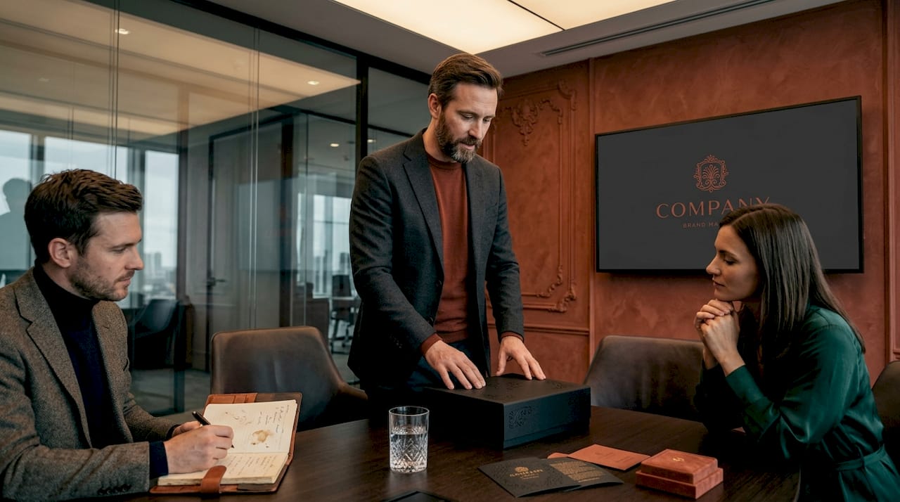
Tactile packaging is not a trend. It is a documented driver of consumer behavior. Studies on tactile packaging appeal show that physical texture increases perceived product value and brand memorability. When a shopper picks up a box and feels an indented logo, their brain registers craft, care, and premium positioning almost immediately. That perception is built before they read a single word.
"Touch is the most intimate sense. Packaging that speaks through texture creates an emotional connection that visual design alone cannot replicate."
Functional benefits beyond aesthetics:
- Grip improvement: Debossed areas on cartons and sleeves add friction, making packaging easier to hold. Cosmetic brands use this on lipstick tubes and compact cases.
- Durability signaling: The impression itself is permanent. It does not fade, peel, or scratch off the way printed finishes can. That longevity communicates quality.
- Differentiation on shelf: In a category where every competitor is using full-bleed printing, a matte debossed logo stands out precisely because it asks nothing from color.
- Guided tactile experience: Debossed borders and panels can direct a consumer's fingers toward a closure or opening mechanism, improving usability.
- Layered brand storytelling: Combining a debossed brand mark with a printed secondary element creates hierarchy that visual design alone struggles to achieve.
| Packaging category | Common debossing application | Primary benefit |
|---|---|---|
| Beauty and cosmetics | Brand logo on carton lid | Premium perception |
| Spirits and wine | Label surface texture | Authenticity and craft |
| Technology accessories | Product name on sleeve | Tactile differentiation |
| Specialty food | Debossed border on box | Artisan positioning |
| Apparel and accessories | Brand mark on hang tag | Tactile brand recall |
For deeper branding inspiration that shows how finishing techniques shape consumer perception, the examples above consistently demonstrate that debossing earns its cost through measurable shelf performance. And when you look at design trends 2026, tactile differentiation is listed among the leading strategies brand owners are investing in across every consumer goods category.
The functional case for debossing is just as strong as the aesthetic one. Brands that treat finishing as decoration are leaving half the value on the table.
Types of debossing techniques used in packaging
Not all debossing is the same. The technique you choose depends on the substrate, the design complexity, the production volume, and the budget available for tooling. Getting this right before you brief a manufacturer saves significant time in the proofing cycle.
The main debossing methods used in packaging production:
-
Single-level debossing presses the design to one uniform depth. This works well for simple logos, wordmarks, and geometric borders. It is the most cost-effective option because the die tooling is straightforward.
-
Multi-level debossing uses a sculpted die that creates varying depths within a single impression. A floral illustration, for example, might have petals pressed to different depths for a three-dimensional, carved appearance. The tooling is more expensive, but the result is significantly more dramatic.
-
Combination debossing and foil stamping applies metallic or pigment foil at the same time the die creates the impression. The foil sits inside the recessed area, catching light differently than foil applied to a flat surface. This technique is extremely common in premium spirits and luxury cosmetics packaging.
-
Heat-assisted debossing uses a heated die to soften the substrate slightly before pressing. This produces sharper, cleaner edges and is particularly effective on thicker boards and uncoated stocks. Cold debossing is used for heat-sensitive materials or specialty substrates.
-
Combination emboss and deboss uses two dies working in opposing directions on the same design. The result is a dramatic relief effect where some elements rise and others sink. This approach is applied in high-end stationery and luxury retail packaging to create an almost sculptural quality.
As packaging design sourcing guidance shows, understanding the technique before briefing a supplier is critical because each method requires different file preparation, die specifications, and material minimums.
Material considerations for debossing:
Substrate choice is as important as technique choice. Thick, uncoated papers (250gsm and above) hold impressions the best. Coated stocks can crack at the debossed edge if they are too rigid. Kraft paper, cotton paper, and linen-finish boards produce beautiful blind deboss results because their natural texture contrasts with the smooth pressed surface. For packaging design for startups, starting with single-level debossing on a thick uncoated board gives the highest quality-to-cost ratio. Once your volumes grow, revisiting multi-level dies becomes far more affordable per unit.
Understanding the full packaging design workflow before locking in your finishing technique also prevents costly late-stage revisions.
Pro Tip: Always request a physical die strike sample before approving production. Debossing looks different on paper than it looks on screen. A physical sample lets you verify depth, edge clarity, and how the finish reads under store lighting, which is often far cooler and more direct than studio light.
Applying debossing: Step-by-step guide for designers and brands
Knowing the theory is not enough. The gap between a beautiful debossed concept and a disappointing production run usually comes down to process failures, not creative ones. Here is how to plan and execute debossing correctly from the first brief to the final shipment.
Step-by-step debossing process:
-
Define the design intent first. Decide what role the debossed element plays in your overall packaging. Is it the hero brand mark? A subtle texture pattern? A tactile navigation element? The answer shapes every technical decision that follows.
-
Prepare artwork to the correct specifications. Debossed elements must be supplied as vector artwork with clean, closed paths. Fine serif fonts and intricate detail smaller than 1pt will not transfer cleanly into most substrates. Minimum stroke weight for debossing is typically 0.5mm to 0.75mm depending on the die type and material.
-
Select the substrate before ordering the die. The die specifications are calibrated to the material thickness. Ordering a die before confirming your final stock is a common and expensive mistake. Lock in your paper or board, get physical samples, and then commission the die.
-
Work with your manufacturer early. Experienced printers and finishing houses will flag design issues before tooling starts. Share your artwork as early as the concept stage so they can advise on feasibility. As packaging concept creation guidance confirms, the designer's role includes translating creative vision into technically sound production specs, not just delivering pretty mockups.
-
Request a die strike on your actual substrate. This is a physical test impression, not a digital proof. It reveals edge clarity, depth consistency, and whether the substrate cracks or distorts. Never skip this step.
-
Proof register alignment if combining with print. If your debossed logo sits over a printed background, any misalignment between the print registration and the die position will be immediately visible. Budget time for at least two rounds of alignment proofing.
-
Quality-check the first production batch. Inspect impressions under raking light (light directed at a sharp angle across the surface) to reveal any inconsistency in depth or edge definition. Spot-check at least 5% of the run.
Common pitfalls to avoid:
- Using debossing on substrates that are too thin (below 200gsm) where the impression shows through to the inside
- Designing at screen resolution and losing fine detail in the die tooling
- Not accounting for the kiss cut zone around debossed areas, which can affect how the pack assembles
- Assuming digital proofs accurately represent tactile depth
- Choosing a cheap magnesium die for a long production run, which leads to impression degradation over time
For teams exploring ways of repurposing packaging designs, debossing can be a powerful way to refresh an existing structural form without redesigning the entire package. Adding a debossed element to a proven dieline can extend brand equity and elevate shelf presence without starting from scratch. Similarly, concept packaging tips can help you integrate debossing decisions earlier in the ideation phase, where changes are still cheap.
A fresh perspective: Why thoughtful debossing pays off
Most brands add debossing because they saw a competitor doing it. That is the wrong starting point, and it produces results that look like copies of a trend rather than expressions of a brand. The brands that benefit most from debossing are the ones that ask one question before anything else: what do we want the customer to feel when they pick this up?
Debossing is not a visual finishing technique. It is an experiential one. The impression communicates before the eyes even register it, which means it carries emotional weight that typography and color cannot. Brands that understand this use debossing with intention. They press it into materials that already have a story: a recycled kraft, a cotton-fiber board, a natural linen stock. The texture of the material and the precision of the impression work together.
The hard-won lesson is that restraint wins. One perfectly executed debossed logo on a simple matte box outperforms a package covered in competing finishes every time. Understanding the full design marketplace benefits available to brands today means you do not have to start from scratch to achieve this level of finish. The concepts already exist. The decision is simply to use them with intention.
Bring your packaging vision to life with Offcut
Great debossed packaging starts with a concept that is built for it from the ground up, not retrofitted at the last minute.
At Offcut, that is exactly what you get. Offcut is where print-ready packaging concepts live instead of gathering dust on a designer's hard drive. If you are a brand owner looking for a premium, debossing-ready packaging concept at a fraction of agency rates, Offcut connects you directly with designers who have already done the creative heavy lifting. If you are a designer with strong structural and finishing concepts sitting unused, Offcut turns that work into revenue. Either way, the result is packaging that is built to perform on shelf and in hand.
Frequently asked questions
How does debossing differ from embossing?
Debossing creates a sunken impression on materials, while embossing raises the surface. As embossing and debossing research confirms, both use a matched die set but in opposing orientations, producing completely different tactile and visual effects.
What materials work best for debossing on packaging?
Thicker papers, cardboard, and select plastics are most commonly used for debossing in packaging because they hold the impression well without cracking or showing bleed-through on the reverse side.
Is debossing more expensive than other finishing techniques?
Debossing can be priced comparably or higher than standard print finishes, especially if custom dies are required. Costs decrease significantly per unit as production volume increases.
Can debossing be used with color or foil?
Yes, debossed areas can be combined with foil stamping or color for enhanced effects and branding impact, with foil-debossing combinations being especially popular in luxury and premium consumer goods packaging.
What are the main steps to create debossed packaging?
Design the artwork, choose the right material, tool the die, run tests, and quality-check before final production. As packaging concept creation guidance outlines, aligning design intent with technical specs from the start is what separates clean results from costly reprints.