
TL;DR:
- Packaging grids provide a structured system that streamlines production and ensures brand consistency.
- Using grids reduces design revision hours, print errors, and accelerates product launch timelines.
- Early adoption of packaging grids benefits brands of all sizes by saving costs and enhancing shelf impact.
Most CPG founders think packaging grids are something designers worry about, not brand owners. That assumption is costing you money. A well-structured grid is not just a layout tool — it is a repeatable system that speeds up production, reduces expensive print errors, and makes your product stand out on a crowded shelf. Whether you are launching your first SKU or scaling into new retail channels, understanding how grids work gives you a real operational edge. This article breaks down what packaging grids actually do, how they lower your costs, and how you can use them to tell a stronger brand story.
Table of Contents
- What are packaging grids and why they matter
- Cost-saving benefits of packaging grids
- Amplifying brand storytelling and shelf impact
- Implementing packaging grids for your brand
- The overlooked power of packaging grids
- Get more value from packaging grids with OffCut
- Frequently asked questions
Key Takeaways
| Point | Details |
|---|---|
| Grids boost branding | Packaging grids create consistent, visually appealing designs that help brands stand out on the shelf. |
| Reduce production costs | Grid systems simplify print workflows and minimize costly errors, saving money for founders and brand owners. |
| Enable scalable storytelling | Grids make it easier to maintain brand identity and narrative, even as product lines expand. |
| Easy adoption steps | Founders can start by integrating grid templates and partnering with designers to streamline packaging design processes. |
What are packaging grids and why they matter
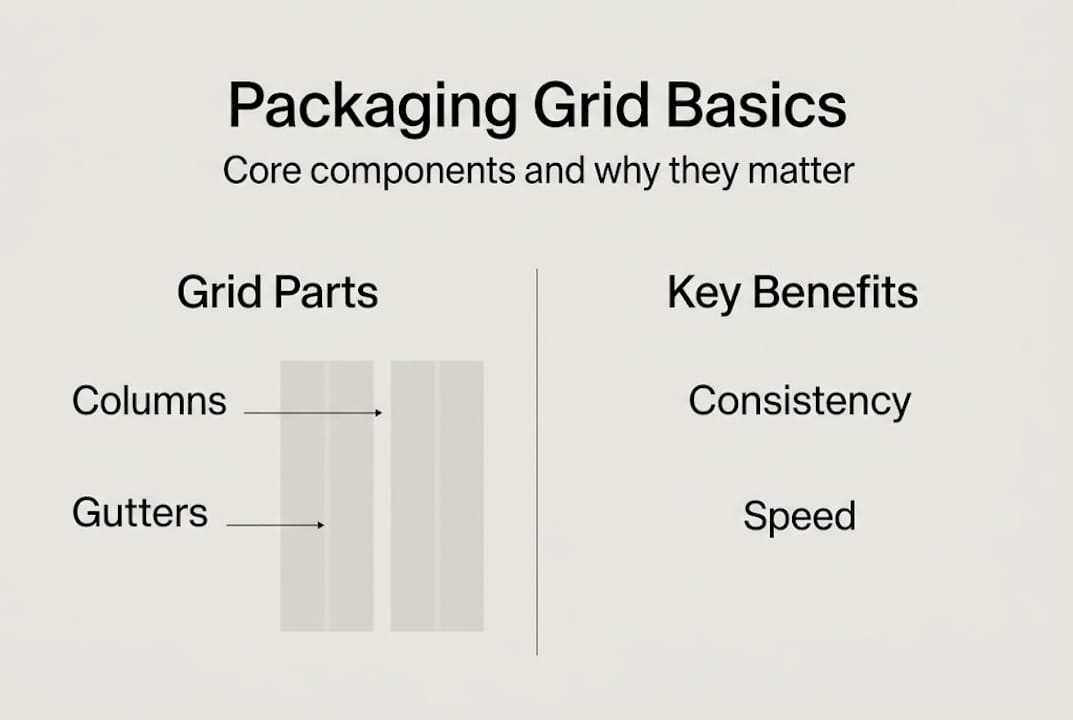
A packaging grid is a structured framework of rows, columns, and margins that guides where every element on your package goes — your logo, product name, nutrition facts, imagery, and legal copy. Think of it as the invisible skeleton holding your design together. Without it, designers make judgment calls on every revision, and brand elements drift slightly each time. With it, every team member works from the same visual rulebook.
The core components of a grid include columns (vertical divisions of space), rows (horizontal bands), gutters (the gaps between columns), and margins (the boundary space around the entire panel). Together, these elements create a repeatable structure that structures packaging layouts for cost-effective, high-impact results.
Grids matter well beyond aesthetics. They influence production timelines, revision cycles, and even supplier relationships. Here is how grid-based packaging compares to non-grid approaches:
| Factor | Grid-based packaging | Non-grid packaging |
|---|---|---|
| Revision speed | Fast — elements snap to predefined zones | Slow — every change requires manual repositioning |
| Brand consistency | High across all SKUs | Variable, prone to drift |
| Print error rate | Low — specs are baked in | Higher — specs reset each job |
| Onboarding new designers | Straightforward | Steep learning curve |
| Template reuse potential | Excellent | Minimal |
Beyond the table, grids deliver a few less obvious advantages:
- They make it easier to stay aligned with packaging design trends without rebuilding from scratch each season
- They create clear zones for regulatory content, so compliance copy never crowds out your brand message
- They support multi-panel consistency, which is critical when a product has front, back, and side panels that all need to feel like one unified design
- They give your printer a cleaner file, which translates to fewer prepress corrections and faster turnaround
For a deeper look at how grid modules are structured in professional packaging environments, the underlying logic is worth understanding before you brief a designer.
Pro Tip: Every time you finalize a packaging grid, document the column count, gutter width, and margin sizes in a one-page spec sheet. When you bring in a new designer or freelancer, that spec sheet alone can cut your briefing time by 40 percent or more.
Cost-saving benefits of packaging grids
For brand founders watching every dollar, packaging grids are one of the most underrated budget tools available. The savings are not just theoretical — they show up across every phase of the production process.
Revision cycles are one of the biggest hidden costs in packaging. When a designer has to manually reposition elements after a copy change or artwork update, that work adds up fast. Grid templates reduce errors and speed up workflow because elements live inside defined zones that do not need to be re-justified with every round of edits. A change to the product name does not ripple into repositioning the logo, the flavor callout, and the barcode all over again.

Print setups are another area where grids save real money. Proper grid use facilitates smoother print production by ensuring bleed, safe zones, and die-cut lines are baked into the template from day one. Your printer spends less time flagging errors before going to press, and you spend less time paying for corrections.
Here is a rough breakdown of where grid-based workflows save versus custom-layout approaches:
| Cost category | Grid-based workflow | Custom layout workflow |
|---|---|---|
| Design revision hours | 2 to 4 hours per round | 6 to 10 hours per round |
| Print prepress corrections | 0 to 1 per job | 2 to 4 per job |
| Seasonal artwork adaptation | 1 to 2 days | 4 to 6 days |
| New SKU development | Reuse existing grid | Full rebuild |
The scalability benefit compounds over time. Once your grid is established, expanding into new flavors, formats, or seasonal variants is a matter of adapting content within the same structure. Efficient packaging workflow strategies are built around this kind of repeatable system, not one-off creative sessions.
Another angle worth exploring is the ability to repurpose old packaging designs using your grid as the foundation. A holiday promotion does not require a brand-new layout if your grid already holds the structure. You swap in seasonal colors or artwork and output a finished file in a fraction of the usual time. See how efficient grid systems support this kind of modular design approach.
Pro Tip: Before briefing seasonal or limited-edition packaging, pull up your existing grid template first. In many cases, only the artwork layer needs updating — and that alone can save 8 to 12 hours of billable design time per SKU.
Amplifying brand storytelling and shelf impact
Cost efficiency matters, but packaging also has one job that no spreadsheet can fully capture — making a shopper stop and pick up your product. Grids are what make that possible at scale without losing your brand voice in the process.
When your layout has a defined hierarchy, every design element earns its place. Your logo sits where shoppers expect it. The flavor or variant name is large enough to register in under two seconds. The brand color fills the right proportion of the panel. None of this happens by accident — it happens because a grid enforces the visual rules that create that experience consistently across every product in your line.
Grid-based designs improve whitespace use and brand presentation, which is especially important as retail environments get noisier. Whitespace is not empty space — it is breathing room that directs the shopper's eye to what matters most.
Here are the storytelling elements that grids help you control deliberately:
- Logo placement: Fixed position across all SKUs builds brand recognition faster than any marketing campaign
- Color blocking: Grid columns define where brand colors live versus where product photography sits
- Typography hierarchy: Grid rows create clear visual levels — brand name, product name, tagline, and claim — without crowding
- Iconography and certifications: Dedicated grid zones keep logos like organic, non-GMO, or kosher from floating randomly across panels
- Narrative flow: A grid guides the reader's eye from the hero claim down to supporting information in a logical sequence
"Packaging that uses deliberate structure is not just easier to produce — it is easier to buy. Shoppers make decisions in under 7 seconds at shelf, and a grid is what gets your message delivered in that window."
Grid frameworks create modern packaging that elevates brands above cluttered competitors. And the designer workflow guide approach to structured layouts is what separates brands that look polished from brands that look assembled. Visual cohesion across a product line builds trust faster than any single design element can — explore the visual cohesion module for practical examples.
Implementing packaging grids for your brand
Knowing that grids matter is one thing. Actually getting one into your workflow is where founders often get stuck. Here is a practical path forward.
- Audit your existing packaging. Before building a new grid, identify the inconsistencies in your current designs. Where does your logo drift? Where does body copy crowd the edges? This audit tells you what your grid needs to solve first.
- Choose a grid format. Most packaging designers work with either a column grid (3 to 6 columns depending on panel width) or a modular grid (rows and columns together). For multi-panel formats, a modular grid gives you more control over front, back, and side panels simultaneously.
- Set your margins and gutters. Standard margins for retail packaging run between 5mm and 10mm from the safe zone boundary. Gutters between columns are typically 4mm to 6mm. These numbers should match your printer's safe zone specs.
- Map your mandatory elements. Legal copy, barcodes, and certification logos all have fixed placement requirements. Build those zones into the grid before you place any brand elements.
- Template your grid in your design software. Applying grid templates improves workflow and brand consistency from the first file to the fiftieth. Lock the grid layer so designers work within it, not around it.
- Test with one SKU before scaling. Roll out your grid on a single product, take it through a full print cycle, and gather feedback from your designer and printer before applying it across the entire line.
For reference, grid module resources show how professional studios structure these templates across complex packaging systems.
Pitfalls to avoid: overly rigid grids that leave no room for creative differentiation between variants, and grids built without input from your actual printer's specs. A grid that works on screen but violates your printer's safe zone requirements will cost you more than no grid at all.
For collaboration with designers, review the packaging portfolio workflow to understand what a grid-literate designer brings to the table before you hire.
Pro Tip: When briefing a designer on a grid project, share your printer's dieline, not just the panel dimensions. A grid built around the actual dieline will survive production without a single repositioning request.
The overlooked power of packaging grids
Most founders delay grid adoption for one reason: they do not think they are at a large enough scale to need it yet. That logic is backwards. The earlier you build a grid, the less debt you accumulate in misaligned artwork, inconsistent brand presentation, and expensive revision cycles.
We see it consistently — brands that commit to grid-based systems early launch faster, spend less on design revisions, and present more cohesively at retail. The brands that skip it scramble to retrofit structure later, often after a costly packaging overhaul.
Designers and business owners recognize the long-term ROI of grids once production results emerge. The bottlenecks disappear. Files go to print cleaner. New SKUs take days instead of weeks.
The real shift is treating packaging grids as a strategic business asset, not a design preference. If you are looking for inspiration for cost-effective branding, the most durable starting point is always the structure underneath the design — not the visual style on top of it.
Get more value from packaging grids with OffCut
If building a packaging grid from scratch sounds like a heavy lift, you do not have to start from a blank file. OffCut is where great packaging designs go instead of a hard drive — meaning you can source print-ready, grid-structured concepts that are already built to production standards, at a fraction of what a custom agency engagement costs.
Founders browse real, unused concepts from professional designers and get packaging that works from day one. Designers who have already done the grid work get paid for it instead of letting it sit on a server. Whether you want to browse OffCut packaging solutions for your next launch or sell unused packaging concepts you have already built, the platform connects both sides of that equation.
Frequently asked questions
How do packaging grids help reduce costs?
Grids reduce print errors and speed up revision cycles, which directly lowers the hours and corrections you pay for across every production run. Streamlined print setups also mean fewer prepress flags and faster turnaround from your printer.
Can packaging grids improve brand consistency?
Yes — grids improve whitespace use and standardize layout elements, so every SKU in your line looks like it belongs to the same family without requiring manual alignment on every file.
How can founders start using packaging grids?
Start by sourcing grid-based templates or working with designers who already build in grid-first workflows, then document your grid specs so every future project starts from the same foundation.
Are packaging grids only useful for large brands?
Not at all — grid frameworks create modern packaging for brands at every scale, and the cost-saving benefits are often most impactful for startups that cannot afford expensive revision cycles or rebrands.
Recommended
- Packaging design inspiration: cost-effective ideas to boost branding
- How to source packaging design that elevates your brand
- Concept packaging: Enhance product appeal and cut design costs
- 5 strategies to improve CPG packaging design workflow
- Verpakking en Branding: Complete Gids voor Succes – Kadopapier.net